Amazing! That map looks pretty similar to Z1's overworld map. I spy some similarities here lol

The Official Quest Screenshot Critique Thread
Started by
Mitchfork
, Apr 16 2011 09:35 PM
7962 replies to this topic
#6271

Eddy
-

- Members
-

ringle
- Real Name:Edward
- Pronouns:He / Him
- Location:London, United Kingdom
Posted 27 April 2015 - 12:36 PM
- Sheik likes this
#6272
Demonlink
-

- Members
-

Lurking in the shadows...
- Real Name:Miguel
- Location:Wouldn't you like to know?
Posted 27 April 2015 - 03:11 PM
Good grief Shiek! ... I hope these words mean something to you, but that's a really inspirational map you made. The colors all flow well and they still look like GB colors. Man, I gotta say, this motivates me to start a custom GB set with a similar style, and use that same set for a custom quest!Thanks again. So, here is what I have thus far, I've gotten really slow at mapping somehow. But yeah, as you can tell a big part is still unfinished (Death Mountain isn't even started yet) and then I should also mention that most (but not all) of the NPCs are placeholders right now until I decide what characters I actually want in the villages.

Talent requieres guts and you have them. Very nicely done, I luvs it :3 !
Edited by Demonlink, 27 April 2015 - 03:11 PM.
- Sheik likes this
#6273
Sheik
-

- Members
-
Deified
Posted 27 April 2015 - 03:37 PM
I'm glad you enjoy my work and all the better if it inspires you to work in the GB Zelda tileset(s) as well - there can never be too many GB styled quests. ![]()
As for the colors, I think this might be something like my best palette yet. It is based heavily of a palette I've been using with Firebird recently and then I kind of tried to an aLttP-esque thing with it, adding the yellow grass and whatnot. The teal was something I kept from the original palette and then it worked well enough with the waterfall area so I used it there. I am trying not to use too many different palettes on the overworld, I want it to 'flow' as you put it - Nintendo seems to be doing this with their overworld maps and I figured it might be worth a shot whether I can do something similar.
I changed around a few things on the transition from the Waterfall area to the NE to the field area below and I added Spectacle Rock as the start of the Death Mountain area. It's gotten pretty late so not sure if I will do much more today. Anyways, very slightly updated map in the spoiler tags:
Spoiler

Edited by Sheik, 27 April 2015 - 04:01 PM.
- Shane, Eddy, Jared and 1 other like this
#6274
Moonbread
-

- Members
-
Playing With Psychos
- Pronouns:They / Them
Posted 27 April 2015 - 03:53 PM
Wowza Bowza, that looks awesome. I absolutely adore your work with the GB graphics! And yep, there's definitely a resemblance to Zelda 1 here, which makes me curious with what you're doing...
- Sheik likes this
#6275
Sheik
-
- Members
-
Deified
Posted 27 April 2015 - 03:58 PM
And yep, there's definitely a resemblance to Zelda 1 here, which makes me curious with what you're doing...
Ehehehe. :>
#6276
Omega
-

- Members
-

Yes
Posted 27 April 2015 - 09:44 PM
Here's a little preview of what I have been working on. Keep in mind that this is not from tFK DX eventhough the subscreen suggests otherwise. It's just that I used the same questfile because I have most of my modifications on the tileset already in place there.

Looks professionally done, nice job!
- Sheik likes this
#6277
KingPridenia
-
- Members
-
King of Pridenia, Safehaven of the LGBTQ
- Real Name:Adam
- Location:Pennsylvania
Posted 03 May 2015 - 11:45 AM
Here are two from me:
Link forgot to wear his Winter clothes...
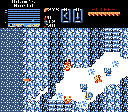
Hopefully the Lynels won't see Link over there...
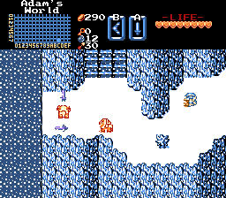
- Eddy, Avaro and Jared like this
#6278
Eddy
-
- Members
-
ringle
- Real Name:Edward
- Pronouns:He / Him
- Location:London, United Kingdom
Posted 03 May 2015 - 11:49 AM
Looking pretty good! I like the wintery setting you got going on there.
#6279
Demonlink
-
- Members
-
Lurking in the shadows...
- Real Name:Miguel
- Location:Wouldn't you like to know?
Posted 03 May 2015 - 01:59 PM

Official progress going on Hylian Legacy. We see Link smiling for this week's SotW contest, and what the heck is that pendant item for!? (I'll give you a hint, it's an item you'll be using a lot in this quest, as I made a few changes to the Quest's Rules).
- Shane, Eddy and Jared like this
#6280
Eddy
-
- Members
-
ringle
- Real Name:Edward
- Pronouns:He / Him
- Location:London, United Kingdom
Posted 03 May 2015 - 02:10 PM
Ooo, looking pretty interesting!
Tell me all your secrets about that pendant or die ![]()
- Demonlink likes this
#6281
Shane
-

- Members
-
🤍
Posted 06 May 2015 - 10:25 AM

Staying focus on one project? lolwat
- Eddy, Avaro and Jared like this
#6282
Eddy
-
- Members
-
ringle
- Real Name:Edward
- Pronouns:He / Him
- Location:London, United Kingdom
Posted 06 May 2015 - 10:59 AM
Looking really good Shane! It somehow reminds me of Minish Cap's starting screen, which I have no idea why honestly lol. Maybe it's the house in that specific position.
- Shane likes this
#6283
MoscowModder
-

- Members
-
Sometimes lurking. Rarely posting.
- Location:Wisconsin
Posted 06 May 2015 - 11:08 AM
The palette seems too brown to me. The screen design is nice though.
- Shane likes this
#6284
Demonlink
-
- Members
-
Lurking in the shadows...
- Real Name:Miguel
- Location:Wouldn't you like to know?
Posted 06 May 2015 - 03:28 PM
Staying focus on one project? lolwat
The brown palette serves for a calm, peaceful village set in a dusk atmosphere right? Loving it 100% here! (dis reminds me from Adaryan quest, yes)
- Shane and Eddy like this
#6285
Frocks7Snee
-

- Members
-

Illustrious
Posted 07 May 2015 - 06:31 PM

Thoughts? I was told that an earlier version of this screen had bad flow, since all sides were immediately accessable, so I changed it a bit. At this point, you wouldn't have any items at all.
- Eddy and Jared like this
0 user(s) are reading this topic
0 members, 0 guests, 0 anonymous users

