
Not sure if sky, or ocean, or both, but I like.

The Official Quest Screenshot Critique Thread
Started by
Mitchfork
, Apr 16 2011 09:35 PM
7962 replies to this topic
#6001

Tree
-

- Members
-

Everything must go away
- Real Name:Mundy Fumple McStroodlestein
- Location:The Milky Way Galaxy
Posted 02 January 2015 - 01:00 PM

#6003
Eddy
-

- Members
-

ringle
- Real Name:Edward
- Pronouns:He / Him
- Location:London, United Kingdom
Posted 03 January 2015 - 07:41 AM
I see an intro coming through, I like it a lot ![]() I also love the LA-style frames for the plates.
I also love the LA-style frames for the plates.
- Shane likes this
#6004
Joelmacool
-

- Moderators
-

Addicted to Overwatch
- Real Name:Joel
- Location:Country of Europe
Posted 03 January 2015 - 08:32 AM

What does this screen remind you of?
Here's another screen i made, its an area.
- Shane, Eddy and Jared like this


#6006
Eddy
-
- Members
-
ringle
- Real Name:Edward
- Pronouns:He / Him
- Location:London, United Kingdom
Posted 03 January 2015 - 08:41 AM
Really nice screens you guys! Joel's Firebird shots are pretty damn good and I like the detail put in. Nokutaa's shot looks really interesting and I do love the whole desert look. Also, dem clouds tho.
- Joelmacool likes this
#6007
Sheik
-

- Members
-
Deified
Posted 03 January 2015 - 08:46 AM
@ Shane: Looks legit, well done.
@ joel: I think those open cornors on the green screen could look better with some trees.
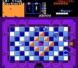
@ Nokutaa: Remniscent of Zelda 2, intentionally so I figure. Cool.
Edited by Sheik, 03 January 2015 - 08:48 AM.
- Shane and Joelmacool like this
#6008
KingPridenia
-

- Members
-

King of Pridenia, Safehaven of the LGBTQ
- Real Name:Adam
- Location:Pennsylvania
Posted 03 January 2015 - 10:49 AM
I kind of feel the palette of the walls is too dark in comparison to the disco/dance floor. Any thoughts?
- Eddy and Jared like this
#6009
David
-

- Administrators
-

Fallen leaves... adorn my night.
- Real Name:David
- Pronouns:He / Him
Posted 03 January 2015 - 11:41 AM
It actually looks fine to me. I think the contrast between the colors work perfectly. The color choices are good and the screen itself is very well made.
If you want to make the walls brighter though, I don't think it'd hurt the screen at all but it could make it better, even though I already think it is fine. ![]()
#6010
Eddy
-
- Members
-
ringle
- Real Name:Edward
- Pronouns:He / Him
- Location:London, United Kingdom
Posted 03 January 2015 - 01:34 PM
I agree with DaviAwesome, the walls and the floor are a perfect match IMO, the palette also seems really good.
#6011
Shane
-

- Members
-
🤍
Posted 04 January 2015 - 01:08 AM
What does this screen remind you of?
Here's another screen i made, its an area.
Nice screens. I think the second screen could benefit closed corners. I'd imagine closing them with pine trees would make the screen a lot more structured looking.
Nice Z1 remake screen by the way.
Very nice and retro. I dig it.
I kind of feel the palette of the walls is too dark in comparison to the disco/dance floor. Any thoughts?
Palette is fine. If it's a disco floor than it should be bright. lol

#6013
ZeldaPlayer
-

- Members
-

What's up my playas
- Location:USA
Posted 07 January 2015 - 04:27 PM
Looking good Shane. ![]()
- Shane likes this
#6014
Eddy
-
- Members
-
ringle
- Real Name:Edward
- Pronouns:He / Him
- Location:London, United Kingdom
Posted 08 January 2015 - 11:03 AM
I like it a lot Shane! I really love how you added in the MC-style shortcuts where you have to push a rock into a hole to make a path. Nice stuff as always ![]()
- Shane and Jared like this
#6015
David
-
- Administrators
-
Fallen leaves... adorn my night.
- Real Name:David
- Pronouns:He / Him
Posted 12 January 2015 - 04:51 PM
Feel free to comment and critique on these screenshots (some are hidden because there are a lot of screenshots):


If you would like to see more of this cave from my Princess' Amethyst quest, check out my update topic in the following link: http://www.purezc.net/forums/index.php?showtopic=65875
Thanks!
More Screenshots


If you would like to see more of this cave from my Princess' Amethyst quest, check out my update topic in the following link: http://www.purezc.net/forums/index.php?showtopic=65875
Thanks!
- Magi_Hero, Shane, Eddy and 1 other like this
0 user(s) are reading this topic
0 members, 0 guests, 0 anonymous users

