yeah, it works. I had a lot of other thoughts about other aspects, but to your question: I always push for variety and this is variety. the issue becomes that there isn't that level of realism in the rest of the tiles which repeat so uniformly. I'll leave it at that.

The Official Quest Screenshot Critique Thread
Started by
Mitchfork
, Apr 16 2011 09:35 PM
7962 replies to this topic
#5701

trudatman
-

- Members
-

one point nine hero
- Real Name:that guy
- Location:State Of Love And Trust, The United State Of Amorica.
Posted 05 September 2014 - 07:14 PM
#5702
Moosh
-

- Moderators
-

The Mush
Posted 06 September 2014 - 07:36 AM
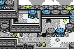
Reposting here because the S:CA topic is full of DayDay. The screen itself is a mock-up, but I may use this style in the future if people don't hate it.
- Eddy likes this
#5703
Shane
-

- Members
-

🤍
Posted 06 September 2014 - 07:44 AM
If the colour choices made a little more sense (green on the HC kinda doesn't make any sense, for example), it'd be neat to see a quest in that style.
As for the screen (and palette, I guess) itself, my only suggestion is to make the green feel less neon and yellow-like. Those solid white tiles on the ground should always be filled in, and stick to one grass detail tile. Variety is good, but with GB, it feels inconsistent.
As a recreation of DayDay, it feels too serious, but as a standalone screen... it's pretty cool! And as I said, the colour thing you've got going on here could work.
#5704
Eddy
-

- Members
-
ringle
- Real Name:Edward
- Pronouns:He / Him
- Location:London, United Kingdom
Posted 06 September 2014 - 08:06 AM
Reposting here because the S:CA topic is full of DayDay. The screen itself is a mock-up, but I may use this style in the future if people don't hate it.
You have disrespected the true legend of DayDay. As a penalty: Joel will send you DayDay 3 via PM (not really)
But anyways, really nice screen! I was expecting a clusterfuck of tiles to make it more DayDay-traditional, but hey this is pretty cool. Also, green Heart Containers? Is this a new trend? XD
#5705
Moosh
-
- Moderators
-
The Mush
Posted 06 September 2014 - 08:36 AM
If the colour choices made a little more sense (green on the HC kinda doesn't make any sense, for example), it'd be neat to see a quest in that style.
The green HCP was just a thing to fit the rules of the S:CA challenge. I thought it looked better than having one red thing mixed in with everything else. With Link and enemies on the screen it wouldn't be as much of a problem.
As for the screen (and palette, I guess) itself, my only suggestion is to make the green feel less neon and yellow-like. Those solid white tiles on the ground should always be filled in, and stick to one grass detail tile. Variety is good, but with GB, it feels inconsistent.
I wanted the green and blue to pop out from the rest of the screen. I suppose I went a bit overboard. I'm obviously not going for an authentic Gameboy feel with this screen as you can probably see by the blatant layering shenanigans in the background. I prefer to have more diversity in my ground details although I may have gone a bit overboard here.
As a recreation of DayDay, it feels too serious, but as a standalone screen... it's pretty cool! And as I said, the colour thing you've got going on here could work.
Personally, I think it's much more of a challenge to make DayDay look good than to make good look DayDay. Also, DayDay is a work of art. Even Joel hasn't managed to top it IMO and he's the one that made it.
- Eddy likes this


#5708
Eddy
-
- Members
-
ringle
- Real Name:Edward
- Pronouns:He / Him
- Location:London, United Kingdom
Posted 09 September 2014 - 11:52 AM
Level 2 - House of Tides
There's so much Mermaid's Cave inspiration going on here that I approve of this screen by a hell lot. In other words, that's awesome!
Pooto Town, a little port town in Dreamcatcher
Interesting screen here, I love how the screen looks and I actually have nothing to say to improve on. Good job!
- Shane and Astromeow like this
#5709
Shane
-
- Members
-
🤍
Posted 09 September 2014 - 12:51 PM
So Nokutaa-chan gave me the motivation to try out something with my Castle Town. He's totally cool with this by the way. ![]()

I have to admit, it's a bit plain in the center and on the bottom right roof. But otherwise, thoughts?
- Eddy, Jared, runa and 1 other like this
#5710
Eddy
-
- Members
-
ringle
- Real Name:Edward
- Pronouns:He / Him
- Location:London, United Kingdom
Posted 09 September 2014 - 01:08 PM
So Nokutaa-chan gave me the motivation to try out something with my Castle Town. He's totally cool with this by the way.
I have to admit, it's a bit plain in the center and on the bottom right roof. But otherwise, thoughts?
Looks pretty awesome! I would suggest to put some stuff on the roof but you already mentioned that it's plain ![]() Besides that, I really have nothing else to say.
Besides that, I really have nothing else to say.
- Shane and Demonlink like this
#5711
runa
-

- Members
-

The Magical Vixen
- Pronouns:She / Her
- Location:comfy
Posted 09 September 2014 - 01:09 PM
I like dis. No, I freaking love this!So Nokutaa-chan gave me the motivation to try out something with my Castle Town. He's totally cool with this by the way.
I have to admit, it's a bit plain in the center and on the bottom right roof. But otherwise, thoughts?
- Shane likes this

#5713
Eddy
-
- Members
-
ringle
- Real Name:Edward
- Pronouns:He / Him
- Location:London, United Kingdom
Posted 09 September 2014 - 02:22 PM
Updates!
Much better with that extra wagon in the middle!
- Shane likes this
#5714
Demonlink
-

- Members
-
Lurking in the shadows...
- Real Name:Miguel
- Location:Wouldn't you like to know?
Posted 09 September 2014 - 02:24 PM
Updates!
That wagon better be full of Lon Lon Milk or I'll be pissed off...
Anyhow, lovely screen! ![]() I didn't know how to actually make a Castle Town, but I think you gave me an idea somehow... Man, Lost Historia looks pretty damn sexy with dem palettes you make! Congratulations Shane, you impressed us as always!
I didn't know how to actually make a Castle Town, but I think you gave me an idea somehow... Man, Lost Historia looks pretty damn sexy with dem palettes you make! Congratulations Shane, you impressed us as always! ![]()
BTW, is that a hobo in the lower left corner?? XD
- Shane likes this
#5715
Shane
-
- Members
-
🤍
Posted 09 September 2014 - 10:18 PM
Thanks! If it weren't for your amazing screen, maybe I would still be clueless on how to make my Castle Town map.I like dis. No, I freaking love this!
Thanks! Glad you think so too!Much better with that extra wagon in the middle!
Thanks! Maybe it has Lon Lon Milk. After all, the ranch is in the quest! I'm glad you think Lost Histroia is coming along great!That wagon better be full of Lon Lon Milk or I'll be pissed off...
Anyhow, lovely screen!I didn't know how to actually make a Castle Town, but I think you gave me an idea somehow... Man, Lost Historia looks pretty damn sexy with dem palettes you make! Congratulations Shane, you impressed us as always!
BTW, is that a hobo in the lower left corner?? XD
The "hobo" was intended to be just a regular NPC, but I guess I'll leave it up for interpretation.
- Demonlink likes this
0 user(s) are reading this topic
0 members, 0 guests, 0 anonymous users

