I could do that I guess.

The Official Quest Screenshot Critique Thread
Started by
Mitchfork
, Apr 16 2011 09:35 PM
7962 replies to this topic
#4832

Jared
-

- Members
-

Deified
- Real Name:Jared
- Pronouns:He / Him
- Location:Massachusetts
Posted 26 December 2013 - 03:04 PM
Oh, well it was more a question, not a demand. ![]()
#4833
KingPridenia
-
- Members
-

King of Pridenia, Safehaven of the LGBTQ
- Real Name:Adam
- Location:Pennsylvania
Posted 27 December 2013 - 05:32 PM
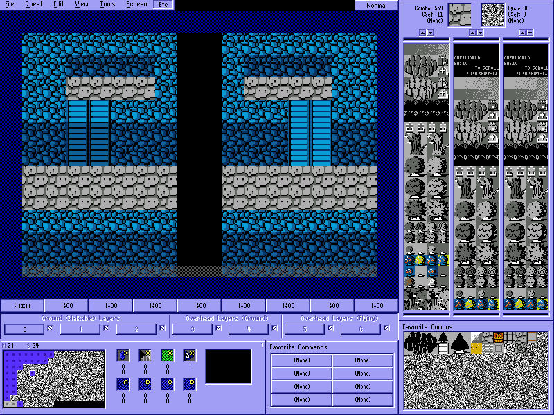
Okay guys, kind of having a debate which side looks better between these two and which gives a better illusion of depth. This is not an official room I'm going to be using; it's just a template to show off the two different styles. So what side do you guys think looks better and why?
Spoiler
#4834
Sheik
-

- Members
-
Deified
Posted 27 December 2013 - 05:41 PM
Is there any difference? It just looks kinda mirrored to me. The first one could be argued to give off more depth, but honestly, none of them does it for me.
#4835
Shane
-

- Members
-
🤍
Posted 27 December 2013 - 05:47 PM
It was hard to see at first, but the stairs were what he was referring to. Left side looks like it's going up along the wall with that kind of shading so I prefer right. Maybe you could replace the top row of stairs on the right with grey floor tiles.
#4836
kurt91
-

- Members
-

Follower of Destiny
- Real Name:Kurtis
- Location:Eastern Washington University
Posted 27 December 2013 - 06:03 PM
Although both look so similar as to be interchangeable, to be honest, if I were forced to pick one, I'd say the one on the left is slightly better.
#4837
anikom15
-

- Banned
-

Dictator
- Real Name:Westley
- Location:California, United States
Posted 27 December 2013 - 06:14 PM
The perspective doesn't make sense. Those stairs are flat. You should use light stairs and replace the top row of stairs with the floor. The way you have it looks like the stairs go over the wall.
- Avaro likes this
#4838
KingPridenia
-
- Members
-
King of Pridenia, Safehaven of the LGBTQ
- Real Name:Adam
- Location:Pennsylvania
Posted 27 December 2013 - 06:24 PM
So the general consensus is to remove the top stair tile with the gray floor tile and keep the stairs the lighter shade then? I do apologize if it was mirrored. Also, if I was to remove the top stair so it was two stairs for a two block high wall, I should use the light or dark scheme?
#4839
Aevin
-

- Members
-

- Pronouns:He / Him
- Location:Oregon
Posted 27 December 2013 - 06:58 PM
I agree with the others. All bright stairs, lowering the stairs one.
#4840
KingPridenia
-
- Members
-
King of Pridenia, Safehaven of the LGBTQ
- Real Name:Adam
- Location:Pennsylvania
Posted 28 December 2013 - 12:38 AM
Alright then it's settled. Right side, but only two tiles of stairs instead of three it is.
#4841
Jared
-
- Members
-
Deified
- Real Name:Jared
- Pronouns:He / Him
- Location:Massachusetts
Posted 30 December 2013 - 11:01 PM
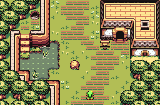
Since it's in Screenshot of the Week 436, why not post it here? ![]()
I've been looking at the old screenshot thread, and I've gotten some inspiration. hopefully I can take some of the screen ideas and implement them into future screens!
- Shane likes this
#4842
Shane
-
- Members
-
🤍
Posted 30 December 2013 - 11:22 PM
I really like this screen. The structure, palette and tile placement are balanced very well. Also things like unreachable staircases in early areas always intrigued me.
Its got that generic village look, sure. But it's got style.
- Jared likes this
#4843
Eddy
-

- Members
-
ringle
- Real Name:Edward
- Pronouns:He / Him
- Location:London, United Kingdom
Posted 31 December 2013 - 06:40 AM
Since it's in Screenshot of the Week 436, why not post it here?
I've been looking at the old screenshot thread, and I've gotten some inspiration. hopefully I can take some of the screen ideas and implement them into future screens!
This screen is awesome, looks really well designed and very detailed! I also like the colours used too.
#4844
runa
-

- Members
-

The Magical Vixen
- Pronouns:She / Her
- Location:comfy
Posted 04 January 2014 - 11:09 AM
Trying something with DoR:

Please give me your opinions, I'm still learning on how to use DoR correctly ![]()
- Shane and Jared like this
#4845
trudatman
-

- Members
-
one point nine hero
- Real Name:that guy
- Location:State Of Love And Trust, The United State Of Amorica.
Posted 04 January 2014 - 11:14 AM
pretty good. there are some folks here who think there is such a thing as "using it wrong," but if there are no glaring tile errors and it looks like the scene you're aiming for, it matters not if you use it in the exact same manor that the creator would employ.
0 user(s) are reading this topic
0 members, 0 guests, 0 anonymous users

