Jump to content

Photo

The Official Quest Screenshot Critique Thread


  • Please log in to reply
7962 replies to this topic

#4786 Aevin

Aevin

  • Members
  • Pronouns:He / Him
  • Location:Oregon

Posted 06 December 2013 - 02:26 AM

I'm not sure ...  Maybe if you eliminated the right-pushing block, the space beneath it, and the two spaces to the right?  It wouldn't actually make the puzzle harder, but it would feel cleaner. I think the other two are good enough that this one doesn't need to be that challenging. Others may have better ideas, though.


Sorry if my last post didn't seem very constructive ... It came off a little more blunt than I expected. The puzzle on the whole looks pretty good. :)


Edited by Aevin, 06 December 2013 - 02:30 AM.


#4787 runa

runa

    The Magical Vixen

  • Members
  • Pronouns:She / Her
  • Location:comfy

Posted 06 December 2013 - 06:19 AM

IqJOtdy.png8EHPIvG.png

Yes, I know, the subscreen still needs some work :D:D and maybe Link too :D:D


  • Shane and Jared like this

#4788 Eddy

Eddy

    ringle

  • Members
  • Real Name:Edward
  • Pronouns:He / Him
  • Location:London, United Kingdom

Posted 06 December 2013 - 10:45 AM

I love that huge tree, and yeah Link might need a bit of work. But besides that, these screens are designed very well!


#4789 MoscowModder

MoscowModder

    Sometimes lurking. Rarely posting.

  • Members
  • Location:Wisconsin

Posted 06 December 2013 - 11:29 AM

Those screens look pretty good! The problem with Link is that LttP Link has too many colors for a GB palette, causing a style clash. If you could make a true GB-colored LttP Link, that would be pretty cool.


#4790 KingPridenia

KingPridenia

    King of Pridenia, Safehaven of the LGBTQ

  • Members
  • Real Name:Adam
  • Location:Pennsylvania

Posted 06 December 2013 - 11:40 AM

@Aevin: It's fine. I just wanted to know what you meant. I guess I could fumble around and make the left side a bit harder. The thing is if I remove some of the block pushing area, it won't look right because it will kill the pattern of the room. Block puzzles aren't my strong suit after all. Although I DO suppose the extra block could be there as a red herring to throw you off, like pushing the right block in the middle section will screw up the puzzle if you do that.


@Hatsunem64: Really nice. Like Moscow said, there is a bit of a clash between the GB backgrounds and more SNES looking Link.


Edited by RedmageAdam, 07 December 2013 - 01:44 AM.


#4791 Shane

Shane

    🤍

  • Members

Posted 07 December 2013 - 08:39 AM

3E889Uu.png


  • Jared likes this

#4792 Jared

Jared

    Deified

  • Members
  • Real Name:Jared
  • Pronouns:He / Him
  • Location:Massachusetts

Posted 08 December 2013 - 10:45 PM

3E889Uu.png

Simple, uncluttered, effective. Perfection. :thumbsup:


  • Shane likes this

#4793 Geoffrey

Geoffrey

    Chosen One

  • Members

Posted 10 December 2013 - 11:37 AM


Simple, uncluttered, effective. Perfection. :thumbsup:


Inspiring, expiring, respiring.  Lungs.   :awesome:


EDIT: The screen is nice, though it's not a pair of lungs.  I give it 18/23.5.  It serves its purpose in an elegant manner.


Any suggestions for improving this block puzzle or do you guys think it's okay?

Spoiler


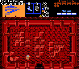
Basically the main floor tiles are all No Push Block flagged and the "playing area" for the blocks are the two 3x3 and one 2x5 section in the middle of the room with the slanted rectangular tiles being the ones the blocks can be pushed onto. The arrow blocks are self explanatory, the blank ones can be pushed in all four directions and the flatted blocks are the trigger points. Once all three triggers are active, the blocks around the stairs go away.


I actually found that the puzzle on the left looked hardest, but, in retrospect, it probably is the easiest; I simply looked at it oddly.  I don't think that there is much harm in having one easy puzzle out of three, if this is an earlier dungeon; if it is, however, after the second dungeon, then I recommend revamping it.


I also like the battle-axe.


EDIT 2:  Also, Hatsunem, I like your version of Link.  Keep him or I will do something drastic.


Edited by Geoffrey, 10 December 2013 - 11:41 AM.

  • Shane likes this

#4794 KingPridenia

KingPridenia

    King of Pridenia, Safehaven of the LGBTQ

  • Members
  • Real Name:Adam
  • Location:Pennsylvania

Posted 10 December 2013 - 11:56 AM

@Geoffrey: It's level 5, so at about the halfway marker. I use two different kinds of puzzles depending on whether the level number is even or odd. For odd numbered dungeons, you get traditional block puzzles. For even ones, you get what I call "number block puzzles" in which you have to, using the clue given in the room, figure out which numbers to push up and down to unlock the door. Example, if the solution is 1-3-4, you push blocks 1, 3 and 4 up and 2, 5 and 6 down.


Minor trivia: The SS was actually taken after level 5's completion. The boots are earned in the dungeon (to jump over lava) and the axe is earned sometime after the 4th dungeon and basically replaces the Magical Sword.


#4795 runa

runa

    The Magical Vixen

  • Members
  • Pronouns:She / Her
  • Location:comfy

Posted 11 December 2013 - 01:19 AM

3E889Uu.png

You probably know my opinion, but I'll say it just in case: Simly amazing! :D


  • Shane likes this

#4796 anikom15

anikom15

    Dictator

  • Banned
  • Real Name:Westley
  • Location:California, United States

Posted 11 December 2013 - 03:42 AM

This is supposed to be a castle in ruins. So how does it look to you all? How can it be improved?


GRxY7Ep.pngyFYOJHu.pngd5Wb1nT.png


  • strike likes this

#4797 Shane

Shane

    🤍

  • Members

Posted 11 December 2013 - 04:05 AM

Perfect to me. Maybe make the Triforce a little less bland perhaps? Give it some light blue specs like you did with the other "dark blue" areas. And give dark blue specs with the light blue part of the "Triforce". If that makes sense.


#4798 NoeL

NoeL

    Legend

  • Members
  • Real Name:Jerram

Posted 11 December 2013 - 05:36 AM

This is supposed to be a castle in ruins. So how does it look to you all? How can it be improved?
 
GRxY7Ep.pngyFYOJHu.pngd5Wb1nT.png

Looks good. The walls are still in pristine condition though. :P

#4799 trudatman

trudatman

    one point nine hero

  • Members
  • Real Name:that guy
  • Location:State Of Love And Trust, The United State Of Amorica.

Posted 11 December 2013 - 12:11 PM

looks good, but I'd go with my usual fallback: it needs more variety. how about some stuff that didn't crumble in the exact same way as the other stuff?

#4800 anikom15

anikom15

    Dictator

  • Banned
  • Real Name:Westley
  • Location:California, United States

Posted 11 December 2013 - 12:46 PM

Looks good. The walls are still in pristine condition though. :P


looks good, but I'd go with my usual fallback: it needs more variety. how about some stuff that didn't crumble in the exact same way as the other stuff?


Yeah I need to make some more custom sprites. Rotating some of the cracked tiles should help too. Didn't think of that last night....


0 user(s) are reading this topic

0 members, 0 guests, 0 anonymous users