

And now, a shot from me that isn't completely green
I am mostly done with the graphics for level 2. The yellows may be toned down, and there are two different sand tiles for a reason. The ones in the corners act as quicksand, and damage Link, but the stuff in the center is safe. This dungeon uses a lot of conveyors, so I'll probably post another shot showing that off.
Personal critiques: I'm not happy with the square tiles. They were my custom attempt at making something to match the diagonal patterned ones. I'm also not sure about the shading on the rounded door frames, but I think they complement the square walls well.
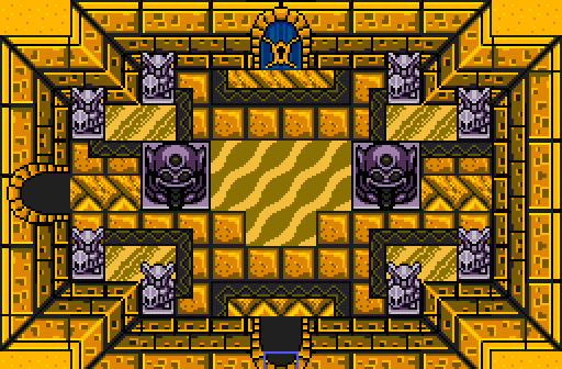
Those walls are nice, although the upper edge could use an extra color, it looks really flat right now.
The sand in the center looks out of place, I think you'd be better off using a different tile for that, for example the other sand type in Pure Tileset Update Extreme.
For a sand themed temple does the red shade on the grey statues look a bit odd, a yellow/brownish shade would look better.


