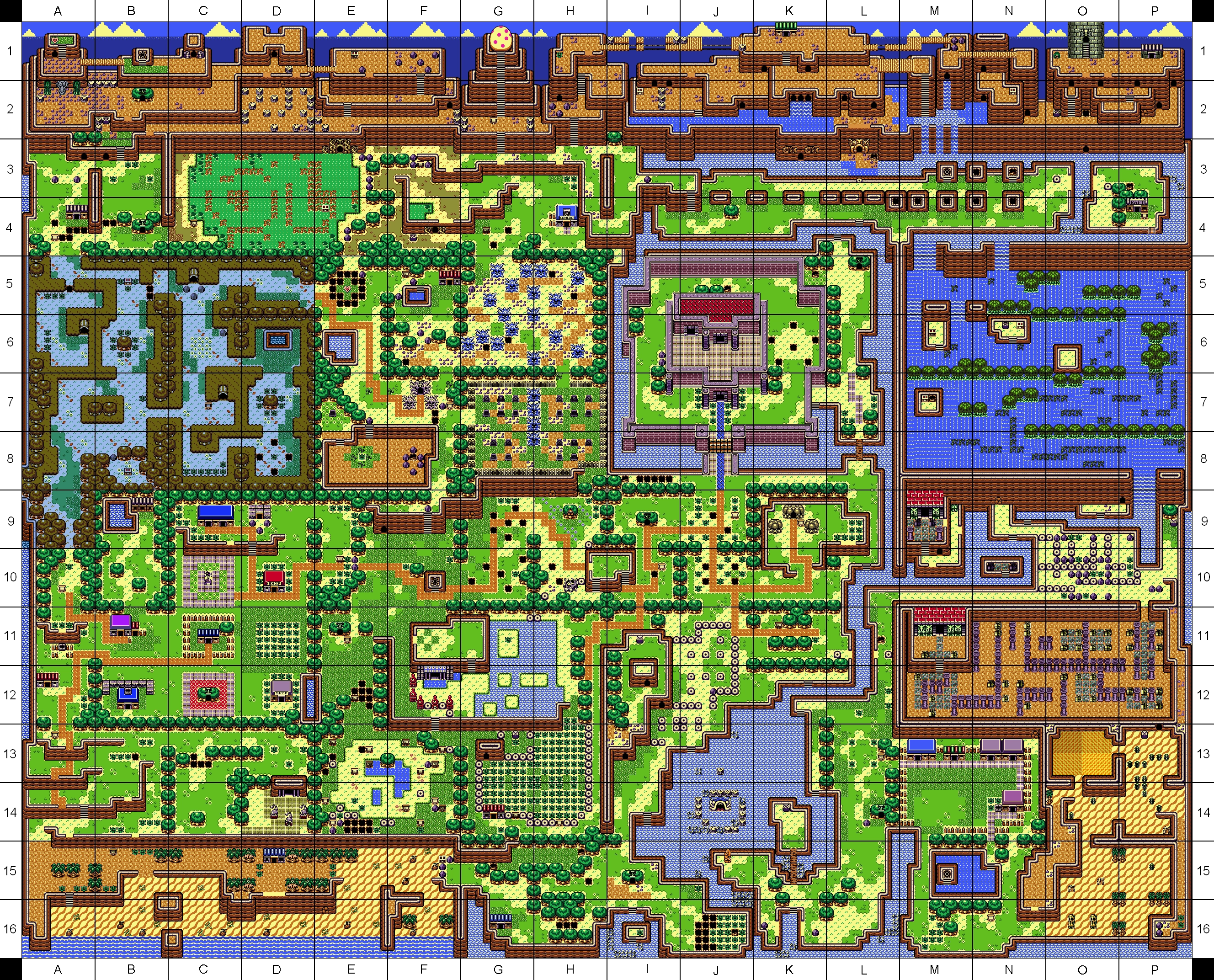
Town...
Too many roads.

Everything must go away

Posted 22 March 2014 - 11:50 AM
Town...
Too many roads.
The Hoff :)

Posted 22 March 2014 - 11:52 AM
Yeah, because it's a hill ![]() around it. Hard to explain... Basically, the right and left part at the bottom(where you enter from south) goes upwards.
around it. Hard to explain... Basically, the right and left part at the bottom(where you enter from south) goes upwards.
Look at the beach here: http://img1.wikia.no...rdinate_Map.png
Edited by Hoff123, 22 March 2014 - 11:53 AM.
🤍

Posted 22 March 2014 - 11:54 AM
Fair enough then. It looks a little odd still, but if it's canon design, it's allowed.
Edited by Charizard, 22 March 2014 - 11:55 AM.
Legend

Posted 22 March 2014 - 09:51 PM
Here is the final version of my map for my quest, finished it a few days ago.

ringle

Posted 23 March 2014 - 08:05 AM
Looks much better than it did before. My favourite section is probably the haunted area on the far-right side.
But the mountains on the top-left still look kinda empty and bland.
goopy

Posted 23 March 2014 - 08:11 AM
Pretty bland but that is to be expected from classic tileset.
It looks functional.
Legend
Posted 23 March 2014 - 08:51 AM
But the mountains on the top-left still look kinda empty and bland.
Oh yeah... they do don't they? hehe I'll make sure to spruce'em up nice. I guess I forgot about that area.
🤍
Posted 23 March 2014 - 09:31 AM
Looks a little unorganized and scattered, to be honest. Not a huge fan on the overall tree placements for the map. Otherwise, it's alright.
So here's a thing:

#realism #yolo, the area desert of swag.qst
Edited by Charizard, 23 March 2014 - 09:40 AM.
ringle
Posted 23 March 2014 - 02:08 PM
The best part of all is that the area has no music.
But anyways, it looks nice for a swagger quest!
Caelan, the Encouraging

Posted 23 March 2014 - 02:13 PM
Yeah, because it's a hill
around it. Hard to explain... Basically, the right and left part at the bottom(where you enter from south) goes upwards.
Look at the beach here: http://img1.wikia.no...rdinate_Map.png
Nintendo's made tile errors with their own graphics before. But just because they did doesn't mean you should too. You can justify it as saying it's sloping, but it still looks really odd in the GB set and skewers the perspective a little.
The Hoff :)
Posted 23 March 2014 - 02:41 PM
Nintendo's made tile errors with their own graphics before. But just because they did doesn't mean you should too. You can justify it as saying it's sloping, but it still looks really odd in the GB set and skewers the perspective a little.
Please, continue this discussion(if you want to) in the new thread I made.
http://www.purezc.ne...showtopic=62424
Edited by Hoff123, 23 March 2014 - 02:42 PM.
anthus

Posted 24 March 2014 - 12:22 AM
I think the town looks fine, Hoff, and there's nothing wrong with using the mountains like that.
Here is a small preview of a later dungeon in the classic quest I am working on again.

ringle
Posted 24 March 2014 - 11:52 AM
That looks really sweet, Anthus. My favourite section is probably the right side, it looks definitely interesting too!
Crystal Warrior

Posted 24 March 2014 - 07:42 PM
Pixel Dragon

Posted 24 March 2014 - 08:22 PM
Duuuude, that's freakin' trippy! I love the little accents of flowers throughout. Reminds me of stars against a dark sky. If you end up naming that location, you should give it a star motif. And at the risk of sounding like a megageek, I'm totally getting some nightime Onett vibes off of it.Random spur of the moment workings. More to come....possibly >_>
http://i.imgur.com/mImR15h.png
0 members, 0 guests, 0 anonymous users

