Pure Tileset Basic v2.5
#31
Posted 08 March 2013 - 02:15 PM
Old (aka CLAW MY EYES OUT VERSION)
and
New
The tall grass and trees could probably stand to be a bit more spearmint looking, but I'm having a hard time getting it over to that without making it blindingly bright. I also scrapped orange in favor of scrapping red or purple, but if it's still needed over a different color, that could be worked with.
#32
Posted 08 March 2013 - 03:06 PM
#33
Posted 08 March 2013 - 03:49 PM
#34
Posted 08 March 2013 - 04:39 PM
#35
Posted 08 March 2013 - 05:36 PM
Anywho, here's an awful attempt at an Autumn palette:
I'm not a fan of making everything bright orange because that's just lazy. Tried to go for a yellow-ish green for grass at first, now trying the yellow-ish brown instead. The green topped trees are supposed to look like they're starting to turn yellow, which would then turn other various fall leaf colors, but it still needs some work, now that I look at it a bit more.
#36
Posted 08 March 2013 - 05:47 PM
#37
Posted 09 March 2013 - 12:35 AM
I honestly think this is pretty good, but that's just me. At this rate, though, I'm throwing out there that anyone can feel free to work with the palette if they think they can improve something about it.
#38
Posted 09 March 2013 - 12:47 AM
#39
Posted 09 March 2013 - 12:58 AM
That's the PTUX autumn palette. I'll give you that the reds and oranges are similar (which I don't see why that's a bad thing anyway), but otherwise... There's definitely a stronger orange hue to PTUX's. Which is precisely what I was trying to avoid.
#40
Posted 09 March 2013 - 01:20 AM
#41
Posted 09 March 2013 - 10:36 PM
Sorry about hogging the thread, Nick.
#42
Posted 09 March 2013 - 10:47 PM
Sorry about hogging the thread, Nick.
Don't worry about it. One of the things I'd really like for the set is participation from others, so there really isn't such a thing as hogging here... unless you were to just start talking about something completely off the wall like bats turning left when exiting caves.
Anyway, I like that summer palette. I didn't really get a chance to say that before my laptop overheated earlier.
#43
Posted 09 March 2013 - 10:52 PM
Anyway, I think your palettes have been really nice, Scootaloo. I'm really looking forward to this tileset be finished. I've sort of wanted to do a project on the side, and I think this tileset would be great for that.
#44
Posted 10 March 2013 - 04:46 PM
Should I...
- Put all of the relational drawing combos in an out-of-the way location. This is already going to happen with dungeon carving. There will be favorite combos pointing to them.
- Overwrite the existing floor edge order that's already in the dungeon combo areas. This would result in less duplicates of the same combos, but manually tweaking the floor would require paying more attention since a simple layout wouldn't be available.
For reference:
Left is the order they appear in for the tileset at the moment. Right is the order that is required for relational drawing, which would allow you to fill in the floor borders as simply as filling in grass instead of constructing them piece by piece.
It doesn't matter too much to me whichever way people would prefer it, but I just need an idea of which direction to go.
#45
Posted 10 March 2013 - 07:32 PM
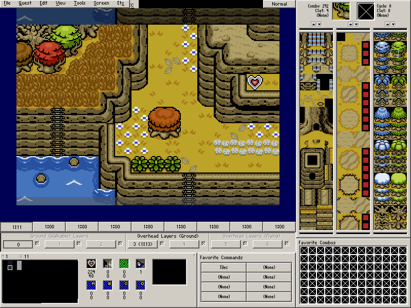
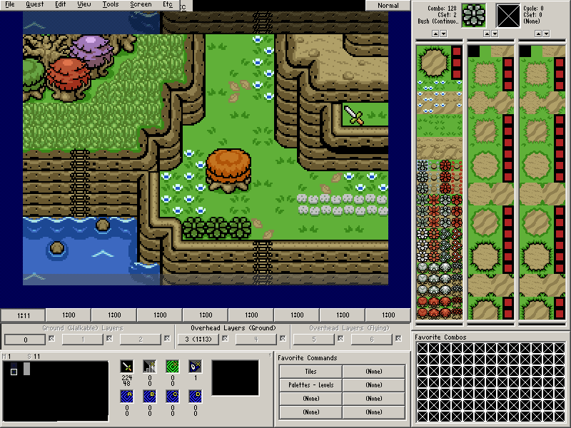
The thing with working with Relational mode is that while it's a bit scary at first, and everything looks like it's all scatterminded, you actually soon learn the "pattern" to it, and can actually find things slightly more easily. It takes a little while, but it's a natural thing, and I find it's a lot easier to work with because of that order. Additionally, if you end up making a big mistake, it's really easy to just really quickly redo the whole screen because, well, it's Relational mode. It's just painting on the screen.
1 user(s) are reading this topic
0 members, 1 guests, 0 anonymous users