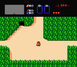
It looks really nice, and I like it a lot, but the color for the tall grass and the bushes seen off compared to everything else in the shot. It's not the outline, like you're pointing out to make them show that they're interact-able, but they look more dark-blue compared to the green shades for everything else, and the bushes look very shiny compared to the trees and tall grass next to them.

A Sprite A Day Keeps the Rust Away.
Started by
Koh
, Jan 10 2014 04:29 PM
512 replies to this topic
#376

kurt91
-

- Members
-

Follower of Destiny
- Real Name:Kurtis
- Location:Eastern Washington University
Posted 13 September 2014 - 04:28 PM
#377
Geoffrey
-

- Members
-

Chosen One
Posted 13 September 2014 - 05:37 PM
Wanted to try something out.
->
Are you still working on this?
#378
Shane
-

- Members
-

🤍
Posted 14 September 2014 - 11:08 PM
The grass does look better with some texture. I used the GB Tall Grass texture minus the shading and highlights. I used the same texture for the actual tall grass, yes, but I made tiles to fit every possible scenario of tall grass. Now I need to find a suitable GB texture for the dirt. I'll probably redo the trees too, where instead of making it look like LTTP's trees, I just use the flat colors from them + my own shades like all the other tiles do, and add detail to the original design.
Also, I made it so entity objects now have a dark outline that isn't black, but they still use the more aggressive shifting like sprites so that they stand out more. Hopefully, this still screams "Hey, I can touch this!"
I'm sorry, but in my humble opinion, this is absolutely dreadful to look at. It really isn't your best work at all.
Firstly, the colours are a serious problem. They're too dark and dull; almost lifeless. I know this is based off of aLttP's colour scheme but aLttP never really had the most appealing overworld colours in the Zelda series. And it made aLttP's incarnation of Hyrule feel flat and bland due to its uninspiring dull colours. Something more bright and colourful would work a lot better. I mean, look at ALBW's colours or perhaps even the Gameboy Zelda palettes... but I'm not sure how that will work out. But since you're making a LttP/GB hybrid, it won't hurt to try.
As for the tiles themselves, the biggest issue is that they feel bloated with outlines. They're so bold and almost ugly to look at. I know a lot of people approve of this technique, but it's more the execution that seems to fail. It just seems to the technique too much. Plus, this technique just feels odd with Zelda tiles. And speaking of not fitting, the art style doesn't really reflect anything like the Zelda series; this isn't a graphical style I'd imagine Nintendo doing. The grass and trees are the worst offenders. They feel rushed, and amateur-like, it's almost a joke.
The concept itself is novel; I like the direction you're trying to take the tall grass, for example. However the execution of the tiles themselves seem to have been rushed out of excitement to use that one technique that really doesn't seem to be executed well neither. Also purple hair Link? Really? Nintendo had limitations when they designed their Link, so I assume you threw this in as a joke to poke fun at that? It's not really going to be taken seriously, please do brown or blonde hair Link.
I'm sorry that this comes off as harsh, but honestly, I'm not seeing the appeal at all. :\
Edited by Shane, 14 September 2014 - 11:10 PM.
- Eddy and Jared like this
#379
Koh
-

- Members
-
Tamer Koh
- Real Name:Dominic
- Location:Monsbaiya, Virginia
Posted 15 September 2014 - 04:43 AM
I could try seeing how the tiles turn out using some of the GB flat colors + my own shades. It's worth a shot, since the tiles originate from there anyway. The main goal was just to add some vibrancy to the otherwise dull LTTP colors, appended to a different style.
The trees were rushed. That's why I wanted to redo them, lol. And did~
Old:  New:
New:  Newer:
Same colors, but the trees are now from Oracle of Ages. I removed the boxy pixels, got rid of the original shading by making the entire thing flat colored, then added my own detail and shading. Dirt detail tile from Oracle of Seasons. It is my intent to make all possible variations on the dirt detail tile, with the various combos of those 8x8 tiles, instead of just one repeating 16x16 tile.
Are you still working on this?
That was just a one shot deal. Wanted to recreate the first screen that started the series~
Edited by Koh, 15 September 2014 - 06:14 AM.
#380
Koh
-
- Members
-
Tamer Koh
- Real Name:Dominic
- Location:Monsbaiya, Virginia
Posted 15 September 2014 - 11:16 AM
Well, here's an updated sprite set for Link.

Uses the flat colors from this.

With my own shades and highlights. Later, I'll try making color variants on the tiles, using the flat colors from Seasons first, since 4 sets~
#381
Jared
-

- Members
-
Deified
- Real Name:Jared
- Pronouns:He / Him
- Location:Massachusetts
Posted 15 September 2014 - 09:43 PM
Honestly, I'd love to see you make your own, true Zelda tileset. Not ripping off ALttP or GB. Simply yours. I bet it'd look great.
- Haylee likes this
#382
Geoffrey
-
- Members
-
Chosen One
Posted 15 September 2014 - 09:45 PM
That was just a one shot deal. Wanted to recreate the first screen that started the series~
Ah. I find that quite disappointing; I would love to see a tileset created in that style. Would you mind terribly sharing the tiles with me? I'd like to mess around with them.
Edited by Geoffrey, 15 September 2014 - 09:45 PM.
#383
link3505
-

- Members
-

Ancientierest
- Real Name:Ben
- Pronouns:He / Him
- Location:The Edge of Infinity
Posted 15 September 2014 - 10:27 PM
I could try seeing how the tiles turn out using some of the GB flat colors + my own shades. It's worth a shot, since the tiles originate from there anyway. The main goal was just to add some vibrancy to the otherwise dull LTTP colors, appended to a different style.
The trees were rushed. That's why I wanted to redo them, lol. And did~
Old:
Same colors, but the trees are now from Oracle of Ages. I removed the boxy pixels, got rid of the original shading by making the entire thing flat colored, then added my own detail and shading. Dirt detail tile from Oracle of Seasons. It is my intent to make all possible variations on the dirt detail tile, with the various combos of those 8x8 tiles, instead of just one repeating 16x16 tile.
Massive improvement on those trees. Absolutely great! My only concern is how bright, and tall, the grass is on the rightmost screenshot. Otherwise, excellent job!
#384
kurt91
-
- Members
-
Follower of Destiny
- Real Name:Kurtis
- Location:Eastern Washington University
Posted 16 September 2014 - 01:03 AM
Personally, I like the middle picture the best. The tall grass on the base of the trees in the rightmost picture looks flat compared to the shading of everything around it. The only problems that I can see are the same as I mentioned before, with the too-shiny bushes and the blue bushes and slash-able grass. They'd probably look better using the same shades of green as the tops of the trees.
#385
NeoMasterZX
-

- Members
-

Max Bombing!
- Location:The year 21XX
Posted 16 September 2014 - 06:07 AM
Seeing things like this really make me realize that pixels aren't my medium, but I suppose I could just practice. Everything looks good to guys, keep up the great work!
#386
Koh
-
- Members
-
Tamer Koh
- Real Name:Dominic
- Location:Monsbaiya, Virginia
Posted 16 September 2014 - 04:20 PM
Personally, I like the middle picture the best. The tall grass on the base of the trees in the rightmost picture looks flat compared to the shading of everything around it. The only problems that I can see are the same as I mentioned before, with the too-shiny bushes and the blue bushes and slash-able grass. They'd probably look better using the same shades of green as the tops of the trees.
That stemmed from me using the more prominent, darker green on the bush/tall grass tiles of LTTP. If I use the lighter green, which actually happens to be the regular grass color, this is the result.

Ah. I find that quite disappointing; I would love to see a tileset created in that style. Would you mind terribly sharing the tiles with me? I'd like to mess around with them.
I actually didn't make a separate tilesheet for that like I'm doing with the tiles here, and just worked with a screenshot directly, but you're free to crop them out and mess with them.
Edited by Koh, 16 September 2014 - 04:22 PM.
#387
HavoX
-

- Members
-

Has more posts in Doomworld than in PureZC
- Real Name:Jon
- Location:Republic, Missouri
Posted 17 September 2014 - 02:06 PM
I posted these at another forum a few months ago...

Since Zelda Classic already has jumping tiles for Classic Link, I figured, why not give him the tiles with him using Roc's Cape?
I also couldn't find any tiles like this in PureZC's database...
The sprite in the middle did require a bit of work, not only to make it not look like crap, but also to fit within the 16x16 limit...
Credits:
Radien for creating the original Classic Link jumping tiles and inspiration.
Sonikuu for the reference sheet I used to make the sprites
I also converted the BS Digdogger (and its kids) to its Classic form...

...and realized that the three frames from the sheet I used weren't going to cut it. So I took the liberty of expanding the frames. (Correct me if I'm wrong, but I believe some scripting may be required to make Digdogger blink at random intervals.)
Credits:
Polar Koala for the reference sheet
Do whatever you want with those.
Since Zelda Classic already has jumping tiles for Classic Link, I figured, why not give him the tiles with him using Roc's Cape?
I also couldn't find any tiles like this in PureZC's database...
The sprite in the middle did require a bit of work, not only to make it not look like crap, but also to fit within the 16x16 limit...
Credits:
Radien for creating the original Classic Link jumping tiles and inspiration.
Sonikuu for the reference sheet I used to make the sprites
I also converted the BS Digdogger (and its kids) to its Classic form...
...and realized that the three frames from the sheet I used weren't going to cut it. So I took the liberty of expanding the frames. (Correct me if I'm wrong, but I believe some scripting may be required to make Digdogger blink at random intervals.)
Credits:
Polar Koala for the reference sheet
Do whatever you want with those.
#388
Koh
-
- Members
-
Tamer Koh
- Real Name:Dominic
- Location:Monsbaiya, Virginia
Posted 17 September 2014 - 09:17 PM
Not bad on the Roc's Cape classic Link. It looks a bit odd though, because the cape has an outline, and nothing else in Classic does.
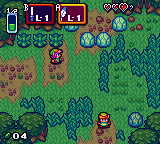
Proof of Concept Mock HUD. Imitates the flat color + white highlight style in the menu boxes, given a drop shadow. GB Screen is TINY. WonderSwan has the same height, but is at least Widescreen with its 224x144 size.
Edited by Koh, 17 September 2014 - 09:21 PM.
- HavoX likes this
#389
kurt91
-
- Members
-
Follower of Destiny
- Real Name:Kurtis
- Location:Eastern Washington University
Posted 17 September 2014 - 09:40 PM
The HUD does seem to take up a lot of space, doesn't it? What about this...
+ Turn the Magic Meter horizontal rather than vertical. Slim it down so that the green portion is only four or five pixels thick. Place it underneath the Heart Meter. If that seems too much like how it's typically done, slim it down but keep it vertical. Slide it to the right of the Heart Meter, so they make a sideways inverted L shape tucked into the corner, and shift the rest of the HUD to the left as needed.
+ Remove the L-1 from the item displays. We can see what they're supposed to be, and if your mock game has the graphical capabilities to do everything else, then we can probably get an idea what level item we're packing via the actual item graphics. You're not limited to only one sword graphic now. Even if you were, it would probably work better anyways to only display the item level in the active subscreen instead of the passive as well.
+ Make the now-shrunk item boxes translucent on the inside to make them less obtrusive on the overall game window.
+ If we're really strapped for space, consider when the player has earned more than the initial row of Heart Containers. Instead of adding a second row, do what Chain of Memories or Banjo-Kazooie does and give second color Hearts that overlap the existing ones. For example, your initial seven Hearts do not have that white outline. Once you've obtained an eighth Heart, the first one gets the white outline to signify it.
- Koh and HavoX like this
#390
HavoX
-
- Members
-
Has more posts in Doomworld than in PureZC
- Real Name:Jon
- Location:Republic, Missouri
Posted 18 September 2014 - 06:22 AM
I see your point, but I didn't want the tan of his cape to conflict with his skin... Oh well, we all can't be perfect!Not bad on the Roc's Cape classic Link. It looks a bit odd though, because the cape has an outline, and nothing else in Classic does.
0 user(s) are reading this topic
0 members, 0 guests, 0 anonymous users

