Dungeon in progress.
Not much atm, I'm having a bit of difficulty making dungeon progression in terms of gameplay.
Looks nicely designed! Just that the rooms look a little too square, but if that's what you're going for, then that's fine.

ringle

Posted 06 February 2014 - 05:42 AM
Dungeon in progress.
Not much atm, I'm having a bit of difficulty making dungeon progression in terms of gameplay.
Looks nicely designed! Just that the rooms look a little too square, but if that's what you're going for, then that's fine.
Everything must go away

Posted 06 February 2014 - 10:45 AM
Looks nicely designed! Just that the rooms look a little too square, but if that's what you're going for, then that's fine.
Rooms are typically square or rectangular.
ringle
Posted 06 February 2014 - 11:31 AM
Rooms are typically square or rectangular.
Well yeah with the classic set. With tilesets like this, people usually make them less square-shape.
But I guess that's just me.
Dictator

Posted 06 February 2014 - 07:33 PM
Everything must go away
Posted 06 February 2014 - 07:35 PM
Actually rooms in real life are typically angular
Tis what I was getting at.
posting on internet

Posted 07 February 2014 - 06:46 PM
This map is amazing. I love seeing the classic tileset used for freeform dungeons. The blocks next to the doors are not distracting in the least to me. My two cents. Are you using a 'bottomless pits' script?
Thanks! I didn't use a bottomless pit script; I used this trick: http://www.purezc.ne...e=8#entry415774
Edited by crazyal02, 07 February 2014 - 06:48 PM.
King of Pridenia, Safehaven of the LGBTQ
Posted 09 February 2014 - 10:04 PM
Well, here's hopefully the last time I have to redesign this without any empty corners. Hopefully I have all the details worked out and can consider this a final copy: http://www.mediafire...g5/zelda131.png
ringle
Posted 10 February 2014 - 11:47 AM
Well, here's hopefully the last time I have to redesign this without any empty corners. Hopefully I have all the details worked out and can consider this a final copy: http://www.mediafire...g5/zelda131.png
I'm liking this, looks pretty nice.
I can't think of any improvements though...
RESPECT DA OBOE SOLO

Posted 12 February 2014 - 11:37 AM

Ridley Entrance. Its Metroidy
==================================================================================================================================
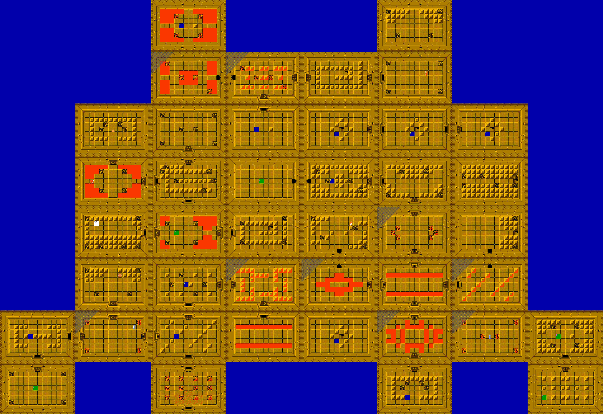
I like this original NES Zelda dungeon design. Your additions sound very challenging-ly curious. The shape itself reminds me of those arcade space shooter enemies.
----------------

Black voids and balance is neat. This is a clean way to give imagination to the player. I like this! A superb NES design as well. good job
Edited by Astromeow, 12 February 2014 - 11:38 AM.
King of Pridenia, Safehaven of the LGBTQ
Posted 12 February 2014 - 11:48 AM
Yeah Astro, the Roc's Cape was originally my level 8 in a 3rd quest I made back in 2.10. I never finished level 7 and I no longer have a computer able to run 2.10 (it crashes immediately on Windows 7). Now that I think about it, it's balanced pretty poorly; level 1 and 2 are nightmares but levels 3-5 are a breeze, comparatively speaking. I have scrapped that 3rd quest, but am recycling some dungeons from it for my current project. I really like the 8-bit version of Lower Norfair's entrance. Looks very faithful to the original source material.
ringle
Posted 12 February 2014 - 11:58 AM
Ridley Entrance. Its Metroidy
I SEE SUPER METROID
Please make Gravity Suit available in this quest...
RESPECT DA OBOE SOLO
Posted 12 February 2014 - 12:06 PM
Please make Gravity Suit available in this quest...
Indeed, it technically is in a way. Maybe not the color. The function. Yesly, it also provides its use elsewhere in the environment.
my favorite part is pressing space to view map.
Edited by Astromeow, 12 February 2014 - 12:32 PM.
Tell all with glee, Argon's on PureZC

I play guitar

Posted 19 February 2014 - 06:46 AM
Great new map TK
I like it alot ![]()
RESPECT DA OBOE SOLO
Posted 22 February 2014 - 06:51 PM
INTERESTING. But not mine

0 members, 1 guests, 0 anonymous users

