QUOTE(Sheik @ Nov 20 2012, 05:09 PM)

I believe you should work on the sprite palettes. NES colors are cool, but try something a little closer to the colors aLttP used, maybe.
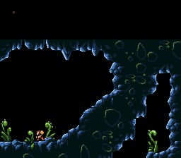
I have to say, that first screen there is probably the best dungeon entrance screen I have yet to see in ZC. It's actually looking like a proper dungeon entrance. Please make all the other dungeon entrances equally big and impressive. I want this to become a new trend or something. too. People. go and rip Anthus off! Please!
@ Shane: Great screen! Though get over the secret project trend already and just make a proper topic where you keep people posted on your progress.

Wow, thanks, that's probably the best thing anyone has ever said about a project of mine
. But yeah, I definitely want to have big, and grand dungeon entrances like that. I think it is more realistic, more true to Modern Zelda's (which may seem opposite from what I'm going for, but meh) and just generally sweeter looking. As far as Link's colors, I agree. When I first hit 'r' when I ripped them, it was in the overworld palette, but the color it used instead of the darkest brown (outline color) was actually quite nice looking. It was sort of a greyish tan. I haven't altered the Sprite palettes at all yet, but I do think that Link set would look nicer with a darker, more subdued outline color.
QUOTE(kurt91 @ Nov 20 2012, 08:01 PM)
@Anthus
I found a couple pirated games for the NES that use Legend of Zelda graphics. One of them actually reduces the trees from Minish Cap down to NES capabilities, and they look very good, surprisingly enough. I made a topic about them in General Entertainment, if you want to look. You might find some graphics you like.
I took a look at the thread, and the only one of those I had seen was the MC one. The LA one was pretty nice looking; probably the most polished
looking out of the group. I particularly like the dungeon tiles, and I might have to do a bit of digging on the tubes, and get those bad boys.
Edited by Anthus, 21 November 2012 - 01:15 AM.


