Somehow, that actually seems to clash less. I don't know how.
The palette is too intense (and orange), but I think it's an improvement.

The Official Quest Screenshot Critique Thread
Started by
Mitchfork
, Apr 16 2011 09:35 PM
7962 replies to this topic
#3661

MoscowModder
-

- Members
-

Sometimes lurking. Rarely posting.
- Location:Wisconsin
Posted 11 November 2012 - 04:00 PM
#3662
Anthus
-

- Contributors
-

anthus
- Real Name:Antbus
- Location:Ohio
Posted 11 November 2012 - 04:07 PM
QUOTE(MoscowModder @ Nov 11 2012, 04:00 PM) 
Somehow, that actually seems to clash less. I don't know how.
The palette is too intense (and orange), but I think it's an improvement.
Probably cause the regular classic bush tiles are harder to see, and less prevalent on this screen. I just wish ZC had a better way to select colors, and copy individual colors between palettes. sigh..
EDIT:

Tried tweaking the palette a bit more. The greens are fine IMO, but the brown is pretty awful. Oranges and browns are the hardest colors to set in ZC. FDSGFDS.
Edited by Anthus, 11 November 2012 - 04:28 PM.
#3663
NoeL
-

- Members
-

Legend
- Real Name:Jerram
Posted 11 November 2012 - 06:43 PM
The colours are better this time, but it's a little too dark.
#3664
Jared
-

- Members
-
Deified
- Real Name:Jared
- Pronouns:He / Him
- Location:Massachusetts
Posted 12 November 2012 - 03:49 AM
Pretty clashy, Anthus. I like your new colors though.

Not exactly finished, but I wanted to show off the cool bridge I made! I personally love it.
Caption! "Oh no, help! I got my sword stuck in between the pieces of wood!"
Not exactly finished, but I wanted to show off the cool bridge I made! I personally love it.
Caption! "Oh no, help! I got my sword stuck in between the pieces of wood!"
#3665
kurt91
-

- Members
-

Follower of Destiny
- Real Name:Kurtis
- Location:Eastern Washington University
Posted 12 November 2012 - 05:24 AM
I'll be honest, they remind me of a pirated NES cart. Kind of if they tried to port LttP or the Oracle games backwards to the NES. (Yes, I know they actually did this.) If that's the look you're going for, you're doing great at it. No, that's not meant as an insult in any way. I like them a lot. You just need a different set of Link graphics. I think GBC Link would work best, just with a brighter palette to match the rest of your graphics.
EDIT: Didn't realize I was a page behind when I typed this. I was talking about Anthus's brighter palette, before he changed it.
EDIT: Didn't realize I was a page behind when I typed this. I was talking about Anthus's brighter palette, before he changed it.
Edited by kurt91, 12 November 2012 - 05:25 AM.
#3666
Anthus
-
- Contributors
-
anthus
- Real Name:Antbus
- Location:Ohio
Posted 12 November 2012 - 03:18 PM
QUOTE(kurt91 @ Nov 12 2012, 05:24 AM)
I'll be honest, they remind me of a pirated NES cart. Kind of if they tried to port LttP or the Oracle games backwards to the NES. (Yes, I know they actually did this.) If that's the look you're going for, you're doing great at it. No, that's not meant as an insult in any way. I like them a lot. You just need a different set of Link graphics. I think GBC Link would work best, just with a brighter palette to match the rest of your graphics.
EDIT: Didn't realize I was a page behind when I typed this. I was talking about Anthus's brighter palette, before he changed it.
That is the style I'm going for. I just need to have a palette that isn't so eye burning. The new one looks worse to me, IMO, after seeing it for a day. As for using the GBC link, I think that might look alright.
Those browns are just so terrible. I think I'll switch back to the original mountain colors, and slightly more mild grass for now. I simply can't get the color selector to generate the color I'm looking for. All I get are these over saturated ugly brown and oranges.
And as far as clashy graphics, I think that is here-say. In a world of ripped, custom, and edited graphics, not everything is going to fit together perfectly. Perspective, and styles will always clash. "Style clash" was never a legitimate complaint back in the day cause no one cared that much about visuals. This is exactly what I didn't want to happen with this project, whoopsies.
Edited by Anthus, 12 November 2012 - 03:21 PM.
#3667
Moon
-

- Members
-

goopy
- Pronouns:She / Her
- Location:Viridi Town
Posted 12 November 2012 - 09:51 PM
QUOTE(Jared @ Nov 12 2012, 05:49 AM)
Pretty clashy, Anthus. I like your new colors though.
Not exactly finished, but I wanted to show off the cool bridge I made! I personally love it.
Caption! "Oh no, help! I got my sword stuck in between the pieces of wood!"
All the colors really pull the thing together, and make it look so much more lively than it would with the default DoR palette.
Bravo, Jared, Bravo.
Edited by Dragonite, 12 November 2012 - 09:51 PM.
#3668
Jared
-
- Members
-
Deified
- Real Name:Jared
- Pronouns:He / Him
- Location:Massachusetts
Posted 12 November 2012 - 10:12 PM
Thanks Dragonite! That makes me feel good. The river was updated a little bit, but that's okay. 

#3669
Marco
-

- Banned
-

Posted 16 November 2012 - 04:39 PM
QUOTE(Jared @ Nov 12 2012, 01:49 AM)
Pretty clashy, Anthus. I like your new colors though.
Not exactly finished, but I wanted to show off the cool bridge I made! I personally love it.
Caption! "Oh no, help! I got my sword stuck in between the pieces of wood!"
The vibrant colors are amazing Jared. I love this shot. This is a perfect example of good ZC work, and I think one of your best so far. No complaints! = D
Alpha snapshot. I'm putting forth effort to make better graphics. Expect backgrounds and enemies. Scripts...!?
#3670
Jared
-
- Members
-
Deified
- Real Name:Jared
- Pronouns:He / Him
- Location:Massachusetts
Posted 16 November 2012 - 04:41 PM
Wow, Marco. That is just...so...sexy. I wasn't expecting it to look so clean, so nice. Well done! I'd love to use it sometime.
#3671
Ica
-

- Members
-

Napoleon Bonaparty
- Real Name:Leonardo
- Location:São Paulo
Posted 16 November 2012 - 05:57 PM
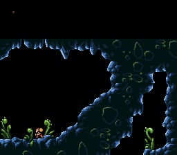
Marco, those graphics are amazing!
The colours are great for metroid and the rock formations flow really well. I don't know about those rocks inside the wall though. Maybe if they had a less vibrant green.
The colours are great for metroid and the rock formations flow really well. I don't know about those rocks inside the wall though. Maybe if they had a less vibrant green.
#3672
Anthus
-
- Contributors
-
anthus
- Real Name:Antbus
- Location:Ohio
Posted 17 November 2012 - 01:12 AM
Wow Marco, you did a great job of making the 'grid' in ZC invisible. This is a very cohesive and smooth shot.
I got around to ripping/ making the house interiors for my unnamed NESesque quest. Blue background is subject to change. Also, here is a less intense outdoors palette

And I'm starting to think I will either keep Classic Link, or maybe have an entirely different main character altogether. Either way, I do think Link needs a black outline or something.
I got around to ripping/ making the house interiors for my unnamed NESesque quest. Blue background is subject to change. Also, here is a less intense outdoors palette
And I'm starting to think I will either keep Classic Link, or maybe have an entirely different main character altogether. Either way, I do think Link needs a black outline or something.
Edited by Anthus, 17 November 2012 - 01:18 AM.
#3673
Sheik
-

- Members
-
Deified
Posted 17 November 2012 - 02:27 AM
Have you considered using Koh's new classic Link? The one in the Z2 x GB style? I believe that would fit better. Anyways, the graphics are falling into place much nicer now and the thing is begining to have some actual flow. I still think the foilage on the trees is lacking black outlining in some shape or form, though.
#3674
Anthus
-
- Contributors
-
anthus
- Real Name:Antbus
- Location:Ohio
Posted 17 November 2012 - 03:58 AM
QUOTE(Sheik @ Nov 17 2012, 02:27 AM)
Have you considered using Koh's new classic Link? The one in the Z2 x GB style? I believe that would fit better. Anyways, the graphics are falling into place much nicer now and the thing is begining to have some actual flow.
I just checked out those Link tiles, and I will see how they fit as I like them quite a bit. My only concern is, they have a bit more shading than other objects in the set. The use 8-bit color too, which is slightly concerning. I agree about the black in the trees as well. I attempted to give them a heavier appearance by adding more black to the bottoms. I definitely would like to get some more black in the actual green part, and I think I see a way finally. And thanks
This quest has a name now, but I'm not going to release it yet. Not cause it is so awesome that even Nintendo might steal it, but because I don't want to give it out without any context. I would like to make a demo. I'm still a little ways from that, but I'd say about 60% of the tile work is done, and once that is all squared away, then building stuff will be smoother hopefully.
Here's another screen with some dialogue, and fancy text boxes

#3675
Marco
-
- Banned
-
Posted 17 November 2012 - 10:18 AM
QUOTE(Anthus @ Nov 17 2012, 01:58 AM)
Here's another screen with some dialogue, and fancy text boxes
Wow! Wonderful work. As I said before, it all clashes so much it creates its own style and becomes perfection. My thought though, make a variety of interior colored furnishings and pottery. Browns mixed with greys and some tans should complete the houses over all. Keep up the good work!
1 user(s) are reading this topic
0 members, 1 guests, 0 anonymous users

