
Wow, sand contrast is making my eyes weep.

The Official Quest Screenshot Critique Thread
Started by
Mitchfork
, Apr 16 2011 09:35 PM
7962 replies to this topic
#3632

Anthus
-

- Contributors
-

anthus
- Real Name:Antbus
- Location:Ohio
Posted 04 November 2012 - 09:51 PM
QUOTE(strike @ Nov 4 2012, 09:01 AM) 
Very impressive Anthus! I really like the feel of those shots! The pallete gives them a sort of broad and open feeling (displayed especially in the second shot). I know you're not going to try and get caught up in perfecting all the graphics, but the snail rock and the average tree seen in the second shot really need to change. Bravo!
I don't know if this is improper or something, but if it is just say so. Can I rip those tress into my tileset? I've been trying to get some more variety into the classic tileset and I think these would go very well into classic even without the expanded pallet. If not, just say the word and the idea will be dropped.
I eagerly await seeing more!
-Strike
Thanks. If you want to go ahead and grab them you can. All I ask is don't use the palette
They use exactly 3 colors too, so you could go the black and green route if you didn't want an enhanced classic palette. That's how they were drawn originally, and that is also why the shading is inverted on them compared to the glaring black/ green classic bushes I left in.
#3633
Marco
-

- Banned
-

Posted 05 November 2012 - 02:46 PM
QUOTE(NoeL @ Nov 4 2012, 06:14 PM)
Wow, sand contrast is making my eyes weep.
Sounds like a personal problem.
I finally got level 1 up and running.

#3634
Moon
-

- Members
-

goopy
- Pronouns:She / Her
- Location:Viridi Town
Posted 05 November 2012 - 02:49 PM
QUOTE(Marco @ Nov 5 2012, 04:46 PM)
Sounds like a personal problem.
I finally got level 1 up and running.
My only complaint is the brightness of the shot.
#3635
Orithan
-

- Members
-

Studying Scientist - Commission from Silvixen
- Location:Australia
Posted 05 November 2012 - 03:09 PM
QUOTE(Orin XD @ Nov 4 2012, 09:35 AM)
Testing out a new pallet (this shot is found in the EZGBZ pallet thread), but I reposted here to receive feedback on the screendesign.
Reposted because it quickly got buried and that I would like more feedback.
#3636
Marco
-
- Banned
-
Posted 05 November 2012 - 03:12 PM
QUOTE(Orin XD @ Nov 3 2012, 03:35 PM)
QUOTE(Marco @ Nov 5 2012, 12:46 PM)
#3637
Supindahood
-

- Members
-

Wizard
- Real Name:Jonathan
- Location:Sweden
Posted 05 November 2012 - 03:20 PM
QUOTE(Orin XD @ Nov 3 2012, 04:35 PM)
Nice! Love the colors and the design works for a ZC game.
QUOTE(Marco @ Nov 5 2012, 01:46 PM)
Looks like a basic design to me, don't like the tiles though. :)
#3638
Jared
-

- Members
-

Deified
- Real Name:Jared
- Pronouns:He / Him
- Location:Massachusetts
Posted 05 November 2012 - 04:15 PM
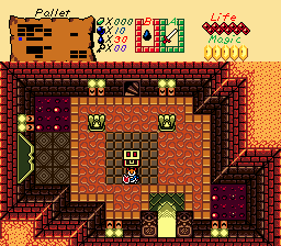
QUOTE(Orin XD @ Nov 5 2012, 03:09 PM)
Reposted because it quickly got buried and that I would like more feedback.
I love this. Perfectly done. Is that a door on the left? It looks like one of those wall rug thingies.
QUOTE(Supindahood @ Nov 5 2012, 03:20 PM)
Looks like a basic design to me, don't like the tiles though. :)
Ahhh! Passive aggressive smiley face!!! xD
#3639
Jared
-
- Members
-
Deified
- Real Name:Jared
- Pronouns:He / Him
- Location:Massachusetts
Posted 05 November 2012 - 10:40 PM

There's something about this screen I really like.
#3640
Shane
-

- Members
-
🤍
Posted 05 November 2012 - 10:50 PM
QUOTE(Jared @ Nov 6 2012, 01:10 PM)
There's something about this screen I really like.
I'd put that purple tree up one tile. Other then that, nicely designed screen.
Tip: Use the "No Enemies" flag on ledges that Link can't reach to ensure no enemies go on those ledges.
#3641
Jared
-
- Members
-
Deified
- Real Name:Jared
- Pronouns:He / Him
- Location:Massachusetts
Posted 05 November 2012 - 10:54 PM
QUOTE(Shane @ Nov 5 2012, 10:50 PM)
I'd put that purple tree up one tile. Other then that, nicely designed screen.
Tip: Use the "No Enemies" flag on ledges that Link can't reach to ensure no enemies go on those ledges.
Maybe...I can fix that tree.
And I forgot about that flag on the screen (I have it on my other screens)
#3642
Shane
-
- Members
-
🤍
Posted 05 November 2012 - 11:07 PM
QUOTE(Marco @ Nov 6 2012, 05:16 AM)
Nice colours and tiles, the mountain shape is a little too square though.
#3643
Marco
-
- Banned
-
Posted 05 November 2012 - 11:28 PM
I suppose I could modify it to be somewhat more jagged BUT. More or less, that is how the screen was in Oracle of Seasons. Thank you for your critique!
#3644
Eddard McHorn Van-Schnuder
-

- Members
-
smash the bye button
- Real Name:Ronny Wiltersen
Posted 06 November 2012 - 03:09 AM
QUOTE(Marco @ Nov 5 2012, 08:46 PM)
Sounds like a personal problem.
I finally got level 1 up and running.
Marco, you often complain about people ignoring to comment on your shots in this thread. It's not so strange that they do that, when you reply with a stupid comment like that. My point is: If you're gonna respond like that anyway, you have no right to complain.
As for the screen NoeL mentioned, I agree with him 100%, so if it is a personal problem, I totally have it too.
#3645
Sheik
-

- Members
-
Deified
Posted 06 November 2012 - 04:52 AM
QUOTE(Jared @ Nov 6 2012, 04:40 AM)
There's something about this screen I really like.
This is actually very nice, Jared. I'd center the main walking area, though. It looks kinda odd to have the main walking space all to the left. I like your subscreen, too.
QUOTE(Migokalle @ Nov 6 2012, 09:09 AM)
As for the screen NoeL mentioned, I agree with him 100%, so if it is a personal problem, I totally have it too.
Same here. Makes me wonder just whose personal problem it is.
0 user(s) are reading this topic
0 members, 0 guests, 0 anonymous users

