
QUOTE(Scootaloo @ Oct 31 2012, 06:13 PM) 
Working on giving the GB Tileset not-blinding palettes.
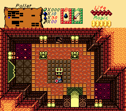
You might find something useful here, maybe.
Edited by Yoshimi, 03 November 2012 - 03:44 AM.

anthus

Posted 03 November 2012 - 03:37 PM


Deified

Posted 03 November 2012 - 04:01 PM

Napoleon Bonaparty

Posted 03 November 2012 - 04:58 PM
Deified
Posted 03 November 2012 - 05:18 PM

Edited by Jared, 03 November 2012 - 05:19 PM.
Caelan, the Encouraging

Posted 03 November 2012 - 05:35 PM
Studying Scientist - Commission from Silvixen

Posted 03 November 2012 - 05:35 PM

Edited by Orin XD, 03 November 2012 - 05:42 PM.
Deified
Posted 03 November 2012 - 05:39 PM
Studying Scientist - Commission from Silvixen
Posted 03 November 2012 - 05:49 PM
Edited by Orin XD, 03 November 2012 - 05:49 PM.
Deified
Posted 03 November 2012 - 06:14 PM
Studying Scientist - Commission from Silvixen
Posted 03 November 2012 - 06:30 PM
Edited by Orin XD, 03 November 2012 - 06:31 PM.
The Mush

Posted 03 November 2012 - 11:10 PM
anthus
Posted 04 November 2012 - 12:36 AM
life is fragile, temporary, and precious

Posted 04 November 2012 - 09:01 AM
Deified
Posted 04 November 2012 - 01:49 PM

Edited by Jared, 04 November 2012 - 01:49 PM.
0 members, 1 guests, 0 anonymous users

