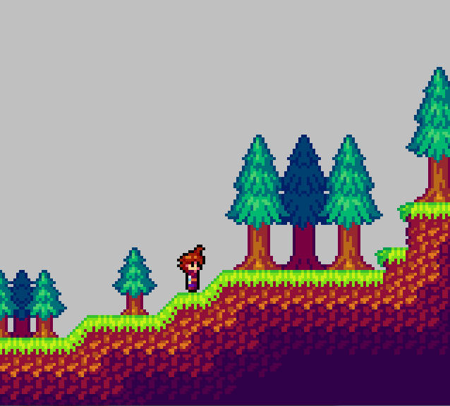
WiP Lo-Res tiles. I need one more, larger Evergreen size.

Tamer Koh

Posted 24 July 2014 - 03:21 PM
WiP Lo-Res tiles. I need one more, larger Evergreen size.
🤍

Posted 26 July 2014 - 08:33 AM

Edited by Shane, 26 July 2014 - 10:12 AM.
Tamer Koh
Posted 27 July 2014 - 08:29 AM

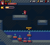
Yeah, I think expression changing on the mug will be easier now~ Moar than 2 pixels to work with.
Edited by Koh, 27 July 2014 - 08:29 AM.
Industrial Sorcerer

Posted 28 July 2014 - 01:46 AM
Good work there. I'm not a fan of the overly bright GBA styled colors, but that's all just an opinion thing.
Lurking in the shadows...

Posted 01 August 2014 - 03:47 PM
I see it's been a while since I posted here:

Tamer Koh
Posted 14 August 2014 - 09:14 AM
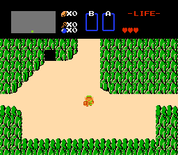
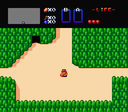
So I found a really old backup of World of Chaos DX: Extended (so old, elemental charging wasn't even added!), and began to derp around in it, updating the graphics with my refined hue-shifting technique. Behold, how much control the power of color can REALLY have on your works.
Edited by Koh, 14 August 2014 - 09:15 AM.
Legend

Posted 14 August 2014 - 11:55 PM

Edited by NoeL, 17 August 2014 - 11:55 PM.
Follower of Destiny

Posted 15 August 2014 - 04:39 AM
I recall reading something that one method is to use the opposite color as your light source as your shadows, so yellow light fades to purple, red light fades to a green tint, and blue light fades to brown (dark orange). I've seen that used once before, in a volcano level of a Sonic fan-game, and it looked really cool. I have to agree with NoeL, it makes your sprites pop out, but in a bad way. Like they aren't connected to the rest of the screen. I'd have to say that while the details of the second screen look nicer, I actually prefer the first shot, lighting-wise.
Tamer Koh
Posted 15 August 2014 - 04:46 AM
I've worked out a system as I refined my process, that I noticed helped, as I practiced more in my toonwork. I do the hue-shifting more aggressively on the characters, so that they stand out much more from the background, and give them black outlines (but not 0, 0, 0 black; no color ever gets below 8, 8, 8 ). For the BG, I do it less aggressively, but still enough to be noticeable, so that the BG isn't dull looking, but also not as vibrant as the characters.
Shifting to blue or purple is actually for the 3rd or 4th shades (for colors that allow it to be) of colors that otherwise wouldn't get there right away. For example, yellow. First, yellow shifts to red. From there, it starts to get more bluish-purple with the 3rd and 4th shades. For grays, reds and blues, Purple is pretty much the straight forward path, since green already has so little bearing over what the color result is.
For highlights, it also depends on the color. Nothing ever goes to yellow straight away, unless it's already within that vicinity, like reds and oranges. Grays and purples go towards blue, and then towards green, and then towards yellow, for the respective shade levels.
Now, if there was a palette system in the development tool, I could have the sprite palettes directly updated to have the shades reflect what type of light they're in (like if there's a blue moon, all the colors would change slightly to reflect that). Since there isn't, instead what I'd use is an overlay for the area (basically whatever the flat color of the blue moon is, for instance, drawn over the screen (but under the GUI) at an alpha, so that everything has that effect). Because of this, I keep all the shading in the general shifting rules as mentioned in the first two sections above, so that I can use an overlay, and not have to make a billion sprite sheets for each specific lighting scenario.
With your version, it seems like you went towards green, and then towards a dark teal, but very slightly, in which I'm assuming that's what you normally do for your grays. I could experiment with shifting to the respective colors for BGs even less aggressively than I already do compared to sprites, but I'm not sure if it'll actually look better, rather than making the BG look duller and less colorful.
Edited by Koh, 15 August 2014 - 04:49 AM.
Tamer Koh
Posted 15 August 2014 - 07:48 AM
So I tried the less aggressive shifting on the tiles, but did my usual go-to shifts.
Old vs New
Follower of Destiny
Posted 15 August 2014 - 01:59 PM
I really like this new version. I don't know why, but for some odd reason it makes me think of a much nicer version of one of the levels of the NES Batman game. Really, listen to this while you look at the picture: https://www.youtube....99E77A7&index=5
Legend
Posted 18 August 2014 - 12:10 AM
Tamer Koh
Posted 18 August 2014 - 07:08 AM
Oh, I didn't post the iteration I did after that...I was too lost in adding more mechanics to this thing, lol. Don't know why, since the new engine needs to be continued, but I guess I was just testing some concepts I want to implement in that one...like Rare Monsters. Discolored, stronger, faster, more resilient, but 3x the exp and a much higher chance of rare rewards.
Old vs New
The less aggressive shifting thing, I can visually see now, but I'm not sure if I get the whole neutralizer thing. It sounds like the contrasting colors thing I heard in Art History, with colors on opposite sides of the wheel, but I've heard they make each other stand out (like red and green).
Edited by Koh, 18 August 2014 - 07:18 AM.
Dictator

Posted 18 August 2014 - 08:56 AM
Much better, though your darks are still way too saturated.
What I did with mine was pick a primary light colour (went with yellow because the tiles looked like a dungeon or something that would have torch light. If those blue bulb things are supposed to be light sources then you would obviously use a blue for your highlights). The second colour in the ramp is a neutraliser (you might have noticed that yellow -> red -> teal -> purple doesn't follow a consistent line across the spectrum. Neutralisers are colours on the opposite side of the wheel to your main palette that, when placed next to your main colours bring the overall look closer to neutral/grey. Very useful if the object you're rendering is looking more colourful than it should be but gets washed out if you desaturate your palette). The third is the teal colour, starting to bend toward the blues/purples as it gets darker, and the fourth is the deep purple, following that trend. I also desaturated the background and made it more blue than grey/purple to contrast it with the foreground.
Tamer Koh
Posted 22 August 2014 - 01:23 PM
Wanted to try something out.
 ->
-> 
0 members, 1 guests, 0 anonymous users

