Your smilies have some five o' clock shadow going on. 

A Sprite A Day Keeps the Rust Away.
Started by
Koh
, Jan 10 2014 04:29 PM
512 replies to this topic
#301

The Satellite
-

- Members
-

May the way of the Hero lead to the Triforce.
- Real Name:Michael
- Pronouns:He / Him
Posted 04 July 2014 - 10:49 PM
- Koh likes this
#302
Koh
-

- Members
-
Tamer Koh
- Real Name:Dominic
- Location:Monsbaiya, Virginia
Posted 04 July 2014 - 10:53 PM
Because they're not supposed to be too distracting is why. The current smileys being flatter and not so dynamic means they don't draw too much unneeded attention to themselves.
I say if they're to be flat, they should just be one solid color at that point, instead of 7 different shades so close together; it's like someone applied the gradient tool.
#304
anikom15
-

- Banned
-

Dictator
- Real Name:Westley
- Location:California, United States
Posted 05 July 2014 - 12:48 PM
It's not like the old smileys were drawn by a professional or anything. /sarcasm >_>
Less is more and more is less.
Less is more and more is less.
#305
Demonlink
-

- Members
-

Lurking in the shadows...
- Real Name:Miguel
- Location:Wouldn't you like to know?
Posted 05 July 2014 - 01:47 PM
Looking good to me~ How fast is she supposed to animate?
Also...
Is there a reason why the smileys use so many colors, and still look flat XD?


She is supposed to animate at a speed of 20 according to the default speed. And those are some good looking smileys by the way! 
#306
Koh
-
- Members
-
Tamer Koh
- Real Name:Dominic
- Location:Monsbaiya, Virginia
Posted 05 July 2014 - 02:05 PM
It's not like the old smileys were drawn by a professional or anything. /sarcasm >_>
Less is more and more is less.
Makes me think of Kingdom Hearts. In this place, to find is to lose, and to lose is to find.
Well the main reason I brought it up, is because, from experience, the more colors a picture has, the larger its filesize is (since the file apparently stores the palette data in itself too). If the smileys were adjusted to use less, they'd not only take up less filespace and load on the page faster, but they'd also look nicer. Whether they're 3D-looking or not, even if they're going to look flat, and actually use way less colors, the filesize will drop. Filesize isn't an issue for most of us, but for dial-up users...
Edited by Koh, 05 July 2014 - 02:06 PM.
#307
anikom15
-
- Banned
-
Dictator
- Real Name:Westley
- Location:California, United States
Posted 05 July 2014 - 04:57 PM
That's a nonissue. Those pictures are so small that even uncompressed they'd be tiny. Reducing a few colors isn't going to speed up loading for dial-up users. The server request to get the pictures is probably larger than the pictures themselves.
I reckon the speed difference is comparable to the load times of whether or not this last sentence is included in this post.
*Tests*
The difference is actually 35 bytes, so it's actually less significant than the above sentence, which is 125 bytes. I guess we really need to keep our posts short for those poor dial-up users.
But at least you're thinking like an engineer.
Edited by anikom15, 06 July 2014 - 12:42 AM.
#308
Moosh
-

- Moderators
-

The Mush
Posted 05 July 2014 - 08:03 PM
Maybe it's just me and my dislike of blink animations, but I found the original ![]() a little bit creepy and somehow I think Koh's recolor made it worse...
a little bit creepy and somehow I think Koh's recolor made it worse... ![]()
#309
Demonlink
-
- Members
-
Lurking in the shadows...
- Real Name:Miguel
- Location:Wouldn't you like to know?
Posted 06 July 2014 - 11:48 AM

No ripping thanks. As you can see, I have recolored 4 different GB NPCs to make a so so DoRish style for them. Thoughts?
#310
anikom15
-
- Banned
-
Dictator
- Real Name:Westley
- Location:California, United States
Posted 06 July 2014 - 01:30 PM
Maybe it's just me and my dislike of blink animations, but I found the original
a little bit creepy and somehow I think Koh's recolor made it worse...
Spoiler
#311
Koh
-
- Members
-
Tamer Koh
- Real Name:Dominic
- Location:Monsbaiya, Virginia
Posted 06 July 2014 - 04:32 PM
@Demonlink: I like that you've went above and beyond to make the animations not just horizontal flips; looks nice! The only thing that bothers me is all their skin colors. At first I thought it was just a thing for Red Nayru, but they all look like they got a bad sunburn. Unless, maybe that's intentional?
These graphics aren't new, and are going to be replaced as mentioned in the previous pages of the thread, but I wanted to try out a sweet program Lexou Duck, on Spriter's Resource, linked me to to capture GIF video, GifCam.
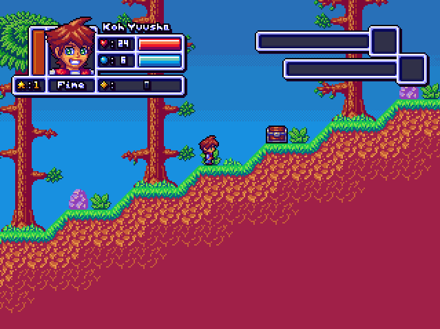
Quite nice indeed. Thanks for the reference! I can use this to show how things animate in the world when I get there with my other projects, without having to make a Youtube Video.
Edited by Koh, 06 July 2014 - 04:34 PM.
- Demonlink, Aevin and Astromeow like this
#312
Demonlink
-
- Members
-
Lurking in the shadows...
- Real Name:Miguel
- Location:Wouldn't you like to know?
Posted 06 July 2014 - 05:05 PM
Thanks Koh! As for their skin colors, they all are actually using Link's skin colors from Cset 6, as those are the closest ones to a so so skin shade. As for your animations, that looks really cool! ![]()
#313
Lemon
-

- Members
-

Legend
Posted 06 July 2014 - 08:57 PM
A slight grin in a character portrait is ok. That constant smile looks painful.
#314
Aevin
-

- Members
-

- Pronouns:He / Him
- Location:Oregon
Posted 06 July 2014 - 09:07 PM
A slight grin in a character portrait is ok. That constant smile looks painful.
Really? I almost posted earlier to tell him how freakin' adorable that smile is. I think it adds a lot of character when the main player sprite can't have a lot of detail.
#315
Shane
-

- Members
-
🤍
Posted 06 July 2014 - 09:38 PM
Does his hair use Seymour's Ambition to defy the laws of physics? ![]()
Looks great. Not sure about the purple rock though. It looks like it could use a fourth, more darker shade of purple.
0 user(s) are reading this topic
0 members, 0 guests, 0 anonymous users

