
My gosh jimmyb you have done it. I love those lighthouse tiles.

Screenshot of the Week 263
Started by
Neppy
, Jul 06 2009 03:10 PM
-
 This topic is locked
26 replies to this topic
#17

Cobgoblin
-

- Members
-

Corn is no place for a mighty warrior
Posted 07 July 2009 - 11:42 AM
QUOTE(jimmyb @ Jul 7 2009, 12:57 AM) 
I null'd. I think I would have gone with Nuvo had I not been in it, his shot looks great, even if it is grayscale.
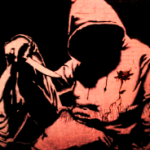
It's technically not grayscale. There are only two colors. Off-black, and off-white. Grayscale is a bit different.
#18
Prophecy Face
-

- Members
-

Junior
Posted 07 July 2009 - 12:48 PM
That's true. Here's an example of a greyscale screen:

#19
Bourkification
-

- Members
-

Magus
Posted 07 July 2009 - 06:40 PM
That actually looks pretty sweet in grayscale. 
#21
MrMister
-
- Members
-

Apprentice
- Location:Oregon, USA
Posted 09 July 2009 - 01:04 AM
*checks poll*
:/
Yeah, definitely gonna try to submit a better screenshot next time.
(And maybe not using BS niether.)
:/
Yeah, definitely gonna try to submit a better screenshot next time.
(And maybe not using BS niether.)
#22
Twilight Knight
-

- Members
-

Tell all with glee, Argon's on PureZC
- Real Name:Sven
- Location:Rotterdam, NL
Posted 09 July 2009 - 03:41 AM
I like your shot very much, but you just submitted on the wrong moment I guess. The other entries are more magnificent.
#23
William
-

- Members
-

Banditos
- Real Name:You'll have to guess.
- Location:Between the Pacific Ocean and the Atlantic Ocean
Posted 09 July 2009 - 05:28 PM
None of the shots are too bad  . I went with Nuvo, I love those graphics!
#24
MrMister
-
- Members
-
Apprentice
- Location:Oregon, USA
Posted 11 July 2009 - 09:36 PM
Lol
Against those shots I'm just glad I got 2 votes. ^_^
Against those shots I'm just glad I got 2 votes. ^_^
#25
Bayta
-

- Members
-

Follower of Destiny
- Real Name:Robin Evans
- Location:Suffolk County, NY
Posted 12 July 2009 - 02:59 PM
I voted for jimmyb. His is the only shot that really stuck out to me. :/
#26
Radien
-

- Members
-

Courage
- Real Name:Steve
- Location:Oregon
Posted 12 July 2009 - 05:19 PM
MrMister:
Very solid BS shot. Thumbs up! I might make the path a little less "square," though.
jimmyb:
I will once again assert that those building tiles on the left are intended to be temple tiles, not town tiles. I'd also adjust the palette a little bit so the lightest green shows better. Nevertheless, you have a very well-balanced shot and haven't overused the small objects, and that tower is cool. This shot just manages to get my vote.
Joe123:
Nothing at all wrong with this shot; it's just not as much of an eye-catcher screen. I still love your subscreen. Keep it up.
Nuvo:
2-color quest contest, is it?... Well, good job, but it's just a stationary ZQuest shot. Can't quite vote for it; it feels too much like a work-in-progress.
Good job guys. There were no boring shots this week.
Very solid BS shot. Thumbs up!
jimmyb:
I will once again assert that those building tiles on the left are intended to be temple tiles, not town tiles. I'd also adjust the palette a little bit so the lightest green shows better. Nevertheless, you have a very well-balanced shot and haven't overused the small objects, and that tower is cool. This shot just manages to get my vote.
Joe123:
Nothing at all wrong with this shot; it's just not as much of an eye-catcher screen. I still love your subscreen. Keep it up.
Nuvo:
2-color quest contest, is it?... Well, good job, but it's just a stationary ZQuest shot. Can't quite vote for it; it feels too much like a work-in-progress.
Good job guys. There were no boring shots this week.
#27
Mitchfork
-

- Members
-
no fun. not ever.
- Real Name:Mitch
- Location:Alabama
Posted 12 July 2009 - 08:54 PM
MrMister - 2 votes = [4.35%]
jimmyb - 27 votes = [58.70%]
Joe123 - 10 votes = [21.74%]
Nuvo - 7 votes = [15.22%]
Total Votes: 46
jimmyb

[i]Ah, I just realised I'm scared of the dark! Never mind, I'll just use my Lantern to ignite the Lighthouse beacon.
A hearty congratulations to jimmyb! May the lighthouse shine bright for him.
jimmyb - 27 votes = [58.70%]
Joe123 - 10 votes = [21.74%]
Nuvo - 7 votes = [15.22%]
Total Votes: 46
jimmyb
[i]Ah, I just realised I'm scared of the dark! Never mind, I'll just use my Lantern to ignite the Lighthouse beacon.
A hearty congratulations to jimmyb! May the lighthouse shine bright for him.
1 user(s) are reading this topic
0 members, 1 guests, 0 anonymous users

