Jump to content

Photo

Screenshot of the Week 207


  • This topic is locked This topic is locked
28 replies to this topic

Poll: SotW 207 (61 member(s) have cast votes)

Vote for your favorite screenshot!

You cannot see the results of the poll until you have voted. Please login and cast your vote to see the results of this poll.
Vote

#16 Dawnlight

Dawnlight

    My name is NOT Jason!

  • Members
  • Real Name:Justin
  • Location:Chicago, IL

Posted 21 April 2008 - 04:39 PM

QUOTE(Mr. Z @ Apr 21 2008, 09:52 AM) View Post

Trimaster's looks an awful lot like a screen I made for Quest for Light:
IPB Image

:<


I don't know if your :< is if you're angry or if you're sad. Anyway, After seeing those tiles I just drolled. And I didn't know it looked similar to one of your QFL Shots. (Even though you gave me the Beta). And No, I didn't make my overlook a ripoff of your QFL Overlook.

And wow Billy, you're in the lead. You should be proud of yourself. If you win this week will it be your first win?

Edited by TriMaster001, 21 April 2008 - 04:41 PM.


#17 The Satellite

The Satellite

    May the way of the Hero lead to the Triforce.

  • Members
  • Real Name:Michael
  • Pronouns:He / Him

Posted 21 April 2008 - 04:43 PM

- billy ronald -

Very good, nice usage of the cloud and and its shadow. But it seems too simple (as far as shape goes) to me...

- CastChaos -

The layout is average, but the palette's unappealing. Too much brown. icon_unsettled.gif

- gray0x -

Is Link supposed to be swimming? If so, what's with the full-grown trees coming out of the surface of the water? icon_eek.gif

If not, then it's pretty nice, but shouldn't there be some kind of ripple around the roots of the tree? It's a good shot, overall, but my vote goes elsewhere. icon_sorry.gif

- LostInHyru1e -

Awesome dungeon shot. But it's a dungeon shot. Nuff said. icon_blah.gif

- TriMaster001 -

My vote goes here. Very nice Pure shot, and me voting for a Pure shot is rare. icon_odd.gif The background is also enjoyable, and the mountains are used very well.

#18 ZebraStallion

ZebraStallion

    Follower of Destiny

  • Members

Posted 21 April 2008 - 05:15 PM

My vote goes to Trimaster! Beautiful! Just amazing!

#19 trucky5

trucky5

    "WHAT KIND ARE THEY?" THEY'RE GUATIBALIAN!

  • Members
  • Real Name:Bryson
  • Location:Boulder, Colorado

Posted 21 April 2008 - 08:39 PM

Awwwww maaaaan!!!! They ALL looked good to me this week, so I had to do some really deep decision making, and I voted for Trimaster. Good job guys!

#20 Russ

Russ

    Caelan, the Encouraging

  • Administrators
  • Location:Washington

Posted 21 April 2008 - 09:49 PM

Billy Ronald: I love that design! *Votes*
CastChaos: I like it, but it looks like you placed some tiles too randomly.
Gray0x: I like how for once, it's a swamp and yet it is still sunny outside. But it is too straight.
LostInHyru1e: Standard PTUX ice dungeon. Looks nice, but it's nothing new.
TriMaster001: It looks good, but the perspective is off. It looks like the cliff Link is on is in top of the other mountains.

#21 Cobgoblin

Cobgoblin

    Corn is no place for a mighty warrior

  • Members

Posted 22 April 2008 - 12:19 AM

Billy Ronald: The cloud in the center is seriously freaking me out. Unless it has some sort of odd plot line importance, I suggest you eliminate it, and replace it with something else.

Castchaos: I voted here, as it is something I haven't seen before. The stone and all the plants add to a nice atmosphere. However, I suggest that you fix those cave edges in the bottom left corner to fit with their adjacent combos.

Gray0x: The plants add a nice swampy atmosphere, however, the tree in the center is totally annoying. Replace it with one of the other trees on the right, and it'll be better.

LostInHyru1e: The iciness is a good touch, along with the pleasing tiles. But, the screen design isn't "crazily amazing". I mean, it has about as good design as Castchaos' however, it loses points due to the lack of atmospheric feelings. One really good compliment you could add to the screen is a statue in the center, with a more square carving about the lower walls about the top left corner. What could be really cool, is if you had a clear sheen of ice coating those lower walls, if you want those tiles, I could arrange to make them for you, if your not willing.

TriMaster001: It's nice, but my major beef with it is lack of detail, I know that is hard to pull off, concerning it's mostly mountainous. However, you could pull off something really cool, if you had some mountainous spires at the left edge of the screen, like on my overlook shot from Incendia:
IPB Image
Something like that, just give it a more epic atmosphere, and you'll be well off. And by the way, could I get those mountain backgrounds by any chance TM001?

#22 Ricky of Kokiri

Ricky of Kokiri

    Apprentice

  • Members
  • Real Name:Ricky
  • Location:southern california

Posted 22 April 2008 - 08:58 PM

billy ronald: looks pretty good, though that vine on the "island" seems to go too high in my opinion... and that cloud looks very out of place. You should either add one or two more clouds to the screen or get rid of the one.

CastChaos: The dark palette makes this look awfully bland, and the sprites stand out far too much because of that... but this is more because of the palette than the actual design. The design itself looks okay.

gray0x: That water looks too much like grass, especially with that tree standing on top of it. If you took the time to create "submerged root" tiles, this could look really cool.

LostInHyrule: The walls look good, but the snow that's "piled" up against the higher level looks too flat for its position.

TriMaster001: This looks pretty cool, but the perspective is off. You've got a side-view background with an above-view foreground. It just doesn't work very well.

All of these were cool in their own way, but I ended up voting for billy ronald.

#23 Nathaniel

Nathaniel

    Unburdened By What Has Been

  • Members

Posted 23 April 2008 - 10:46 PM

billy ronald - 5/10
I'm not digging it, sorry. Too many vertical lines and 45 degree angles. The island in the middle of the stream seems like too much of an interruption to it. Either make it smaller (probably would have to sacrifice the grass on top of it too and just make it all rock) or try something different there.

CastChaos - 7/10
It took me some time, but I like this shot today better than I did yesterday. As dark as it is, that is all part of the effect. The light near the center gives that away. The work on the ground is pretty good overall. I am not liking that particular grass with the rest of the more detailed ground, though.

gray0x - 7/10
While the banks can look better in shape, most of the swamp I think looks very good. This screen has very good consistency, and it makes a phenomenal difference.

LostInHyru1e - 7/10
This screen looks like it plays it's role over a much larger picture, which of course is a big plus for any screen, whether it is overworld or dungeon. Good job.

TriMaster001 - 6/10
Great background choice, but the rest of the screen doesn't quite live up to it for me. It still is good despite me saying that, though.

My tie breaking vote goes to gray0x for consistency. Good job guys.

#24 Questwizard

Questwizard

    The Moldorm Guy

  • Members
  • Location:The Desert

Posted 25 April 2008 - 12:51 AM

Hmm.. Looks like another bad week.

billy: That cloud looks really weird there. Doesn't seem to fit in very well. The bottom edges of the mountains look a bit on the "square-ish" side to me too. Probably one fo the better screens this week though. 7/10

CastChaos: The palette isn't the bad part, but those cave walls in the bottom left look awful, and don't blend in at all with the adjacent combos. 4/10

gray0x: Not bad, but shouldn't the water around Link be green there? 7/10

LostInHyru1e: Not much to say about this one. Looks like an ordinary screen to me. No big flaws in it though, so it gets a 7/10 also.

TriMaster001: Looks pretty nice, but there's still some perspective issues lurking around there. Mountains should have been more of a top-view than a side-view, then it would look right. Still pretty nice though. 6/10

I nulled this one. There's not really anything that stands out at all this week.

#25 Radien

Radien

    Courage

  • Members
  • Real Name:Steve
  • Location:Oregon

Posted 25 April 2008 - 01:53 AM

Woo, it looks like I cast the deciding vote. icon_razz.gif If nobody else votes, that is...

Billy Ronald:

You've improved. icon_smile.gif Yours ended up being my second choice. The main thing that kept me from voting for this one is the use of mountains. There's some "fudging" going on here and there, though I know that not everybody here would notice it. Nice use of clouds, though. I'd love to figure out how to make clouds like that move using FFCs, but the screen warp transition would arguably ruin the effect.


CastChaos:

A lot of these tiles feel like they clash to me. There's nothing that incredibly horrible about the shot, but I find it rather uninteresting and just a little bit strange, mostly from the colors and the tile choice.


Gray0x:

A pretty solid screen, I'd say. icon_smile.gif The only real complaint I have is that I can't tell whether the trees are partway underwater or not. Also, the water is the same color as the greenery, so if it weren't for the floating objects, I wouldn't be able to know for sure that it was indeed water. Other than that, though, you have made a convincing and above average swamp area. icon_thumbsup.gif


LostInHyrule:

A pretty average Pure screen, I'd say. You didn't do much of anything that I'd consider horrible, but there ar a few things I'd change. First of all, the snow pushed up against the lower walls in the center of the screen overlaps it in a way that doesn't look natural. Rather than using floor snow tiles, you should edit out the snow from the wall tiles to use on LTTP lower walls...at least, for the corner tiles. I'd keep the straight ones as-is.

Also, the snow that overlaps the torch on the left should overlap the ones on the right, too. It looks better, and it's more consistent.
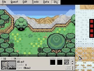

TriMaster001:

This is a VERY solid overworld screen with no flaws worth mentioning at all. The only downside is that there are no enemies and no other action going on, but in this case, the scenery and the basic-but-well-designed subscreen are more than enough to make up for that. icon_smile.gif I'm not sure whether this is a standard Pure palette or not, but if it isn't, then you imported or edited the palette quite effectively. Voted!

#26 /M/

/M/

    6♣7♠8♥9♥10♥

  • Members
  • Location:Gotham City

Posted 27 April 2008 - 12:22 PM

Voting is closed, and TriMaster is the winner of SoTW 207!

Congratulations. SoTW 208 will be posted shortly, so submit your entry quickly if you plan on participating.

#27 Old Inactive Member

Old Inactive Member

    Chosen One

  • Members

Posted 27 April 2008 - 12:52 PM

NOOOOOOOOOOOOOOOOOOOOO!!!!!
I was soo close

I meen Congras on athpore win Trimaster

Anyway i frogot to review the shots

Billy: yours is the best ness ever even better than that newbiw who made Hyrule's Darkness 2 years ago (wait that was you) (socrry had to get a joke in somewhere)

CastChaos: What can i say ummm Needs tons more detile and well umm that's it

gray0x: that is the best swamp i've ever seen

LostInHyru1e: Standered Pure DGN SHot NEXT I meen it's a relly good DGN shot

TriMaster001: HOW DID I LOSE TO THIS Quest For Light RIP OFF
I meen it's a great overlook and it's a solid pure shot and well it did desever to wi

Ps /M/ you need to upadte the topic's descrption as it still says Voting is open

Edited by billy ronald, 27 April 2008 - 12:53 PM.


#28 Dawnlight

Dawnlight

    My name is NOT Jason!

  • Members
  • Real Name:Justin
  • Location:Chicago, IL

Posted 27 April 2008 - 05:33 PM

Ouch, that bites Billy. I was hoping you would win. Wouldn't it have been your first win if you won this?

#29 Evile

Evile

    Dolphinslayer

  • Members

Posted 28 April 2008 - 12:19 AM

Billy, you're an ass. I'm glad you didn't win. Your comments are always rude and unnecessary, you need to get your head out of your ass and quit thinking you are the best. Your stuff is not as great as you think it is and you need to quit putting down others work. I don't care if I get banned for this, someone needed to say it, and I'm glad it was me.


1 user(s) are reading this topic

0 members, 1 guests, 0 anonymous users