Radien, not that your shot isn't the winner, but the chest really looks like it's stuck inside the bench. This
would have needed a flatter chest with a part of a bench under it. You get my vote though.

Screenshot of the Week 157
Started by
Neppy
, Mar 20 2007 07:42 PM
-
 This topic is locked
32 replies to this topic
#17

Zemious
-

- Members
-

Magicite: Bahamut
Posted 21 March 2007 - 12:14 PM
Well we know who's gonna win. :/
#18
Old Inactive Member
-
- Members
-

Chosen One
Posted 21 March 2007 - 03:45 PM
Radins screen fit togeter unlike Joe123
Joe123's screen trees look wrong they just don't fit right in my openien
Joe123's screen trees look wrong they just don't fit right in my openien
#19
Zemious
-
- Members
-
Magicite: Bahamut
Posted 21 March 2007 - 04:26 PM
QUOTE
Radien, might as well close this now! XD
Instead of being rude, why don't we tell him how he could fix it?
Even if Radien is more skilled, their are only two shots so the choice was limited.
Lets not point out the obvious.
#20
/M/
-

- Members
-
6♣7♠8♥9♥10♥
- Location:Gotham City
Posted 21 March 2007 - 05:15 PM
QUOTE
Well we know who's gonna win. :/
QUOTE
Lets not point out the obvious.
QUOTE
Instead of being rude, why don't we tell him how he could fix it?
You never make much sense to me..
"Lets not point out the obvious?" Yet you said "Well we know who's gonna win" right after DFW said that. And she is right, Radien already won this SoTW. He has 30 votes, while the other doesn't even have half that many votes.
#21
Moonbread
-

- Members
-

Playing With Psychos
- Pronouns:They / Them
Posted 21 March 2007 - 07:55 PM
You know, I think this could be a lesson for all of you. Now, we all want SotW on time. But if this is going to be the situation for it being on time, this ain't gonna be too great. So don't complain if SotW is late, or this may happen again!
#22
NoeL
-

- Members
-

Legend
- Real Name:Jerram
Posted 21 March 2007 - 08:45 PM
Joe123 FTL!!! Sorry dude, you have a very interesting setup of opaque and transparent leaves... but it just doesn't work in this situation. The limited number of tiles in the treetops make them look flat and boring. In a classic palette it would look fine, because I've seen many NES games with limited tile space use this technique, but since ZC has no such problem anymore I'd recommend you work some more on those trees.
I'm guessing most of that screen is custom drawn? Layout aside, some of those tiles are pretty good! Keep at it
*votes Radien*
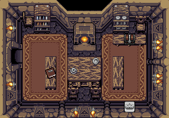
... although Radien, I think that fireplace sticks out way too much, and that stone tablet looks much too bright in comparison to the wall. The rest of the screen's pretty top notch though, mix of ripped and custom tiles.
EDIT
Umm... how do you know he didn't do that already? YOU CAN'T SEE THE BOTTOM OF THE CHEST BECAUSE SERINA'S IN THE WAY! It looks fine to me.
... sorry if that was a bit harsh, I just realised you're a newbie. Welcome to SOTW!
I'm guessing most of that screen is custom drawn? Layout aside, some of those tiles are pretty good! Keep at it
*votes Radien*
... although Radien, I think that fireplace sticks out way too much, and that stone tablet looks much too bright in comparison to the wall. The rest of the screen's pretty top notch though, mix of ripped and custom tiles.
EDIT
QUOTE(Imprisoned @ Mar 21 2007, 09:50 AM) 
Radien, not that your shot isn't the winner, but the chest really looks like it's stuck inside the bench. This would have needed a flatter chest with a part of a bench under it. You get my vote though.
Umm... how do you know he didn't do that already? YOU CAN'T SEE THE BOTTOM OF THE CHEST BECAUSE SERINA'S IN THE WAY! It looks fine to me.
... sorry if that was a bit harsh, I just realised you're a newbie. Welcome to SOTW!
Edited by NoeL, 21 March 2007 - 08:49 PM.
#23
Radien
-

- Members
-
Courage
- Real Name:Steve
- Location:Oregon
Posted 22 March 2007 - 03:29 AM
Indeed, Serenia is covering 60% of the chest and completely blocking the bottom of it. Since so many people want to talk about the chest, I made a GIF that shows it without Serenia in the way. The chest animates, by the way, so watch it for a moment. ~Link~
Yes, even so, the chest is jutting out over the edge of the bench a bit. However, I don't see how this is unusual compared to real life. *shrug*
Hmm, I'll think about the fireplace. I seem to remember moving it up 8 pixels and it looked too high. But if that's the case, I could try putting it somewhere in between.
Do you recognize that stone tablet?... It's yours. It's from the "crabby statue" loose tiles. I altered the Triforce symbol because I wanted something a bit more unique than the panels in LTTP. The symbol I put on it is the same as the one I drew for the wall engravings.
Your stone panel has always been that bright, but your comment is understandable; this dungeon is a lot darker than anything you drew for your own quests. I'll experiment with the tile and the palette and see how it turns out. However, it IS supposed to stand out pretty obviously. Hint panels aren't meant to be subtle, after all... not like treasure chests.
Yes, even so, the chest is jutting out over the edge of the bench a bit. However, I don't see how this is unusual compared to real life. *shrug*
QUOTE(NoeL @ Mar 21 2007, 06:45 PM)
... although Radien, I think that fireplace sticks out way too much, and that stone tablet looks much too bright in comparison to the wall. The rest of the screen's pretty top notch though, mix of ripped and custom tiles.
Hmm, I'll think about the fireplace. I seem to remember moving it up 8 pixels and it looked too high. But if that's the case, I could try putting it somewhere in between.
Do you recognize that stone tablet?... It's yours.
Your stone panel has always been that bright, but your comment is understandable; this dungeon is a lot darker than anything you drew for your own quests. I'll experiment with the tile and the palette and see how it turns out. However, it IS supposed to stand out pretty obviously. Hint panels aren't meant to be subtle, after all... not like treasure chests.
#24
Joe123
-

- Members
-
Retired
Posted 22 March 2007 - 12:07 PM
Hmm no, not custom drawn at all. This is from a game called Final Fantasy Adventure for the gameboy. I have a black and white tileset up for it on the database; I'm making a colour version at the moment. I know it looks a little funny, but it looked a lot worse in the original game, and I'm making a tileset for FFA, not FFA changed to how I like it. Just thought I'd see how people like it; obviously they don't.
#25
The Satellite
-

- Members
-
May the way of the Hero lead to the Triforce.
- Real Name:Michael
- Pronouns:He / Him
Posted 22 March 2007 - 02:08 PM
No, Joe123. I like it, it's just something's odd with the trees. They're a little... odd. What can I say? 
Other than that, it's a nice shot. And yes, I do like the tiles.
Other than that, it's a nice shot. And yes, I do like the tiles.
#26
Zemious
-
- Members
-
Magicite: Bahamut
Posted 22 March 2007 - 10:11 PM
Eh, I do seem to contradict my self alot now don't I?
#27
Sharon Daniel
-
- Banned
-

.
Posted 22 March 2007 - 10:39 PM
I decided to vote for Joe123. I like the graphics and screen design.
#28
NoeL
-
- Members
-
Legend
- Real Name:Jerram
Posted 22 March 2007 - 11:42 PM
QUOTE(Radien @ Mar 22 2007, 02:29 AM)
Do you recognize that stone tablet?... It's yours.
Ha! I thought you were joking when you said the tablet was the best part
#29
Radien
-
- Members
-
Courage
- Real Name:Steve
- Location:Oregon
Posted 23 March 2007 - 01:39 AM
QUOTE(NoeL @ Mar 22 2007, 09:42 PM)
Ha! I thought you were joking when you said the tablet was the best part
Yep, I was only half-joking.
It's not that the rest of the graphic wasn't awesome. It's just that I don't really need a crab.
#30
August Yifu
-
- Banned
-
Magus
Posted 30 March 2007 - 03:51 PM
I really like both of them, though, I'm going to have to vote for Radien's shot.
1 user(s) are reading this topic
0 members, 1 guests, 0 anonymous users

