QUOTE(NoeL @ Mar 9 2013, 09:07 AM)

Which brings me back to my initial point on the importance of nailing down a palette
before laying down pixels (or at least during the early stages of doing so).

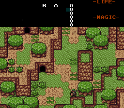
If you built the palette first you could have drawn your mountains without quite so many highlights.
In this screenshot the mountain highlights share a colour with the bright sand/dirt, but because the colour is used sparingly the mountains don't look like sandstone:
If you've still got those 4 extra slots it might be worth adding a lighter brown, or you could try and find a middle ground that makes the dirt look a bit better without completely ruining the mountains. Alternatively, try darkening the grass. That'll make the dirt look brighter by comparison. Optical illusions are handy.
I totally understand why now XD. Oh and I really want to save those for the special grays we'll be needing for rocks and things, lol. I might just have to tamper with the browns a bit more to see what I can cook up.
QUOTE(Marco @ Mar 9 2013, 09:39 AM)
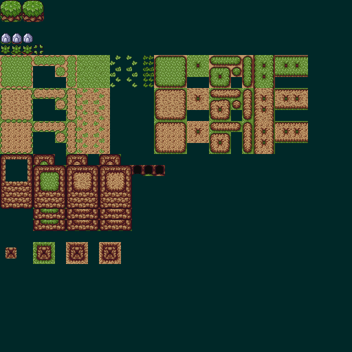
I dislike your dirt grounds Koh.
The transitions of your grass/dirt are below par, and could use a bit more definition IMO. Even so, the dirt/sand tiles themselves are quite an eye sore. I say rework them, or at least make the sand more...smooth but not loosing its rustic look.
Other than that wonderful work there.
The first dirt variant I drew myself, while the second is the cave dirt graphic from Oracle of Seasons and Ages....As for the edges....I was doing what I've been doing with every graphic in this tileset so far if you've noticed~ I kept the OUTLINES of the tiles the exact same as the original graphics, but whatever's INSIDE the outlines are free game and edit worthy~ So technically I COULD make my own grass meets dirt edges, since there wasn't a solid black outline as a delimiter for such on the original tiles, but rather a dark green.
QUOTE(Surreal Canine @ Mar 9 2013, 11:27 AM)
I really don't see a problem with the original screenshots you posted, Koh. The trees and grass and mountains have very vibrant colors that blend smoothly with each other, and the result is beautiful. Honestly, they look like something out of Pokémon Ruby and Sapphire. However, I agree with NoeL that it is probably a bad thing to do in ZC, as the more CSets you use in your tile palettes, the fewer you will have to draw enemies, items, and the like.
Also, don't feel like you have to get caged in on a palette right away. Personally, I would prefer a very bright palette. Real is not brown, people! XD
Bright colors ftw. I might just include a bright color palette as an alternate when I get there =).
AAAAAAAAAAaaand I really appreciate all the feedback and help you've guys have been providing....but now I need moar!
Introducing, Palm Trees and Power Bracelet Rocks!

-Which palm tree looks more appealing to you guys (as it will be the one put into the set): The one on the left, or the one on the right?
-I just used the browns I have for now for the first Power Bracelet Rock variant, but I do need to start conjuring up the 3 or 4 grays I'll be needing for the other variant(s) as I mentioned above....
Edited by Koh, 09 March 2013 - 07:37 PM.