Jump to content

Photo

The Official Quest Screenshot Critique Thread


  • Please log in to reply
7962 replies to this topic

#2776 Marco

Marco

  • Banned

Posted 27 April 2012 - 12:00 AM

IPB Image

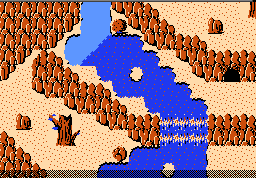
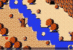
Frostmint Candywood Meets Chocolate Blunt Ridge

Edited by Marco, 27 April 2012 - 12:00 AM.


#2777 Shane

Shane

    🤍

  • Members

Posted 27 April 2012 - 12:09 AM

"Hello Chocolate Blunt Ridge!" "Hellooooo!"

Ahem.

The colours are pretty creative.

#2778 The Satellite

The Satellite

    May the way of the Hero lead to the Triforce.

  • Members
  • Real Name:Michael
  • Pronouns:He / Him

Posted 27 April 2012 - 12:58 AM

If you can reach those mountains later, I hope none of those areas that line the edge of the screen can be walked onto from the screen above it, or else there'll be problems. The palette itself is kind of neat, but the mountain area seems kind of boring compared to the relative vibrancy of the lower area. Unless that is the intent, in which it's very well done. icon_thumbsup.gif

#2779 Adem

Adem

    -

  • Members
  • Real Name:Anything except rap and country.
  • Location:New England

Posted 27 April 2012 - 07:19 AM

QUOTE(Dragonite @ Apr 25 2012, 12:23 PM) View Post

Screenshot and custom palette I made.
IPB Image

The mountains look a little funky, but I really like the atmosphere of this screenshot, in addition to the design in general. Great job! You've come such a long way since you first started and it's super cool to watch. icon_smile.gif

#2780 Avaro

Avaro

    >w<

  • Members

Posted 27 April 2012 - 06:45 PM

I tried improving the custom palette of my space quest. I think I made the greys looking more like metal now. (hard to notice: also added more colors for the stars)
IPB Image ---> IPB Image

Is that an improvement?

Edited by Avataro, 27 April 2012 - 06:46 PM.


#2781 Cukeman

Cukeman

    "Tra la la, look for Sahasrahla. ... ... ..."

  • Banned
  • Location:Hyrule/USA

Posted 27 April 2012 - 06:51 PM

The cool gray is definitely better than the warm gray. It gives a cold space feeling.
Does this mean this is a quest in development? icon_biggrin.gif
I also like the bluish stars you added.

Edited by Cukeman, 27 April 2012 - 06:52 PM.


#2782 Marco

Marco

  • Banned

Posted 28 April 2012 - 06:53 PM

IPB Image

I decided to make an enhanced Lttp-eque tileset for my quest. It's ice world.

#2783 Jared

Jared

    Deified

  • Members
  • Real Name:Jared
  • Pronouns:He / Him
  • Location:Massachusetts

Posted 28 April 2012 - 07:14 PM

That's very nice! I really love your color usage. Very unique.

#2784 kurt91

kurt91

    Follower of Destiny

  • Members
  • Real Name:Kurtis
  • Location:Eastern Washington University

Posted 28 April 2012 - 07:39 PM

I don't know why, but I think of mint when I see that palette. It looks very nice, though. I like it.

#2785 Moon

Moon

    goopy

  • Members
  • Pronouns:She / Her
  • Location:Viridi Town

Posted 28 April 2012 - 07:47 PM

QUOTE(Marco @ Apr 28 2012, 07:53 PM) View Post

IPB Image

I decided to make an enhanced Lttp-eque tileset for my quest. It's ice world.
Looks very good, kinda similar to what Shane is doing icon_wink.gif


#2786 Shane

Shane

    🤍

  • Members

Posted 28 April 2012 - 07:50 PM

QUOTE(Marco @ Apr 29 2012, 09:23 AM) View Post

IPB Image

I decided to make an enhanced Lttp-eque tileset for my quest. It's ice world.


Nice! I think the water sticks out like a sore thumb though. icon_frown.gif

#2787 NoeL

NoeL

    Legend

  • Members
  • Real Name:Jerram

Posted 28 April 2012 - 08:30 PM

QUOTE(Marco @ Apr 28 2012, 05:53 PM) View Post
IPB Image

I decided to make an enhanced Lttp-eque tileset for my quest. It's ice world.
I like it, but it's a bit too high contrast - particularly the dirt borders and bushes.


#2788 Russ

Russ

    Caelan, the Encouraging

  • Administrators
  • Location:Washington

Posted 30 April 2012 - 04:20 PM

Even though I made these screens to be used as base screens in S:CA, I was wondering if I could get some feedback on them. The classic tileset interests me, and I wanna know how I'm doing with it.

IPB Image IPB Image

#2789 Marco

Marco

  • Banned

Posted 30 April 2012 - 04:26 PM

They're alright screens....but a little crammed. There is little open space for movement. Sometimes, classic works better with simplicity and free space.

#2790 Twilight Knight

Twilight Knight

    Tell all with glee, Argon's on PureZC

  • Members
  • Real Name:Sven
  • Location:Rotterdam, NL

Posted 30 April 2012 - 04:56 PM

QUOTE(Dragonite @ Apr 29 2012, 02:47 AM) View Post

Looks very good, kinda similar to what Shane is doing icon_wink.gif

Seriously??? Just because they use the same base tileset? It's in no way similar.


0 user(s) are reading this topic

0 members, 0 guests, 0 anonymous users