He needs to be thinner. The reason the old one is so fat is because he'd look too small if they made him smaller.

A Sprite A Day Keeps the Rust Away.
Started by
Koh
, Jan 10 2014 04:29 PM
512 replies to this topic
#151

anikom15
-

- Banned
-

Dictator
- Real Name:Westley
- Location:California, United States
Posted 04 April 2014 - 05:27 PM
#152
Koh
-

- Members
-

Tamer Koh
- Real Name:Dominic
- Location:Monsbaiya, Virginia
Posted 04 April 2014 - 05:51 PM
I don't buy that. I've drawn within 16x16 and 16x24 dimensions before, and I can say with certainty there's absolutely no need to make the body that wide.
Just a sample

The body isn't too big or too thin, and doesn't try to fill the entire space. Same dimensions as Link over there, 16x24 (even though he's only using 22 pixels)
Edited by Koh, 04 April 2014 - 05:52 PM.
#153
Alestance
-

- Members
-
Saint Alestance - Eliminator of the ZGP format
- Real Name:Lonk
- Location:Pennsylvania
Posted 04 April 2014 - 06:09 PM
Hey, Koh! I've been watching the progression of this sprite for a while and it this kind of thing seems pretty fun! Not to mention, I've been doing a lot of revamps lately and I've always wanted to attempt something like this. Here's my interpretation I cooked up in about 2 hours.
As you can see, I took a lot more of a western approach...slightly more gritty with higher-contrast shading that takes advantage of the (surprisingly strong) variety of colors this sprite has. I removed two browns, though...they seemed kind of pointless.

I like this, even if the face is vaguely cat-like.
#154
anikom15
-
- Banned
-
Dictator
- Real Name:Westley
- Location:California, United States
Posted 04 April 2014 - 06:51 PM
I don't buy that. I've drawn within 16x16 and 16x24 dimensions before, and I can say with certainty there's absolutely no need to make the body that wide.
Just a sample
The body isn't too big or too thin, and doesn't try to fill the entire space. Same dimensions as Link over there, 16x24 (even though he's only using 22 pixels)
Um I don't understand what you are saying.
But what I am saying is that your Link looks fatter than the original. They should look the same width, even if that means the pixel width is different.
#155
Koh
-
- Members
-
Tamer Koh
- Real Name:Dominic
- Location:Monsbaiya, Virginia
Posted 04 April 2014 - 08:03 PM
Edits to the upper body. Should make him look a bit thinner.
<Old>

<New>

All I did was get rid of the outward reach of the tunic straps the original's influence had over the HR remake.
Edited by Koh, 04 April 2014 - 08:04 PM.
#156
Aevin
-

- Members
-

- Pronouns:He / Him
- Location:Oregon
Posted 04 April 2014 - 08:07 PM
It's funny how such minor changes can make a big difference. I really do think that helps.
#157
Koh
-
- Members
-
Tamer Koh
- Real Name:Dominic
- Location:Monsbaiya, Virginia
Posted 04 April 2014 - 08:10 PM
Makes me question: Why are the straps jutting so far out on the original? I bet even that would look less fat if you made the same edit.
#158
anikom15
-
- Banned
-
Dictator
- Real Name:Westley
- Location:California, United States
Posted 04 April 2014 - 09:18 PM
Edits to the upper body. Should make him look a bit thinner.
<Old>
<New>
All I did was get rid of the outward reach of the tunic straps the original's influence had over the HR remake.
He looks thinner, but now it looks like he's tense, and then he still looks stubby in the lower half.
Makes me question: Why are the straps jutting so far out on the original? I bet even that would look less fat if you made the same edit.
Just by going by my head, it seems that the arms would look too long, or he would seem to not have any shoulders. His broad shoulders are fine, it's his tummy that is too broad. That's what makes him dwarfish.
Rather than going by the proportions of the original, why don't you just draw it by eye? I think it would turn out more natural that way.
#159
Geoffrey
-

- Members
-

Chosen One
Posted 04 April 2014 - 09:35 PM
Hey, Koh! I've been watching the progression of this sprite for a while and it this kind of thing seems pretty fun! Not to mention, I've been doing a lot of revamps lately and I've always wanted to attempt something like this. Here's my interpretation I cooked up in about 2 hours.
As you can see, I took a lot more of a western approach...slightly more gritty with higher-contrast shading that takes advantage of the (surprisingly strong) variety of colors this sprite has. I removed two browns, though...they seemed kind of pointless.
He looks leonine, so much so that he reminds me of Lynx from Chrono Cross. ![]()
#160
Koh
-
- Members
-
Tamer Koh
- Real Name:Dominic
- Location:Monsbaiya, Virginia
Posted 04 April 2014 - 09:54 PM
<Old>
<New>

EDIT: Updated again. This is about as thin as he gets.
Edited by Koh, 04 April 2014 - 10:38 PM.
#161
anikom15
-
- Banned
-
Dictator
- Real Name:Westley
- Location:California, United States
Posted 04 April 2014 - 11:11 PM
Now we're talking. I think you could bring his arms in closer too, so he looks more relaxed. The original looks a little nonchalant. Yours looks a lot more anxious.
#162
SpikeReynolds
-

- Members
-
Industrial Sorcerer
- Real Name:Spens
- Pronouns:He / Him
- Location:Grand Rapids, Michigan
Posted 05 April 2014 - 02:15 AM
Makes me question: Why are the straps jutting so far out on the original? I bet even that would look less fat if you made the same edit.
On such a small sprite I would guess to better define his shoulders.
#163
Koh
-
- Members
-
Tamer Koh
- Real Name:Dominic
- Location:Monsbaiya, Virginia
Posted 05 April 2014 - 04:36 AM
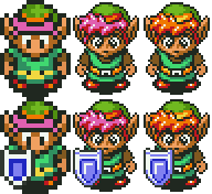
This is looking pretty finaru to me.
Edited by Koh, 05 April 2014 - 04:36 AM.
- DaLink and Logos like this
#164
Koh
-
- Members
-
Tamer Koh
- Real Name:Dominic
- Location:Monsbaiya, Virginia
Posted 14 April 2014 - 07:23 PM

Lo, Med, and Hi Res.
People would be able to switch between any of them at any time in the options menu. Which do you like best?
Edited by Koh, 14 April 2014 - 07:48 PM.
#165
Russ
-

- Administrators
-

Caelan, the Encouraging
- Location:Washington
Posted 14 April 2014 - 09:39 PM
I prefer the Med. The clothes look really cool in Hi, but his face looks... less expressive, somehow. I swear I can see determination in the Med res face, but in Hi it's just kinda blank. And Lo looks too pixelated to really make out well enough.
- Koh likes this
1 user(s) are reading this topic
0 members, 1 guests, 0 anonymous users

