")


QUOTE(Dorian @ Mar 14 2007, 11:38 AM) 
Those were my first "serious" maps
but i really find this blue quite ugly... sometimes it's difficult to read. Well... i couldn't find a better one
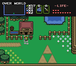
look, here is a little preview of what i'm working on
what do you think? i really like this font but sometimes we can't read very well (look at the name of the font, it's quite weird the "ri" from calibri, no?) and i'm settled on the color (i love that green)
if you have any suggestion about the font, please tell me ^^
i plan to use more colors, unlike CM&S maps
for exemple i'll use blue for items or something to get, green is standard text, red would be things to do etc...
i haven't decided for the yellow yet.
edit: just found a HC in the third room of my preview map (damn, why didn't I noticed it before???)
edit2: i think i'm decided on the font Lucida Sans Italic
I looked your preview map,it's so cool.
I think almost good about your ideas.
Yellow?
How about using it to show bombable and walkthrough wall?


![[text-colored version]](http://img124.imageshack.us/my.php?image=mapdungeonhousoflinkcoluj7.png)
![[single color version]](http://img248.imageshack.us/my.php?image=mapdungeonhouseoflinksiuv2.png)