QUOTE(Yoshimi @ Nov 28 2011, 08:59 AM) 

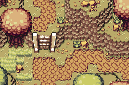
Practice Palette: Eldin Volcano
I tried to pick the colours by eye from the GameInformer Eldin Volcano teaser video and adjusted them where I thought appropriate. Does the palette look good? And do those dirt tiles work at all?
I like it a whole lot. The borders actually look good, in my opinion. Who's to say that lava didn't flow down the mountain there, and then when it rains, the water flows through the channels the lava already carved out? I'd say stick with them.
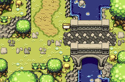
Blackbishop: It's a solid shot, but nothing jaw dropping or anything. Here's my advice: First, change up the trees. It looks weird how they're all exactly the same. I think using three different trees might look better. Second, just like with the sand, you're using the default grass tile too much. Personally, I try not to ever use it. Use the other four exclusively, and don't keep them in that 2x2 pattern. Just spread them out randomly. Then, break up the monotony of the grass a bit. Add some dirt here and there, maybe a mushroom, just little stuff to change things up. Little changes can do wonders for screens. And lastly, I'll excuse the symmetry, since it is the entrance screen, but in the future, unless there's a specific reason for a screen being symmetric, try to avoid it. It's not a bad screen altogether, it's just falling short of it's potential. Keep at it.