Heh, after I submitted, then looked at the shot again, I started banging my head against the keyboard (not literally). And I don't think it has
that much to do with emptiness, but moreso the palette. But as for the shot itself, I'm not liking it, either, guys.

Truthfully, it needs a little more filler, but it's better than it was before I upgraded: nothing but fallen leaves, flowers, and those little grass detail thingies.

But hey, I peeked around at the other palettes, and kabam!
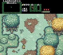
Now it looks much better. Well, to be able to see things, that is. And be glad it didn't look like this:
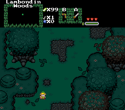
lol. That wasn't how it looked like, before. I just went back to my old file and made it to look
near exactly like the new, just for kicks. But enough about me, on to the others.
- CastChaos - Nice use of foliage on the rocks. Great rip, too. But the rip's the only thing you've got going for you in this shot, sorry. ;P
- LinkMystro - Ah, a very nice almost-GB shot. Good job on your design skills.
- Nuvo - Very good. But, as I've always felt about them, those mountains are ugly, and very unappealing to me. And they're also too realistic in comparison with the 2D graphics.
- Grand Master Aerandir - The Force is not with you.
- TriMaster001 - I probably would've voted for this. Good use of mountains, and amazing background. Good job.
Null'd, obviously, as I'm a contestant.

 This topic is locked