Looks awesome. About the subscreen, I don't like the transition between active and passive too much. The area around the triforce seems a bit empty and the area for passive items seems a bit big (a little overkill regarding the amount of items you need to fill it). I also am not a too big fan of the two maps, the are not so easy to compare since the rooms in the passive subscreen (that is the small one below, right?) are flatened, I think it would be worth it to aim for one map that combines the actual two maps through a script, especially for a modern mc-quest. I also am not too happy about the hearts/timer above the background pattern and the transistion between the limited magic meter and the area for additional magic (the gray line). I really like what you did with the counters, but do you really have a good idea how you can use level keys and normal keys together in a quest?
You screens look nice for the start, but are you aiming for a mc-tileset that looks as much as the original as possible? Otherwise I would think it could be nice to dirty thinks a bit, like lost isle did.
MC Tileset
Started by
Cukeman
, May 06 2012 06:51 PM
121 replies to this topic
#77

Cukeman
-

- Banned
-

"Tra la la, look for Sahasrahla. ... ... ..."
- Location:Hyrule/USA
Posted 18 June 2016 - 12:42 PM
Looks awesome. About the subscreen, I don't like the transition between active and passive too much. The area around the triforce seems a bit empty and the area for passive items seems a bit big (a little overkill regarding the amount of items you need to fill it).
Thanks for your feedback. The challenge here is creating a catch-all subscreen which has every option so that it's compatible with any typical quest (the default subscreens do this). I'm quite fond of my results, but if you wanna post an image depicting what you'd like to see I'll take a look. Please note that you can have multiple subscreen options in a tileset. This nice thing about the one you see here is that it's completely modular and thus highly customizable (each element is an individual piece on a separate layer) ![]() .
.
I also am not a too big fan of the two maps, the are not so easy to compare since the rooms in the passive subscreen (that is the small one below, right?) are flatened, I think it would be worth it to aim for one map that combines the actual two maps through a script, especially for a modern mc-quest.
The two maps function exactly how they always have in Z1 and ZQuest, and that's how they appear on the default subscreens. I'm not sure why it would be any more difficult to compare than with any other standard quest. Please note that this is a mock-up, and that the Active Subscreen map is 8x8 and used for dungeons, while the Passive Subscreen mini-map you see belongs to an overworld. Check out the third screenshot you see HERE to see an actual 8x8 style dungeon mini-map. Like I said, this is just a mock-up, in the actual game you'd only see the Active Subscreen map if you were in an 8x8 style dungeon.
Keep in mind this is just a tileset- I'm including a few smaller scripts for basic things, but scripting an entire custom map system is beyond the scope of my project, and is something I will leave up to the user to decide.
I also am not too happy about the hearts/timer above the background pattern and the transistion between the limited magic meter and the area for additional magic (the gray line).
Actually, while the time does cover a pattern, you might be interested to know that there is no pattern underneath the hearts.
I really like what you did with the counters, but do you really have a good idea how you can use level keys and normal keys together in a quest?
As I alluded to before, I'm including every option here. The default subscreens include both types of keys, so my subscreen does too. I realize that not everyone is going to use every possible item in each quest (that makes Link far too overpowered if you ask me), however I am making a subscreen here which is compatible with any standard quest. Anyone can choose not to include certain items, and while it's true this will result in blank item slots, there are 51 total item types- there's no way I am going to make 52 different subscreens (including one for 0 items). That's why I did the next best thing by making the subscreen modular so that it's customizable.
Z1 allows you to buy normal keys in shops so that if you get stuck in any dungeon, you can save up and buy some. I always liked this idea, although I never found any official Zelda title confusing enough to necessitate this. I can imagine a variety of ideas for keeping both level and normal keys though, if a quest maker really wanted to get creative, and who am I to deny that? Either way you're always free to just delete the key and counter you don't want off the Passive Subscreen.
You screens look nice for the start, but are you aiming for a mc-tileset that looks as much as the original as possible? Otherwise I would think it could be nice to dirty thinks a bit, like lost isle did.
As close I can get while keeping ZC's tools and options in mind, yeah. The first thing I did was get rid of those large triforce corners on the official MC subscreens. What a waste of limited space those are!
Thanks for your interest!
#78
Naru
-

- Members
-

Magus
Posted 18 June 2016 - 01:57 PM
I know that you just aim for the default settings, my suggestions are just random ideas that sound a bit like "you should better do it like that" because I have troubles wording them better, less regarding.
My point with the map is that the big dungeon map has rooms as long as high while the small dungeon map has rooms only half as long as high. With more complex maps I get problems to compare them both to see wich rooms are still not visited, also the only reason you even have two maps.... To replace these maps with one that shows not visited rooms in a color less dark to throw out the big map (that also has the ugly shutter-connection that is messed up if you use tile-warps) could be worth to add a script at default for your tileset.
With the keys my point is that you hardly can use both together (since the whole quest gets messed up if you use a normal key once where you have to use a level key. My other point is that is looks awesome with both key-counters but will look rather bad with one of them gone (what should be the case for most quests)
- Cukeman likes this
#79
Anthus
-

- Contributors
-

anthus
- Real Name:Antbus
- Location:Ohio
Posted 22 June 2016 - 11:13 PM
This looks really good, and this is probably the most progress I've seen on a Minish Cap tileset. Good job, keep it up. ![]()
- Cukeman likes this
#80
Cukeman
-
- Banned
-
"Tra la la, look for Sahasrahla. ... ... ..."
- Location:Hyrule/USA
Posted 23 June 2016 - 12:13 AM
Thanks! Figuring out palette options was the biggest hurdle. Moving forward I'm coming across some quirks in the enemy settings/options, and I know the limited number of tile pages is going to be a constant concern, but it's going pretty smoothly at this point ![]()
EDIT: Some of you might enjoy walking around the testing screens. Just keep in mind it's a work-in-progress, so you may encounter unfinished stuff.
Edited by Cukeman, 23 June 2016 - 05:14 PM.
- Anthus likes this
#81
Sheik
-

- Members
-

Deified
Posted 23 June 2016 - 11:06 AM
That is a lot of progress. Again, very nice stuff, Cukeman. As far as tileset projects currently running are concerned, this is the one which I am most interested in. It's a great effort and greatly appreciated.
- Cukeman likes this
#82
Anthus
-
- Contributors
-
anthus
- Real Name:Antbus
- Location:Ohio
Posted 23 June 2016 - 11:07 AM
Yeah I can't wait to remake Zelda 1 with it 
Edit: I ripped the Mt Crenal tiles, you can add them if they work with your palettes, but they are made for 8 bit color, but you're free to try!
Edit: I ripped the Mt Crenal tiles, you can add them if they work with your palettes, but they are made for 8 bit color, but you're free to try!
- Cukeman likes this

#84
Cukeman
-
- Banned
-
"Tra la la, look for Sahasrahla. ... ... ..."
- Location:Hyrule/USA
Posted 30 June 2016 - 06:25 PM
<- Screenshot Update #1
Screenshot Update #2:
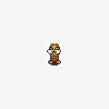
LEFT: In Z1 Moldorms are huge worms, but I also included the modern version of the Moldorm.
RIGHT: Red and Blue Lanmolas. The Z1 Lanmolas look more like modern Moldorms than anything, and since Lanmolas were replaced by Winders (which are almost always invincible) this was my best option. I did make a Winder enemy, but since tile space is at a premium, Winders will probably be available as an external tile page to import if you wish.


LEFT: Slashable pots and skulls with breaking animation/SFX and customizable item drop sets (and a dormant Armos).
RIGHT: Possessed pots and skulls (slash them before they rise and they're still regular pots and skulls!).


Pitfall/Lava scripts with Falling/Drowning animations (color of drowning animation is level-dependent [also, active Armos]).


Gibdos and Keese:


Fire Zols wreaking havoc:

Screenshot Update #3 ->
Screenshot Update #2:
LEFT: In Z1 Moldorms are huge worms, but I also included the modern version of the Moldorm.
RIGHT: Red and Blue Lanmolas. The Z1 Lanmolas look more like modern Moldorms than anything, and since Lanmolas were replaced by Winders (which are almost always invincible) this was my best option. I did make a Winder enemy, but since tile space is at a premium, Winders will probably be available as an external tile page to import if you wish.
LEFT: Slashable pots and skulls with breaking animation/SFX and customizable item drop sets (and a dormant Armos).
RIGHT: Possessed pots and skulls (slash them before they rise and they're still regular pots and skulls!).
Pitfall/Lava scripts with Falling/Drowning animations (color of drowning animation is level-dependent [also, active Armos]).
Gibdos and Keese:
Fire Zols wreaking havoc:
Screenshot Update #3 ->
Edited by Cukeman, 20 July 2016 - 11:46 PM.
- Shane, Sheik, Jared and 2 others like this
#85
Cukeman
-
- Banned
-
"Tra la la, look for Sahasrahla. ... ... ..."
- Location:Hyrule/USA
Posted 01 July 2016 - 09:56 PM
I've got a decision to make...
There's currently a bug in ZC that causes enemies to appear two pixels higher than they should. This is especially noticable in side-view quests, where enemies appear to be "floating".
Now that I have the scripting tools to make and position large enemies, I could go in and adjust each enemy to correct that behavior... However, if that bug is ever fixed, then the enemies I adjust will just be off 2 pixels again (this time in the other direction).
Should I worry about this tileset being forward-compatible? From what I hear the next build may be a rewrite instead of an update. Sure my tileset could be 2.50.2 exclusive, but 2.50.2 already has some painful bugs in it...
#86
Sheik
-
- Members
-
Deified
Posted 02 July 2016 - 05:20 AM
I would suggest not to care for the moment if it is a major thing to implement and check back with the developers how they feel about said bug and any future fixing of it.
Edit: Also, it is a bit late now for palette critique, eh? I was thinking that maybe the Like Like should be a little rosier. Probably even using Link's skin tones? I felt the same about Abei. Well, it is a minor thing.
Edited by Sheik, 02 July 2016 - 05:22 AM.
#87
Cukeman
-
- Banned
-
"Tra la la, look for Sahasrahla. ... ... ..."
- Location:Hyrule/USA
Posted 02 July 2016 - 06:17 AM
Well if I don't address the 2 pixels off thing, does that mean I have to make my new large enemies 2 pixels off on purpose to match? Since I'm coding their position with a script I don't know if they'd be affected by an update or not.
Naturally with a smaller number of colors there will be subtle shifts in value and saturation. I'm constantly having to find the closest color, and decide to go a little lighter or a little darker, a little redder or a little browner, etc.
Here are the two choices I was going back and forth with on the Like Like, one is slightly too light, and one is slightly too dark:

Working at ZC's 2x scale, I felt the left one looked better. At a 1x distance, I kinda feel the right one looks better.
Naturally I can't screw all the other sprites to make one enemy look better, but when I get further along in the tileset if one color is consistently off I'd think about changing the palette. I am noticing that the lightest yellows and greens for instance, tend to be more saturated than in my palette. But I wanna gather more comparison data before looking into stuff like that.
Edited by Cukeman, 28 August 2016 - 05:48 AM.
- judasrising, Sheik and Jared like this
#88
Sheik
-
- Members
-
Deified
Posted 02 July 2016 - 04:36 PM
If you are going to use the same pink/brown on the Moblin's as well, then it probably really is going to look too dark. In 1x scaling, the right option looks better to me, too.
...So, given you are putting so much work into this and while this might be the wrong place to address this (after all, this is the tileset thread, right?), I have to ask: do you have plans for a quest project with this?
#89
Cukeman
-
- Banned
-
"Tra la la, look for Sahasrahla. ... ... ..."
- Location:Hyrule/USA
Posted 02 July 2016 - 05:49 PM
My main quest project, Zelda III: The Return of Link, slowed to a halt because I got busy with university, it felt like a really massive project, and I was creating custom graphics for it at the same time that I was actually building the quest (which automatically made it take at least twice as much time to develop), plus I lost a whole lot of my plans for it when my hard drive failed.
So, I focused on just making a MC tileset instead, it feels easier. Instead of a whole quest to complete, it presents small tasks that can be accomplished within a day, such as a couple enemies, a couple SFX, or a few combos.
I think it would be fun to do a Z1 remake (and there's a lot of different approaches you can take when you're doing that with this tileset). Each time I test out my work, I'm remaking/learning about the different ways to remake small sections of Z1.
Beyond that, making this tileset is really helping me to learn all the corners of the program, what each menu is for, etc. In short, I would consider making a Z1 quest when this tileset is complete, before then, I'm not really gonna spend any time thinking about it.
On a broader scale, MC graphics just really appeal to me because they feel like the perfect balance between the visual style of ALttP, WW and the N64 games, and it comes with a really large amount of the enemies, items and characters those games have in common, so it feels like less of a jump to remake existing Zelda games in MC than in any other graphic style (in my opinion). i.e. it feels very much like a strong representation (visually) of the series as a whole, so quests in this style feel very true to the overall look and feel of the franchise.
As soon as I played MC it felt and looked like it was designed as an engine for 2D remakes of the N64 games. I'm not crazy enough to attempt that, demakes are kind of bad, but if you reimagine them as a ZQuest I think you could get some nice results.
So... yeah, with a completed tileset I'd either wanna do a Z1 quest or just keep making additional combos and enemies in the MC style.
- Sheik and Jared like this
#90
Cukeman
-
- Banned
-
"Tra la la, look for Sahasrahla. ... ... ..."
- Location:Hyrule/USA
Posted 04 July 2016 - 02:13 AM
Finished the Weapons/Misc Sprites today! That means my primary goal is complete ![]()
[✓] Link
[✓] Items
[✓] Weapons/Misc Sprites
I guess that means my secondary goal is Enemies, SFX, and Message Strings for standard items.
In-between, I'll probably work towards an old-school subscreen, and some more Field/other combos for Link to interact with.
Some of the SFX are real stumpers though... what to use for Hammer, Refill (default is horrible), Spell Rocket, Summon, and Cane of Byrna?
- Sheik, Jared and Dark Ice Dragon like this
1 user(s) are reading this topic
0 members, 1 guests, 0 anonymous users

