Screenshot of the Week 262
#1
Posted 28 June 2009 - 09:19 PM
You got the Kakariko Overhead Sign! ... now where are you going to put it? (Gah, unfinished subscreen!)
Prophecy Face
Welcome to Boringtown!
Midnight_King
T. Platinum
Just messing around with Angeal's tileset.
Beta Link
Waiting for the opportune moment to strike...
#2
Posted 28 June 2009 - 09:34 PM
I voted for Beta Link.
Beta Link - 8.5/10
Absolutely amazing mountain design. You probably have one of the best remakes I've ever seen. Well Done.
Migokalle - 8/10
Nice tiles and custom subscreen, but I was expecting a lot more from you. It's overall a great shot.
Prophecy Face - 7/10
Looks pretty generic if you ask me.
Midnight_King - 6.5/10
Those orange flowers keep the color flow of the screen unbalanced. Try using a different palette. Plus, work on your use of greenery. It feels rather TOO green for me.
T. Platinum - 6.5/10
Nice rips but I don't see anything going for it.
Edited by Dawnlight, 28 June 2009 - 09:44 PM.
#3
Posted 28 June 2009 - 09:45 PM
Midnight_King - 6.5/10
Those orange flowers keep the color flow of the screen unbalanced. Try using a different palette. Plus, work on your use of greenery. It feels rather TOO green for me..
There not Orange. there red and there roses. The pallet was a mistake I forgot about it its meant to be the spring pallet. and its a field so it should be green.
Any more complains?
Edited by Midnight_King, 28 June 2009 - 09:48 PM.
#4
Posted 28 June 2009 - 09:56 PM
There not Orange. there red and there roses. The pallet was a mistake I forgot about it its meant to be the spring pallet. and its a field so it should be green.
Any more complains?
Anyway...
Migo: Awesomesauce. Would get my vote if I wasn't participating myself.
Prophecy: Good, solid New1st shot. Nothing wrong with it, but then again, nothing spectacular about it either.
Midnight: OMG JPEG!!!! D:< And so forth. Good shot though, very nice transparent water, too.
T. Platinum: Nice, but it doesn't have anything really going for it. More a showcase of ripped tiles than anything else.
Beta Link:
#5
Posted 28 June 2009 - 10:00 PM
Well the bad quality of the image does make the roses look orange.
Anyway...
Migo: Awesomesauce. Would get my vote if I wasn't participating myself.
Prophecy: Good, solid New1st shot. Nothing wrong with it, but then again, nothing spectacular about it either.
Midnight: OMG JPEG!!!! D:< And so forth. Good shot though, very nice transparent water, too.
T. Platinum: Nice, but it doesn't have anything really going for it. More a showcase of ripped tiles than anything else.
Beta Link:
Oh OK but they seem red to me. Thanks through.
#6
Posted 28 June 2009 - 11:20 PM
Migokalle comes in a VERY close second. I'm a sucker for pretty tilesets.
#7
Posted 28 June 2009 - 11:38 PM
#8
Posted 29 June 2009 - 01:41 AM
T.Platinum is my 2nd favorite since i'm a fan of the NES FFIII tileset.
Midnight_King: Please Save your shots in .GIF format The color-loss really damages your shot in this week's entry.
#9
Posted 29 June 2009 - 02:02 AM
#10
Posted 29 June 2009 - 02:27 AM
Prophecy Face: It's pretty good, but the mountains are a bit too straight.
Midnight King: Probably the best screen I've ever seen from you.
T. Platinum: Final Fantasy. Neat.
Beta Link: Nice screen. Link is a ninja!
I'm really torn between Beta and Migo. So hard to decide... *goes to random.org* Beta Link wins.
#12
Posted 29 June 2009 - 12:56 PM
Nice shots this week, everyone. Keep up the good work!
#13
Posted 29 June 2009 - 01:34 PM
Migo: It looks good, but several things about it stand out. The change in the mountains perspective looks a bit weird, but I suppose its workable. Except for that mountain error in the lower left corner. The stairs could use some work though. the grass borders next to them look weird. If you could show a bit more of the mountain through the grass, I think that might help (looks like that's what you tried to do) -OR- reverse the angle on the grass, so that it goes up towards the gray stone instead of down. Also, continuing the grass overlay onto the top of the stairs would help. Other than all that... looks good.
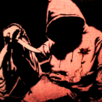
Prophecy Face: Not a whole lot to say, your caption describes it well enough. An NPC could help fix that though. Other than that, a good GB screen.
Midnight king: Color loss aside, it looks pretty good. But a few things stand out. The water seems very cluttered. maybe get rid of half the junk there, it might look a bit better. Speaking of water- The edges of the water, where it meets the ground, stand out way too much. It looks like those tiles have a solid black around their edges, rather than transparent. The black edge gets changes the color of the mountains and makes it look... weird. Or maybe its just me. Only other thing, slashables one tile in from a walkable screen border = Bad idea.
T. Platinum: It looks exactly like you described it. I can't really say any more.
Beta Link: I cant really say much about it. Looks really good.
Other than that, I just noticed something odd that applies to everyone (except T. Platinum). Flowers: Correct me if I'm wrong, but don't flower petals typically change colors, not the stamens? I'm sure there's exceptions...but still...
Sorry if this seems overly critical, its just work has me worked up right now *ba-dum pish*
Edited by Xiion, 29 June 2009 - 01:53 PM.
#14
Posted 29 June 2009 - 01:56 PM
Correct me if I'm wrong, but don't flower petals typically change colors, not the stamens? I'm sure there's exceptions...but still...
You have a point. But after a quick Google search for "white flower", I see some with yellow, purple, and pink centers. I'm content with that, but I'll also experiment with different colored petals and see how they look.
#15
Posted 29 June 2009 - 04:58 PM
Midnight_King: Please Save your shots in .GIF format The color-loss really damages your shot in this week's entry.
Lol, of course he said .PNG ... PNG FTW
Anyway, I voted for Midknight_King, the design appeals to me (=the shapes).
0 user(s) are reading this topic
0 members, 0 guests, 0 anonymous users