Screenshot of the Week 224
#1
Posted 18 August 2008 - 10:03 PM
It's a bird! It's a plane! It's... Super Classic!
Migokalle
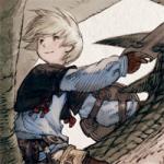
Link walks around in a old screenshot. Wahoo!
TheMasterSwordsman
It's my first quest's starting screen, Purified!
ZeeLiam
#2
Posted 18 August 2008 - 10:48 PM
your shot blows the other shots out of the water! "vote"
Migo: Nice shot, but DoR has become over used.
TheMasterSwordsman: Its a solid shot.....
Edited by ZeeLiam, 18 August 2008 - 10:49 PM.
#3
Posted 18 August 2008 - 11:08 PM
*Voted for Lostinhyru1e.*
Edited by Owneybaloney, 18 August 2008 - 11:47 PM.
#4
Posted 18 August 2008 - 11:42 PM
#5
Posted 18 August 2008 - 11:51 PM
Everyone's this week are good.
#6
Posted 19 August 2008 - 12:55 AM
Migo's is close, however I don't like the house. Really, I don't like it at all. Don't ask me why, but I just don't. It just seems to detract from the quality of the rest of the shot. If it had been a true LTTP house, it'd have gotten my vote. The palette looks like Earthbound Zero, for some reason
#7
Posted 19 August 2008 - 03:07 AM
#8
Posted 19 August 2008 - 04:37 AM
LostInHyrule: Beautiful shot,
your shot blows the other shots out of the water! "vote"
Migo: Nice shot, but DoR has become over used.
TheMasterSwordsman: Its a solid shot.....
Okay, this is NOT because I don't respect your opinion. I do. But I HATe it when people say that "DoR is overused" or "Pure is overused".
If it's so god damn horrible, make yourself a new one!
A good thing CANNOT be overused. A bad thing shouldn't be used. That's how it is...
LiH's shot would have gotten my vote. It's simply amazing... AND it's classic! It's amazingly classic
#9
Posted 19 August 2008 - 06:02 AM
#10
Posted 19 August 2008 - 06:05 AM
If it's so god damn horrible, make yourself a new one!
I second that. That, or use a different tileset, which is probably just the same thing Migo said. Try to be original instead of criticizing everyone else's decisions. Not meant to be flaming anyone, but still..
#11
Posted 19 August 2008 - 07:53 AM
#12
Posted 19 August 2008 - 08:09 AM
I love what you've done with classic!
#13
Posted 19 August 2008 - 11:09 AM
Edited by AgentLym, 19 August 2008 - 11:10 AM.
#14
Posted 19 August 2008 - 11:31 AM
LiH: Everyone and their dog has revamped the classic tileset... well, not really, but revamping that tileset is one of the easiest things to do for tilesets. Heck, I'VE revamped it.
Migokalle: Almost everyone has used DoR at one point
TMS: Almost everyone has used Pure at one point
ZeeLiam: Same as LiH.
So really, whether or not one would say a tileset is overused, you gotta realize what you're using as well, all of the tilesets here have been used a bit, but they all look good, which is why they're used. If it's a custom tileset, then I give ya props on that.
Now, I think I'm gonna give some C&C now.
LiH: The colors are well done, and so is the action. HOWEVER, I aint a fan of this fragmented screen design with classic mountains. Period. You can pull that off with the more detailed mountains because they can do elevation better, but in order for this to look better in my eyes, you're going to have to attempt to emulate elevation a bit more clearly with them.
Migokalle: I don't actually have any problems with this screen. Maybe... I don't like the palette, but it's hard to describe what I think can make it look better.
TMS: This is actually really excellent concerning ground details, it's a really good overall shot. But, the blocky mountain set that loops around the entire screen isn't too attractive to me. Also, gameplay wise, the bushes that sit right at the edge of the screen probably aren't a good idea to have there.
ZeeLiam: The enemy colors aren't that attractive. That small rock in the top right corner isn't a good idea to keep there, I suggest a mountain corner there instead. And the small island part in the bottom left, would look better if it had a more rounded edge at the corner, and a top right big tree corner would work well in the very bottom left part of the screen.
#15
Posted 19 August 2008 - 12:44 PM
0 user(s) are reading this topic
0 members, 0 guests, 0 anonymous users