im cold...
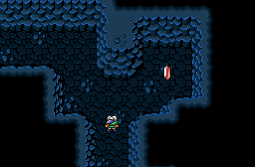
Haylee
The enticing pretty crystal cave draws the adventurer's eye.
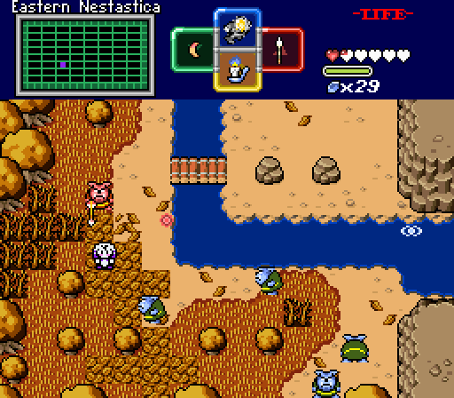
Mani Kanina
[Scarlet Thicket Intensifies]
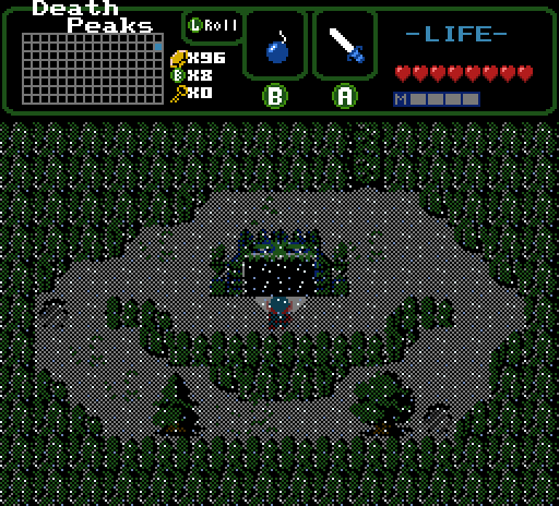
Orithan

 This topic is locked
green and retired

Posted 14 July 2025 - 06:33 AM
The Magical Vixen

Posted 14 July 2025 - 10:14 AM
Great turnout this week! Here's my thoughts:
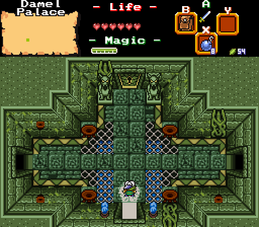
Airfart: Good use of classic tiles. Very mysterious atmosphere! The climbable wall is a bit hard to see, but I don't think it's that bad of a thing here.
Haylee: Oo, very pretty usage of palette cycling, love it!
Mani Kanina: My vote went here. Just a very nice looking "modern" BS screen with a lot of good-looking custom/edited tiles!
Orithan: My thoughts about Mani's echo here, a very nice "modern" take on BS tileset. Very nice custom dungeon tiles.
Magical Witch

Posted 14 July 2025 - 03:52 PM
God this is gonna be a tough week. Literally all 4 of the shots are really good. I like the the unusual tileset representation: 1 Classic, 2 BS, 1 (almost completely) custom. 0 Game Boy or DoR.
Airfart: The translucency is really strong here, but I really like it. It adds to the atmosphere a lot and makes it feel like the thick of night. I like the tiny little light cone the character gets here, too.
Haylee: This palette slaps. So shiny...
Mani Kanina: I've talked about it at length before, but I'm still absolutely in love with the way you've used the BS tileset. It feels so authentically SNES-y. I love the palette and the shaded leaf tiles...
Orithan: Love this one a lot. Really digging all the custom tilework here, especially the floor borders and the braziers.
It was extremely hard to pick one, but I ultimately went with Orithan. Good job, everyone!
Trofessional Pransposer

Posted 16 July 2025 - 01:14 AM
Airfart
It's always neat to see old-school transparency like this. While the screenshots are all presented pixel-perfect here, I'd bet this would look great on an actual CRT with a degree of natural blurring. This area feels ominous!
Haylee
I like the subtle color changes in the walls. It reminds me of a rupee's animation, which goes hand-in-hand with the crystal theme. I'm eager to see what an area with a bit more variety in the ground or walls would look like.
Mani Kanina
A solid screen! I like the transition between the tree-filled, leafy region to the apparently more arid, rocky region. There's a lot of detail here and it looks like a fun area to play.
Orithan
Nice dungeon shot. I like the mix of the symmetric layout with the asymmetric details. It gives the room a bit of life and organic-ness.
A tough choice as usual, but my vote goes to Mani Kanina this week.
~ I will spread my wings ~

Posted 18 July 2025 - 07:26 PM
Not voting for obvious reasons but I really like Mani's use of BS, and it looks prettier with each screenshot I see her make in it. airfart's is interesting, but I'm very half and half on whether or not I like dithered lighting or not. Depending on the day I'm leaning on not, while others I don't mind it. Meanwhile with Orithan's, it's a pretty simple dungeon entrance screen, but there's a lot going on that does a good job teasing potentially what the dungeon could be about.
As far my shot, it's an old cave palette I made years ago for a cancelled two week project. I do like how that palette looks, but I kind of wish I made a new screen instead of using an old screen from it though. I may start uploading screenshots from old cancelled projects for the foreseeable future while I get my modern projects figured out.
green and retired
Posted 21 July 2025 - 10:48 PM
 |
Mani Kanina
PureZC Events →
Screen Rebirth →
Poll Screen Rebirth 37! The Contest!Started by Moosh , 29 Jun 2026 |
|

|
|
|
|
Mani Kanina
PureZC Events →
Screen Rebirth →
Poll Screen Rebirth 36! The Contest!Started by Moosh , 15 Jun 2026 |
|
|
|
|
|
Matthew
PureZC Events →
Screenshot of the Week →
Poll Screenshot of the Week 878Started by Anthus , 31 Mar 2026 |
|

|
|
|
|
Twilight Knight
PureZC Events →
Screenshot of the Week →
Poll Screenshot of the Week 876Started by Anthus , 16 Mar 2026 |
|
|
|
|
|
Zeron
PureZC Events →
Screenshot of the Week →
Poll Screenshot of the Month 218Started by Anthus , 08 Mar 2026 |
|
|
0 members, 1 guests, 0 anonymous users

