Jump to content

Photo

Screenshot of the Week 645

Shoshon the Elegant Anthus aiib

  • This topic is locked This topic is locked
15 replies to this topic

Poll: Screenshot of the Week 645 (48 member(s) have cast votes)

Cast your vote!

You cannot see the results of the poll until you have voted. Please login and cast your vote to see the results of this poll.
Vote

#1 Neppy

Neppy

    Grand Overlord Empress

  • Members
  • Real Name:It's dangerous to go alone. Take Nep!
  • Location:Minnesota

Posted 14 January 2018 - 11:10 PM

Just putting this here as a reminder to the rules in Screenshot of the Week.

1. When commenting on screenshots, please leave constructive feedback. The screenmaker will find it most helpful if you list both the positive and negative aspects of their screen in a clear, polite manner.

There should not be any one or two word posts... anywhere on PureZC, as it counts as substance-less. If you don't have anything to comment on for any of the screens, then there isn't really any reason to post at all. Thank you.
 
Anthus
Anthus.png
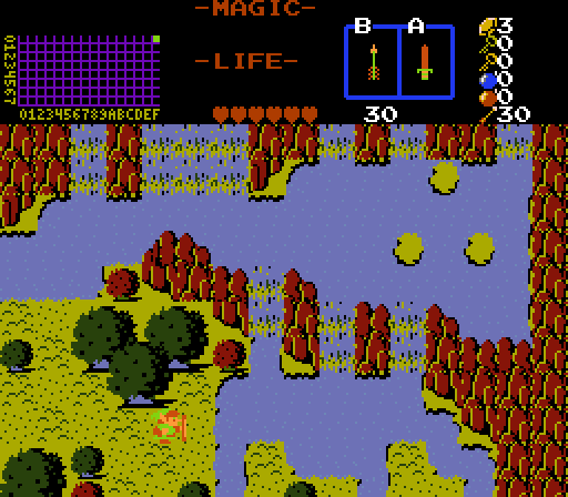
The palette of Ill Omen.

allb
allb.png
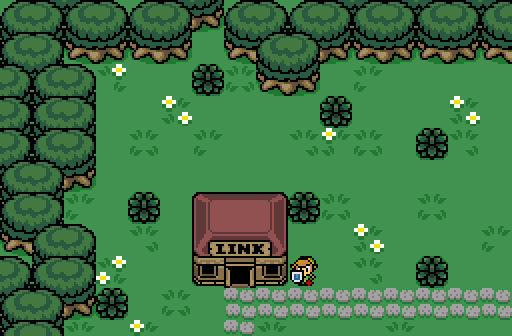
This is from my first Game, that I just started.

Shoshon the Elegant
Shoshon%20the%20Elegant.png
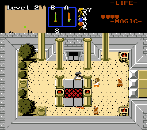
Prometheus battle with the god of wine and theatre, Dionysus.
Summoner of Satyrs, just his touch can confuse Prometheus into doing things he doesn't intend to do.


  • Anthus likes this

#2 Jenny

Jenny

    braixen

  • Members
  • Real Name:Jennette
  • Pronouns:She / Her

Posted 14 January 2018 - 11:35 PM

I voted for allb.


It has charm.


  • Sheik, Jared and allb like this

#3 Architect Abdiel

Architect Abdiel

    Kingdom Builder

  • Members
  • Real Name:Michael
  • Location:Florida

Posted 15 January 2018 - 12:08 AM

Anthus:
Really lovely colors and excellent construction.

allb:
Not a bad first screen. It could use some more ground detail. And some contrast. It's very green. Try zigzagging the trees instead of placing them in a line. Again though, not bad.

Shoshon the Elegant:
So glad I finished that level. :D

Edited by Shoshon the Elegant, 15 January 2018 - 12:11 AM.

  • Anthus and allb like this

#4 Eddy

Eddy

    ringle

  • Moderators
  • Real Name:Edward
  • Pronouns:He / Him
  • Location:London, United Kingdom

Posted 15 January 2018 - 01:25 PM

Anthus - Pretty interesting shot here. The palette is neat and the design seems quite nice. I wonder if that triangle of islands on the top-right is hiding any secrets :P


allb - Off to a good start, I like the openess of the shot so neat job with that. If I may suggest a couple things to liven up the shot a bit, maybe add a bit of tall grass in places to have a bit more ground variety. Also, you could add some NPCs to populate the screen a bit (assuming this is a village). One last thing, what Shoshon said, try not to stack up trees vertically like that. It's more of a personal preference thing I guess, but I find stuff like that to look really odd and weird, so you could try placing them all diagonally instead. Again though, it's a good start and good luck on your first quest!


Shoshon the Elegant - I really like the overall look of this shot. Assuming this is a boss room, the battle arena looks pretty nice and I especially like those pillars and general details. One thing that confuses me though, what is the floor supposed to be? I keep assuming that's off-coloured water since it uses the same graphics. If it's meant to be sand or something, then I could probably recommend to make some proper sand tiles since it might look nicer IMO. Good work anyway.


I voted for Shoshon this week.


  • Anthus, Shane, Cukeman and 1 other like this

#5 Anthus

Anthus

    Lord of Liquids

  • Banned
  • Location:Ohio

Posted 15 January 2018 - 01:59 PM

I really like the contrasting colors in Shoshon's, and the custom sprites add a lot of personality. Keep it up (but I know you will). :)

Allb's isn't bad, but as others said it could use a bit more detail. It's still a solid screen from a construction stand point, and you're off to a good start.

I can't be the only one who read that part in LttP as "The lake of 3 Omen". I also thought Il Pantissmo in Mario Sunshine was "2nd Pantissmo". :P
  • Cukeman and allb like this

#6 Nathaniel

Nathaniel

    Deified

  • Members

Posted 15 January 2018 - 02:54 PM

It's great to see more than one classic screen in a SotW that goes above and beyond the basics, yet employ a diversity of thought processes.  It's nice to get that once in a while.

Anthus - Lots of yes to go around here, even though I can't say it like Marv Albert.  While it's not my favorite color combination, the attention to detail is strong.  My vote for what looks to me like the most superior effort down to every detail.

allb - The screen shows a basic ability to design, but to me it seems to lack the passion of creativity, which no doubt comes with experience.  It certainly is functional and would work fine in a lot of quests, but I just don't see much beyond that in this one.  It gets a pass on competency at least.  Competency alone won't win you contests, but it does make stuff that works.  Keep at it though, and find some inspiration from others when you are ready for it.

Shoshon the Elegant - This definitely shows passion, using quite a variety of tile choices that attempt to work together, and takes its share of risks in classic.  The only reason this one didn't get my vote is that while it really strives for something, I don't feel it's executed quite as well as what you see in Anthus' screen.  The tiles don't seem to mesh quite as well in comparison (thus those risks), but the ideas are definitely firing on all cylinders, which is often enough to win on plenty of weeks.


  • Anthus, Cukeman and allb like this

#7 Sheik

Sheik

    Deified

  • Members

Posted 15 January 2018 - 03:53 PM

I voted for allb.


It has charm.

I second this vote with the same reason.


  • Jenny and allb like this

#8 Jared

Jared

    Deified

  • Members
  • Real Name:Jared
  • Pronouns:He / Him
  • Location:New Hampshire

Posted 15 January 2018 - 07:31 PM

I voted for allb.


It has charm.


Took the words out of my mouth. (post? :P) Something about it is just so simple and charming....I can't even put my finger on why honestly. I love it.


  • Jenny and allb like this

#9 David

David

    Fallen leaves... adorn my night.

  • Administrators
  • Real Name:David
  • Pronouns:He / Him

Posted 15 January 2018 - 07:33 PM

I voted for Shoshon the Elegant because of its superior design and detailing. In my opinion, allb's screenshot does not have enough details while Anthus' screenshot does not have a very strong palette nor atmosphere. Other than that, this is still a pretty solid week. Good job everyone! :)


  • Cukeman likes this

#10 Cukeman

Cukeman

    "Tra la la, look for Sahasrahla. ... ... ..."

  • Banned
  • Location:Hyrule/USA

Posted 16 January 2018 - 11:41 AM

Anthus

I've got to admit, I ran away from your screen because of the palette making me a little nauseous. But on closer look it is a really neat area in that is has a lot of geography that's pretty elaborate in the sense that there's a lot going on and no real wasted space, but it also doesn't feel crowded, which is a hard balance to pull off. However, I do have one gripe with it. The water in the upper right is at a higher elevation than the water in the upper left, but there's no visual clues in the water to indicate that.


(The body of water between the north and south waterfalls appears to be entirely on the same elevation level until you realize that the left portion is level with the ground at Link's feet and the right portion is coming down a waterfall two combos taller than the ground at Link's feet). Once you realize that it does break the perspective. On the plus side, it's kind of subtle and you won't see it unless you're looking for it. And I know the tileset doesn't come with any sideways waterfall tiles to fix that little problem (Classic wasn't made to be that flexible), but a new combo or two could be created to make that possible...


allb

As the others said, great start, looks a little simple (kind of like the upper left corner of a box). Nothing to be ashamed of, it's good, and you'll improve with practice.


Shoshon

I like this a lot and voted for it. You have a knack for breathing life into Classic. I didn't notice until Eddy pointed it out, but yeah using different colored water (and water borders) for sand looks a little odd. I get that you're doing grass overlapping sand, but I feel like you should use grass/sand borders and try using the "bumpy" ground tile instead (combo 14 in 2.50.2). One last thing, but it's very minor, the tree trunk is as black as its shadow, I'd like to see a brown (even a very dark brown) especially as the room looks very bright and well lit, it feels like we're losing detail on the tree without a reason, given this isn't an area with low visibility or unique lighting making lots of dark shadows. I like how the pillars make the room feel like we have a really high ceiling, but they would logically stop at the top of the walls. Pretty minor considering Z1 perspective feels unnatural to begin with. You could fix it by lowering the pillars to the height of the wall, or editing the wall to be taller. Not a big deal though, just something I thought I'd mention. Sorry to nitpick so much, it's really a great looking screen and I love the theme, and you did steal my vote :) .


Edited by Cukeman, 16 January 2018 - 11:44 AM.
  • Anthus and allb like this

#11 Geoffrey

Geoffrey

    Chosen One

  • Members

Posted 16 January 2018 - 04:06 PM

Anthus, I like how you've managed to create perspective with the most perspective-less mountains in ZC.


  • Anthus and Sheik like this

#12 Sans

Sans

    Hey kid wanna buy hot dogs ?

  • Members
  • Location:Judgement Hall

Posted 17 January 2018 - 04:59 PM

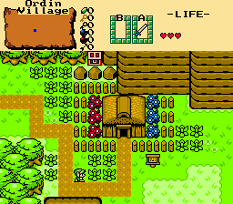
Here's a screenshot of a screen of the remake of my original and first quest here.

zelda020.png


#13 Anthus

Anthus

    Lord of Liquids

  • Banned
  • Location:Ohio

Posted 17 January 2018 - 05:15 PM

That's a cool screen and all, but perhaps you were looking for the SotW dropbox instead? Or the screenshot thread? :P


People don't really post screenshots in these contests, you have to enter, then the contest goes up on Sunday, or Monday.


#14 Sans

Sans

    Hey kid wanna buy hot dogs ?

  • Members
  • Location:Judgement Hall

Posted 17 January 2018 - 06:34 PM

well i think the SotW dropbox would be a good choice


  • Anthus likes this

#15 Anthus

Anthus

    Lord of Liquids

  • Banned
  • Location:Ohio

Posted 17 January 2018 - 07:52 PM


(The body of water between the north and south waterfalls appears to be entirely on the same elevation level until you realize that the left portion is level with the ground at Link's feet and the right portion is coming down a waterfall two combos taller than the ground at Link's feet). Once you realize that it does break the perspective. On the plus side, it's kind of subtle and you won't see it unless you're looking for it. And I know the tileset doesn't come with any sideways waterfall tiles to fix that little problem (Classic wasn't made to be that flexible), but a new combo or two could be created to make that possible..


(Oops, I missed this)


I never really noticed that till you pointed it out. I sort of envisioned this area having a rocky ridge that goes along a creek bank that is raising, but that would be odd in nature. Another easy fix would be to just make the waterfalls in the middle section regular water tiles, but I like them. I remember Jared made sideways waterfalls for one of his recent SotWs, and it looked really awesome. I dunno if such a thing could be done in Classic with those ugly stock waterfalls convincingly though xD


Also tagged with one or more of these keywords: Shoshon the Elegant, Anthus, aiib

0 user(s) are reading this topic

0 members, 0 guests, 0 anonymous users