Anthus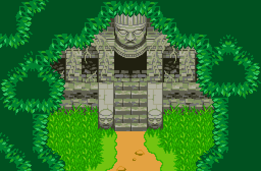
"Oh look, graphics."
Ecruteak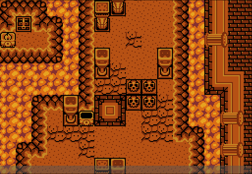
Can't be sure, but it might be pretty hot here.
Jared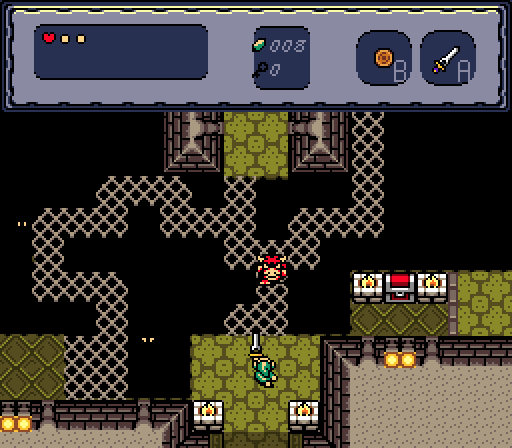

-
 This topic is locked
14 replies to this topic
#1

Neppy
-

- Members
-

Grand Overlord Empress
- Real Name:It's dangerous to go alone. Take Nep!
- Pronouns:She / Her
- Location:Minnesota
Posted 15 October 2017 - 10:13 PM
#2
Zaxarone
-

- Members
-

Gigi & Merri Superstar Saga
- Real Name:Derek
- Location:Oregon
Posted 15 October 2017 - 10:26 PM
anthus: Very nice shot. it lacks in the area of movement. it feels kinda still and boring. still looks nice this is tied with jareds.
Jared:nice gb screen, definitely nice with the shading. 2nd place, tied with anthus.
Kekruteak:this one is the winner for me. i like your take on classic. makes me want to go back and play another land.
The lava with a mix of gb esque and outlands walls on the outside is something i wish i would've thought of. 10/10
#3
Geoffrey
-

- Members
-

Chosen One
Posted 15 October 2017 - 10:36 PM
Damn, Anthus, where'd those come from?
- Anthus likes this
#4
Shane
-

- Members
-
🤍
Posted 16 October 2017 - 03:05 AM
Damn, Anthus, where'd those come from?
They came from Gunple: Gunman’s Proof, a very LttP-esque game.
All amazing shots, but I voted Jared. Good job everyone!
- Anthus and Jared like this
#5
Moosh
-

- Moderators
-

The Mush
Posted 16 October 2017 - 03:38 AM
Anthus: I really like the tiles in this screen, but I'm not so fond of the palette. The greens of the grass and the yellowing color of the dirt don't seem to fit well with everything else. Sort of like you started out going for an NES Zelda bootleg look and ended up trying for something more SNES-like.
Ecruteak: Really solid screen. My only real complaint is it's rather monochrome, and my tileset is to blame there. Would have voted if not for...
Jared: Jared! AAAAAAAAAAAAAA! Thas a pretty screen. With gameplay! Oh man. Empty hearts on the subscreen look a little thick. Like I feel they'd work better either as tiny white dots or empty white hearts. I gotta have at least one nitpick. ![]()
- Jared likes this
#6
Moon
-

- Members
-

goopy
- Pronouns:She / Her
- Location:Viridi Town
Posted 16 October 2017 - 06:40 AM
Anthus: Pretty graphics, but a lot of the screen appears to be taken up from what I assume are overhead layers. Feels a bit cramped from a gameplay perspective, but it looks good for what you were going for.
Ecruteak: Solid screen, not a fan of the lack of color variety but I assume that's a tileset thing so I wouldn't really say it makes it a worse screen.
Jared: Simple but interesting. Looks like it might be fun to play.
Voted for Jared.
#7
Cukeman
-

- Banned
-

"Tra la la, look for Sahasrahla. ... ... ..."
- Location:Hyrule/USA
Posted 16 October 2017 - 08:11 AM
Voted Jared. I love how multiple route screens make ZC feel bigger (tricky to pull of without making it feel cramped).
Really like what you have going Ecruteak, except for the pillars on the right wall, they clash with the style and perspective.
#8
Titanium Justice
-

- Members
-
Justice is served!
- Real Name:Jared
- Location:Ontario
Posted 16 October 2017 - 09:27 AM
I'm going to vote for Anthus. Love that temple exterior. Reminds me of a Mayan construct.
#9
Joelmacool
-

- Moderators
-
Addicted to Overwatch
- Real Name:Joel
- Location:Country of Europe
Posted 16 October 2017 - 10:24 AM
I'm going to be completely honest with the screen Anthus posted. I can say that while the concept is cool, the actual way it was created is a bit off. I'm not sure what it is that makes me not like the screen, but I can say that the perspective look very odd. By this, I mean that the perspective of the overhead bushes contradict a lot with the actual temple. This is because the perspective of the temple is from an angle that is much different from that of the overhead bushes (the perspective there being birds-eye view).
To me, this creates an eye-sore and doesn't look appealing to me at all. Thus, I voted for Jared.
- Anthus, Twilight Knight and Jared like this
#10
Twilight Knight
-

- Members
-
Tell all with glee, Argon's on PureZC
- Real Name:Sven
- Location:Rotterdam, NL
Posted 16 October 2017 - 11:02 AM
Another excellent round of SotW!
Anthus: These graphics are amazing and I really like the screen layout, giving you that epic, yet ominous vibes. The only feedback I can give, is that the tree leaves are in a different perspective. They are more top-down instead at another degree like the temple. Perhaps you could play a bit with the "top" parts of the leaves, I hope you understand my vague description.
Ecruteak: I really like this screen layout and atmosphere, but I'm unsure about the mixture of graphics. The classic walls have less detail and shading than the GB graphics. If you like revamping graphics, I'd suggest you try to detail the classic walls some more, but otherwise you shouldn't really bother, I think. This screen looks great.
Jared: I like the clean graphics and the layout of this shot, it's definitely a nice screenshot. I also like how you use those 2 floor tiles together. But I feel this screen is missing a bit of a niche like the other 2 screens in this contest. Perhaps, just a suggestion, you can do something with the pit? What is supposed to be under that? Lava or water? You might be able to add some spice to that pit. Still, this is a solid screen.
I had to vote for Anthus, I really like where his screen is going and I'm curious to see more.
- Anthus likes this
#11
Cobgoblin
-

- Members
-
Corn is no place for a mighty warrior
Posted 16 October 2017 - 12:28 PM
Anthus, voted for you. You need some shadows under your overhangs. I'm fairly confident that will be an almost night and day adjustment for your screen. I'd position these shadows in such a way they make the overhangs appear as though they're about 6 or 7 tiles off the ground. So like, if most of the screen beneath the overhangs was cast in shadow except for maybe the road leading to the stairs and maybe halfway up the stairs.
Also, lift the roots off the wall graphics and make them their own layer so you can make the roots brown. That will help a lot.
The grass, ruins, and dirt look good.
Edited by Strato, 16 October 2017 - 12:28 PM.
- Anthus likes this
#12
Anthus
-

- Contributors
-

anthus
- Real Name:Antbus
- Location:Ohio
Posted 16 October 2017 - 12:45 PM
Damn, Anthus, where'd those come from?
They came from Gunple: Gunman’s Proof, a very LttP-esque game.
All amazing shots, but I voted Jared. Good job everyone!
Yeah, it's a late-SNES Japan only game that is -very- similar to LttP in terms of movement, and level design, but it plays a but more like Commando, or maybe the top-down parts in Blaster Master. It has an unofficial English translation, and the game itself is pretty fun, but it is kinda hard, and has a lives system for some reason, and if you die in a dungeon, it pulls a Zelda 2 and puts you back at the start.
Also, lift the roots off the wall graphics and make them their own layer so you can make the roots brown. That will help a lot.
That was something I meant to do before submitting, but I was having trouble doing it, then ZC crashed, and I was like, nope, good enough ![]() . I also agree about adding a shadow. Other areas in this project/ tileset use shadows, and it really only requires one color to use as a transparent, so that should be doable.
. I also agree about adding a shadow. Other areas in this project/ tileset use shadows, and it really only requires one color to use as a transparent, so that should be doable.
- Twilight Knight, Moosh and Jared like this
#13
Eddy
-

- Members
-
ringle
- Real Name:Edward
- Pronouns:He / Him
- Location:London, United Kingdom
Posted 16 October 2017 - 01:20 PM
Anthus - Oh man this looks really nice. I definitely love the idea you're going for here and the overhead bushes (or trees or whatever) look really nice. I do think that the vertical parts of the overhang look a bit weird (as the leaves kinda just cut off on the sides), but other than that, really solid job here.
Ecruteak - Looking really nice. I like the overall structure of the screen, and the tiles used fits the theme very well. I guess there's some sort of puzzle involved here, probably burn the torch to open a bridge to get to the chest? Or Hookshot with no way out ![]() I think my only critique is how monochrome it looks. I'd probably make the torches white (with red flames) to help that a bit. But yeah, nothing much you can do there.
I think my only critique is how monochrome it looks. I'd probably make the torches white (with red flames) to help that a bit. But yeah, nothing much you can do there.
Jared - This looks great, I especially love the grates and how they curve. That makes them look really smooth. Interesting screen design too, I really like the touch you made right at the very bottom where you make the floor tiles a bit darker to show that there's a doorway. Good job here.
I voted for Anthus this week, but this was a really good turnout from all 3.
- Anthus, Shane and Jared like this
#14
Lüt
-

- Members
-

Germanize
- Real Name:Steve
- Location:Chicago
Posted 19 October 2017 - 03:51 AM
I like graphics, I like Anthus, the winner is clear.
#15
Neppy
-
- Members
-
Grand Overlord Empress
- Real Name:It's dangerous to go alone. Take Nep!
- Pronouns:She / Her
- Location:Minnesota
Posted 22 October 2017 - 09:12 PM
With 60.00% of the vote, the winner of Screenshot of the Week 632 is Anthus!
"Oh look, graphics."
Congrats!!
Voting totals:
- Anthus - 30 votes [60.00%]
- Ecruteak - 4 votes [8.00%]
- Jared - 16 votes [32.00%]
Also tagged with one or more of these keywords: Anthus, Ecruteak, Jared
 |
Zeron
PureZC Events →
Screenshot of the Week →
Poll Screenshot of the Week 872Started by Anthus , 16 Feb 2026 |
|

|
|
|
|
Moon
PureZC Events →
Screenshot of the Week →
Poll Screenshot of the Year 2025 - FINALE!! -Started by Anthus , 26 Jan 2026 |
|
|
|
|
|
FTX6004
PureZC Events →
Screen Rebirth →
Poll Screen Rebirth 26! The contest!Started by Moosh , 19 Jan 2026 |
|
|
|
|
|
Anthus
PureZC Events →
Screenshot of the Week →
Poll Screenshot of the Year 2025 - [Lunar Bracket]Started by Anthus , 12 Jan 2026 |
|
|
|
|
|
Twilight Knight
PureZC Events →
Screenshot of the Week →
Poll Screenshot of the Week 868Started by Anthus , 12 Jan 2026 |
|
|
1 user(s) are reading this topic
0 members, 1 guests, 0 anonymous users

