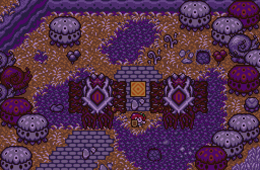
Twilight-Prince - Looks pretty interesting and I like the story behind the screen, but I'm not a fan of the palette honestly. All the purple in the shot doesn't look great and makes the mountains look really off-coloured (especially at the top-left).
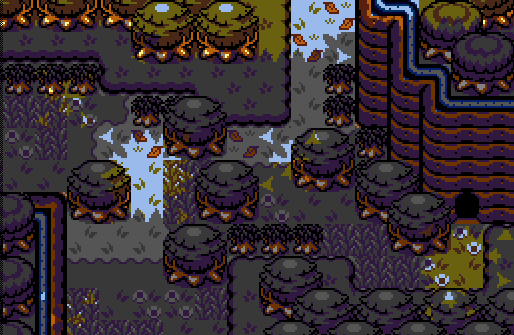
Ecruteak - Really nice job with this one and you sure did use overhangs correctly. The screen looks pretty good, though I would suggest to probably make the overhang near the top-left of the screen a bit less straight like that. It looks a little weird how the overhangs cut off just as they reach the trees, and so they end up looking a bit odd. But besides that, really good job.
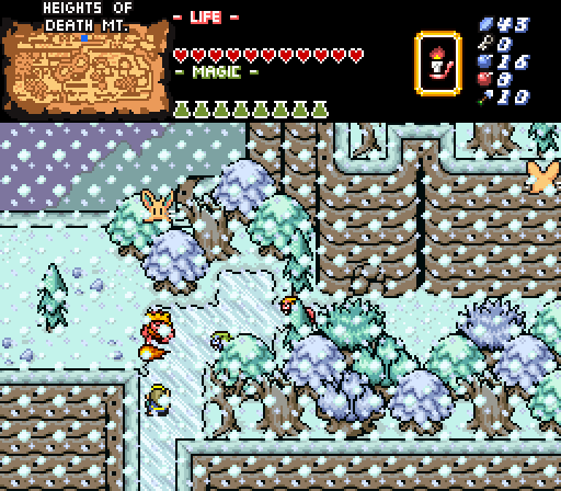
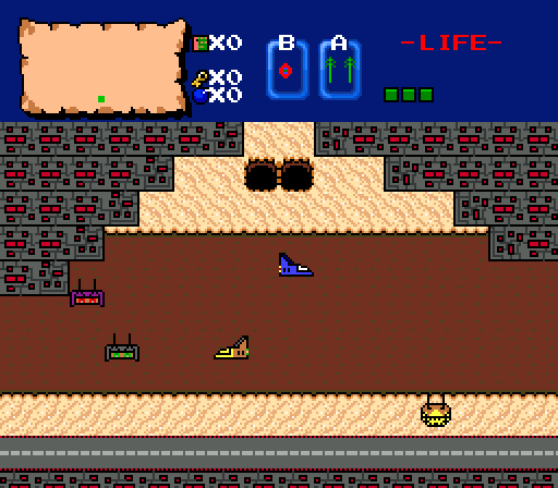
FireSeraphim - Very nice mountain shot, I really like the palette and the general look of the screen. Also looks like quite a dangerous place with those lynels everywhere. Though I think the one issue I have is that the screen seems very overly cluttered on the right side and I'd probably remove some trees to make more walking space like on the left side. But anyway, nice job.
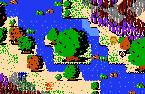
Joelmacool - Pretty interesting shot once again. Though it doesn't too much different than last week (except for mountain colour change), it still looks pretty nice and well made.
Alestance - What a beautiful creation this is. So much great art in this shot, should be a museum piece tbh.
Was quite close between Joel, FS and Ecruteak this week, but I'm going for FS.

 This topic is locked