Anthus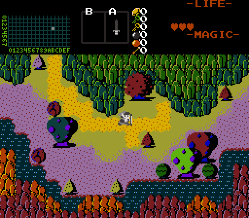
"Something is very wrong here."
ywkls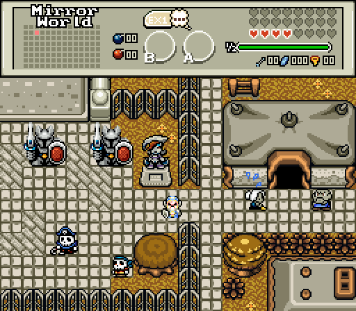
Maybe I should turn back now before they notice me...
Omega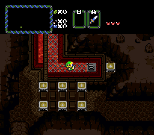
"I wonder what this switch does?"
Joelmacool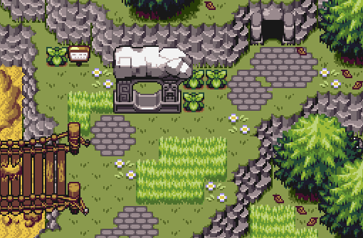
I wonder what's in that cave?
Dimentio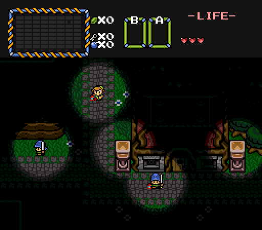
https://www.youtube....h?v=CqZXoRdQsGY
Plutia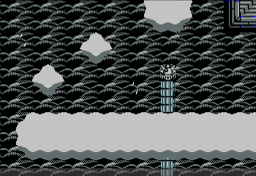

Screenshot of the Week 590
Started by
The Satellite
, Dec 19 2016 05:34 PM
Joelmacool Anthus ywkls Omega Dimentio Plutia
-
 This topic is locked
17 replies to this topic
#1

The Satellite
-

- Members
-

May the way of the Hero lead to the Triforce.
- Real Name:Michael
- Pronouns:He / Him
Posted 19 December 2016 - 05:34 PM
- Joelmacool likes this
#2
TheLegend_njf
-

- Members
-
Deified
- Real Name:Grant
Posted 19 December 2016 - 05:48 PM
I vote for joelmaghoul.
- Joelmacool likes this
#3
Naru
-

- Members
-

Magus
Posted 19 December 2016 - 08:05 PM
Plutia - your own tiles are nice and it feels atmospheric, but there isn't really anything going on.
Dimentio - really nice and solid screen, did you create this awesome transparency only with ZC? I always get some really ugly colors if I use a overhead black transparent layer. The torches could have a more intense color, the seem a bit dark for being the center and source of the light.
Joelmacool - not sure what tileset that is, I especially like the little flowers. I don't think the desert-tiles fit in too well though.
Omega - the dark parts look good, but can't see it too well. The lava part looks odd, not sure if there are tile errors or if I don't get your idea, but I don't think the tiles fit the rest of the screen anyway. I can't help to think that the torches are floating.
Ywkls - same like last time.
Anthus - I really want to vote for Dimentio, but I just love your screen. Only the water looks a bit odd, more like the eyes of countless bats waiting to raise from the depth of the dark abyss to suck you dry. Not that Link looks as if he have much blood left.
- Anthus likes this
#4
Anthus
-

- Contributors
-

anthus
- Real Name:Antbus
- Location:Ohio
Posted 19 December 2016 - 08:51 PM
I null'd but I probably would have gone with Joel's shot, cause I'm a sad, sappy, sucker for BS mountains, and that palette is nice too.
ywkls:
This is a decent shot, and I like the autumn colors here. The only thing that stands out as a bit odd is that structure in the upper left. I'm assuming it's a building, but it looks kinda wierd. It also took me a second to realize that wooden object in the upper/ middle right wasn't stairs, but part of a fence. Did that guy run out of money, and is unable to finish his fence? Maybe that's why he looks so mad, standing there. ![]()
Omega:
Can't go wrong with a good ol' MC cave screen. I think the GBC assets clash a bit (the lava boarder, and angular rocks up top) but it's not a deal breaker. It looks like that switch possibly lowers those blocks, if I had to take a wild guess.
Dimentio:
I want to like this screen more, but it is so dark that I can see very little of it clearly, but that's probably the point with it being night time, and all. I like the light effect though. Animated shots always look nice. Nice choice of music too, if that is intended to be the background music (as it still plays while I'm writing this in another tab.)
Plutia:
I like the clouds in the background, but as others have said, it is kind of a plain screen, aside from the custom graphics. I'm not entirely sure, but there *might* be a tile error in the upper right, but I've never used your tiles, so I could be missing something. ![]()
- Joelmacool likes this
#5
Deedee
-

- Administrators
-

Small Pixie Dragon
- Real Name:Deedee
- Pronouns:She / Her, They / Them
- Location:Canada
Posted 19 December 2016 - 09:07 PM
For those of you wondering: yes, my screen is scripted. The script uses a marvelous new feature from the upcoming 2.54 called DrawBitmapEX, which allows for transparent bitmaps, and thus transparent dark screens. Truth is, I wanted the screen to be lighter, but I couldn't really do that and keep the sexy triple lighting effect at the same time without major palette editing (which I such at). Also, the palette is just the Night 1 palette from Pure, with CSet 4 swapped out for dungeon colors so I could add the torches.
Anyways, this is just an example of what I hope to have for my entry to the Random Theme contest. This screen won't appear in the actual quest, it's just a mockup I made back when the quest was planned to be GBC and was showing how the lighting system would work to my (now ex) partner.
Also, for those of you wondering what the screen would look like with more light (and what the lighting for overworld areas would be until I can learn how to edit palettes and transparent colors):
Spoiler

- Anthus and Naru like this
#6
Kivitoe
-

- Members
-

Sponsored by Taco Bell
- Location:Beyond Sagittarius A*
Posted 19 December 2016 - 09:24 PM
I'm uploading for the next one.
I voted for Joel, by far the best screen here.
I voted for Joel, by far the best screen here.
- Shane and Joelmacool like this
#7
Shane
-

- Members
-
🤍
Posted 19 December 2016 - 10:02 PM
I voted Anthus. The unique colour scheme caught my eye.
- Anthus likes this
#8
Anthus
-
- Contributors
-
anthus
- Real Name:Antbus
- Location:Ohio
Posted 19 December 2016 - 10:41 PM
postitypost
Ohh, now I can appreciate it a lot more. I just assumed it was vanilla tiles, and transparent layers, but I admittedly didn't really consider Link's light following him, so it didn't occur to me that some clever new transparent bitmap features were at play. I still like it though, and it is much more realistic than a perfect circle then BLACK DARKNESS around. Looking forward to your entry to the two-week thing. ![]()
I would say though, you are right, a different palette for such a theme would make a lot of difference, but it's really not bad for a mock-up.
- Cukeman likes this
#9
Titanium Justice
-

- Members
-

Justice is served!
- Real Name:Jared
- Location:Ontario
Posted 19 December 2016 - 11:25 PM
Voted for Joelmacool. Very nice use of the BSMC tileset.
- Joelmacool likes this
#10
ywkls
-

- Members
-

Master
Posted 19 December 2016 - 11:28 PM
Nulled my vote since I'm in this one, so here's my thoughts on the others.
Anthus- That is an incredibly weird shot. It looks like someone slipped Link something psychedelic or he's in a weird alternate dimension. The trees with the bell shape are interesting.
Omega- That cave is almost too dark for me to make anything out. I can just discern a high level of detail and the general outline of what's going on, but because of the lighting issues; I can't say I really like it.
Joelmacool- I'd have to say that this is my favorite out of all the other screens. There's quite a bit going on here, from the cave and ruins to the variety in trees and vegatation to the halfway destroyed bridge. All very good.
Dimentio- As a way to show off a script and the newer features being worked into ZC, this is excellent. As a screenshot... not so much so.
Plutia- There's not very much for to go on here. Is this a sideview screen? An area where you have to cross from one cloud to another? I'm not sure what's going on.
Pretty good overall for the most part.
- Joelmacool likes this
#11
Cukeman
-

- Banned
-

"Tra la la, look for Sahasrahla. ... ... ..."
- Location:Hyrule/USA
Posted 20 December 2016 - 12:03 AM
Anthus- Inverted world
ywkls- Love how it looks like a large important city, but I find the mix of graphical styles distracting.
Omega- I voted here because I understand what’s going on, the story is clear (if simple), and it feels like a real environment.
Joelmacool- I’m biased against landscapes without characters
Dimentio- Nice, looks like a fun dodge-the-guard level.
Plutia- I can’t tell if this is side-view or top-down, is that a dark cloudy sky in the background (or a floor), and is that a column? Not sure what to make of this. I’m confused.
#12
Eddy
-

- Members
-
ringle
- Real Name:Edward
- Pronouns:He / Him
- Location:London, United Kingdom
Posted 20 December 2016 - 04:32 AM
Joelmacool - not sure what tileset that is, I especially like the little flowers. I don't think the desert-tiles fit in too well though.
He used the BSMC tileset.
Either way, pretty nice week this time round.
Anthus - This is some really weird and wacky drug trip I'm seeing here. I really love the variety of colours you got here and it looks like they all fit together pretty nicely.
ywkls - Getting slightly better, but there's still quite a bit more things you can sort out. The straight fences is still an issue and they don't look like they fit in all that well. The Veran statue also looks quite off and looks like a bad recolour IMO. More ground detail with the grass would be nice too.
Omega - Pretty nice screen. It is a little dark, but it doesn't bother me that much and it is a cave after all lol. I think the atmosphere works pretty perfectly here with the dark setting. I like the design you added on the ceilings too, though maybe a bit more detail could go on the floor (like railings or something)
Joelmacool - My favourite this week. With or without NPCs, this screen looks fantastic (even though I spot a few tile errors, like on the top of the screen with the mountains, next to the cave entrance and on the stone pillar thing). Other than that though, I really like what you got going here.
Dimentio - With all the dark screen complaints, I would've expected it to be this screen ![]() But anyway, I like the concept you got here, really nice job with the candle idea. Though I can't actually make out anything else on the screen. Neat idea, but as far as a screenshot contest goes, there isn't much here I can actually see lol.
But anyway, I like the concept you got here, really nice job with the candle idea. Though I can't actually make out anything else on the screen. Neat idea, but as far as a screenshot contest goes, there isn't much here I can actually see lol.
Plutia - Not going to lie, I'm not a fan of this shot this week. It seems incredibly empty with a random pillar and some clouds, and that's all there is to it. The cloud at the bottom also seems a bit too straight to be natural. Other than that, there isn't anything else I can really say.
Overall, it was close between Joel and Anthus, but I'm going for Joel this week.
- Joelmacool likes this
#13
Joelmacool
-

- Moderators
-

Addicted to Overwatch
- Real Name:Joel
- Location:Country of Europe
Posted 20 December 2016 - 04:32 AM
Only now am I seeing the tile-errors on my screen...
#14
TheLegend_njf
-
- Members
-
Deified
- Real Name:Grant
Posted 20 December 2016 - 05:40 AM
Only now am I seeing the tile-errors on my screen...
Still a nice screen overall.
- Joelmacool likes this
#15
ShadowTiger
-

- Members
-
The Doctor Is In
Posted 21 December 2016 - 09:12 AM
Anthus - I'm pretty sure I'm trippin' balls here. Not that I have any Pokeballs to trip over or anything.
ywkls - That's pretty neat. Where did you get those square walkway tiles?
Omega - I love this screenshot. There's so much variety of the floor and walls! The thing that kills it for me though is that brown floor-guard stretching vertically up towards the top-middle of the screen. It messes with the perspective on the floor grating to its right. I don't know what's higher or lower, really. But believe me, that is now my favorite cave design. It's super-sweet.
Joelmacool - Wow! That's really cool! Superb use of the tileset! Everything about it just screams "GBA Zelda" and more! I would love to see more of this. The crumbling stone architecture adds leaps and bounds to it.
Dimentio - It's ironic, really. Even though I'm quite thoroughly impressed by the lighting effects, (I really am. I love them!) it's the fact that I can barely see the rest of the screen that I can barely justify voting for it. And I hate myself for that, I really do. I never thought I'd be in that particular mindset, really. But seriously, hat's off for scripting that! Absolutely.
Plutia - Not sure what's happening here, but it's a neat screen. Very little variety though, and I'm unsure of its context. I don't know whether that bottom cloud should be that "straight" or not. I don't know if it's an overpass to walk under, or a road to walk on.
I think my vote will go to Joel for this one. Some truly incredible screens though.
- Joelmacool and Deedee like this
Also tagged with one or more of these keywords: Joelmacool, Anthus, ywkls, Omega, Dimentio, Plutia
 |
Matthew
PureZC Events →
Screenshot of the Week →
Poll Screenshot of the Month 220Started by Anthus , 04 May 2026 |
|

|
|
|
|
Shane
PureZC Events →
Screenshot of the Week →
Poll Screenshot of the Week 882Started by Anthus , 27 Apr 2026 |
|
|
|
|
|
Matthew
PureZC Events →
Screenshot of the Week →
Poll Screenshot of the Month 219Started by Anthus , 06 Apr 2026 |
|
|
|
|
|
Joelmacool
PureZC Events →
Screenshot of the Week →
Poll Screenshot of the Week 879Started by Anthus , 06 Apr 2026 |
|
|
|
|
|
Zeron
PureZC Events →
Screenshot of the Week →
Poll Screenshot of the Week 877Started by Anthus , 23 Mar 2026 |
|
|
1 user(s) are reading this topic
0 members, 1 guests, 0 anonymous users

