Jump to content

Photo

Screenshot of the Week 555

Orithan Joelmacool Anthus Sephiroth Lunaria Shane

  • This topic is locked This topic is locked
12 replies to this topic

Poll: Screenshot of the Week 555 (63 member(s) have cast votes)

555! That's... not a jackpot but still pretty cool I guess.

You cannot see the results of the poll until you have voted. Please login and cast your vote to see the results of this poll.
Vote

#1 The Satellite

The Satellite

    May the way of the Hero lead to the Triforce.

  • Members
  • Real Name:Michael
  • Pronouns:He / Him

Posted 18 April 2016 - 12:20 AM

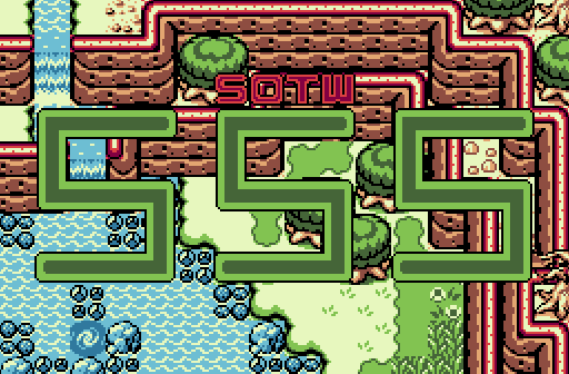
Joelmacool

Joelmacool.png

This took a while to make (Custom text). Hope it wins :D


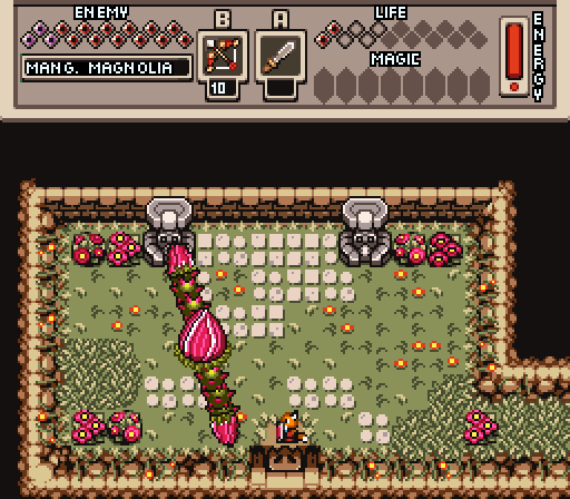
Orithan

Orithan.png

Sometimes you can underestimate how far arms can stretch...


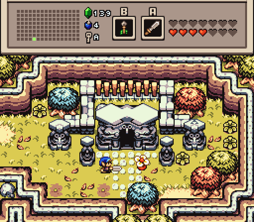
Anthus

Anthus.png

"Link faces off against his most consistently annoying foe yet..."


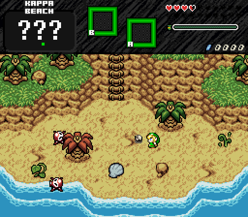
Sephiroth

Sephiroth.png

Link, once again finds himself on a new adventure.


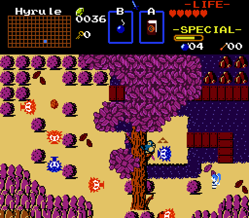
Lunaria

Lunaria.png

Bird


Shane

Shane.png

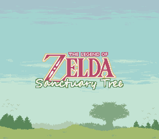
A true adventure always has a title screen! ... Right?


  • Lightwulf and Joelmacool like this

#2 Binx

Binx

    Formerly Lineas

  • Members
  • Real Name:Brian
  • Location:Lancaster, CA

Posted 18 April 2016 - 12:34 AM

Nice shots this week. Voted Orithan, because it grabbed my attention.

EDIT: Okay, more awake, and I think I can do my critiques:

Joelmacool: It's certainly a well-made shot, but the "SotW 555" covers up too much. I think it would have worked better if you had built the shot around that, rather than layering it over the shot (Like, maybe a nice dungeon screen,  or making the numbers out of trees, or something)

Orithan: Beautiful. No complaints. Screen design is beautiful. Northern wall is a bit bare, but I didn't even notice that until Eddy pointed it out, below. Love that boss. This shot actually makes me want to play the quest it's in.

Anthus: To me, the clear second. It's not quite as eye-catching as Orithan's; but the screen design is about perfect. 10/10

Sephiroth: A very impressive beach shot.... And that's about it. It's really well done, but it's just outclassed, this month, in terms of design, as the beach, especially the layout you used, is kinda stock. You really do good work with that tileset, though!


Lunaria: Very purple. Seriously, though, it's a good classic shot, except I'm not fond of the big tree. The trunk fits, but the leaves are far too detailed, and the outlines clash withe the normally un-outlined classic tiles.

Shane: Love it! Killer title screen. Just don't think it's enough to outclass Anthus and Orithan.


Of course, this is all just my personal opinion.


Edited by Binx, 18 April 2016 - 10:44 AM.

  • Sephiroth and Shane like this

#3 Shane

Shane

    💙

  • Moderators
  • Pronouns:He / Him
  • Location:South Australia

Posted 18 April 2016 - 01:18 AM

Had I not entered, I would of went with Sephiroth's. I really like it when DoR is used like this (clean and simple). Also nice name for the beach. :P


#4 TheLegend_njf

TheLegend_njf

    Deified

  • Members
  • Real Name:Grant

Posted 18 April 2016 - 05:35 AM

Question for Lunaria:


Was your trees inspired by TRIFORCE and Link's Quest for the Hookshot 2: Quest by any chance?


#5 Mani Kanina

Mani Kanina

    Rabbits!

  • Members

Posted 18 April 2016 - 07:06 AM

Question for Lunaria:
 
Was your trees inspired by TRIFORCE and Link's Quest for the Hookshot 2: Quest by any chance?

The tiles are edited versions from moosh's, which I did get the permission for to use. :P

Stylistically I think I have used them a bit differently from either of the two quests you mentioned though.

#6 Eddy

Eddy

    ringle

  • Moderators
  • Real Name:Edward
  • Pronouns:He / Him
  • Location:London, United Kingdom

Posted 18 April 2016 - 08:56 AM

Joelmacool - Good job covering the screen with 555 :P It's pretty distracting from the rest of the screen, but I guess that's what you were going for.


Orithan - Nice shot, and I like that plant boss too. It reminds me of the one from Four Swords. The screen design itself is nicely done, though I noticed a strange lack of detail in the northern wall compared to everywhere else. Looks a bit odd.


Anthus - Really cool shot here, I like how everything looks and I got no complaints for this one. Good job here.


Sephiroth - This is an interesting one. You could say it's a bit on the empty side, but in a way so that it actually looks pretty good. I like what you got going here and that subscreen looks pretty neat too.


Lunaria - Nice tree. It really reminds me of Hookshot 2 lol. Besides the tree and bird though, I like how it looks so good job with the screen overall.


Shane - It's pretty rare to see title screens pop up on SotW, so it's good to see stuff like this appear from time to time. Fantastic job with the title screen though, it reminds me of the Oracle title screens with the kind of detail in the background and how everything is focused near the bottom of the screen. Logo also looks really awesome.


Overall, it was close between Anthus, Shane and Sephiroth, but I went for Anthus this week. I just really like how that one turned out.


  • Sephiroth, Anthus and Shane like this

#7 Anthus

Anthus

    Lord of Liquids

  • Banned
  • Location:Ohio

Posted 18 April 2016 - 11:30 AM

Null'd.


Joelmacool:

This is a cool tribute to SotW 555 (which I thought would have a way bigger turnout, but six entries is still good). Other than that, there isn't much I can say cause the numbers block the screen pretty well. One thing I'd have done differently is made the SOTW letters a color that contrasts better with the mountains (blue, or maybe yellow). Cool idea though. I could be wrong, maybe this is actually a really elaborate custom boss/ enemy whose true power is yet to be seen... :P


Orithan:

I like the ground detail, and the enemy, but the room shape is a bit too square for such detail, imo. I suspect that top wall moves or something, (judging by the differing top border) so if its square design serves a greater purpose, it can slide. Get it? 'cause the room might slide? Okay, done.


Anthus:

Go home, you're drunk. Why are you posting Firebird shots when you're not even really making a quest in Firebird? 


Sephiroth:

I'm really liking the palette here. It has a very bright, and cheery, and first area vibe to it. The screen is well composed, and the detail is nice. Not much else to say on this one. I probably would have voted for this, or Shane's title screen, had I not entered.


Lunaria:

Purple. I like purple. I like classic. I like this shot. The tree-tops tend to make parts of the screen out of sight when playing, but it looks pretty.


Shane:

Very pretty title screen here. My only suggestion would be maybe making the logo one tile larger in each direction, but this is trivial. It looks good either way. Looking forward to playing it! :)


  • Sephiroth and Shane like this

#8 Cukeman

Cukeman

    "Tra la la, look for Sahasrahla. ... ... ..."

  • Banned
  • Location:Hyrule/USA

Posted 18 April 2016 - 02:14 PM

Despite the sight-blocking numbers I voted for Joelmacool because the other screen designs felt too straight-edged and/or symmetrical. Joel's has some pleasing asymmetrical design and really appealing elevation details.


Orithan- the enemy boss sprites are beautiful. I feel like redesigning the room could add a lot more interest (the graphics are fine).


Anthus- a bit too symmetrical in my opinion.


Sephiroth- I like how clean and appealing this shot is, it's just a bit too symmetrical in my opinion.


Lunaria- that big tree is just breaking the perspective too much for me.


Shane- I'd make some composition suggestions, but there's not really anything you can do because of the graphics you are using. The size they are is the size they are. Great vibe and idea either way.


Edited by Cukeman, 19 April 2016 - 06:08 AM.

  • Sephiroth, Anthus and Shane like this

#9 MermaidCim

MermaidCim

    Yes I'm that guy who dreamt Dani was Zelda. LOL Cimfam/zelda

  • Members
  • Real Name:Michael
  • Location:Danbury, CT

Posted 18 April 2016 - 08:41 PM

Joel:Eh, the screen doesn't stack up to the others this week. I had to put you 6th. The 555 gimmick was the screen's saving grace honestly because this was pretty poor honestly IMO


Shane:I give you 5th place. It's solid, but the others were stronger for me.


Sepiroth:4th place for me. I love how you put the ??? because it has that mystery feel. The subscreen looks very aesthetically pleasing. Great job.


Lunaria:3rd place for me. That tree is beautifully done. The other 2 just were better hence why I didn't give you my vote. Great screen overall.


Orithan and Anthus  were very close, but because of slightly more inviting qualities and the subscreen design, I give it to Orithan. But great job overall. The only one I didn't enjoy was Joel's. [sorry bro]


#10 Jenny

Jenny

    braixen

  • Members
  • Real Name:Jennette
  • Pronouns:She / Her

Posted 19 April 2016 - 01:50 AM

Shane, Anthus, Orithan and Sephiroth all have screens that I like.


Joel's is good too, though the text does get in the way I can still enjoy the effort put into it.


In the end, I voted for Anthus.


  • Sephiroth, Anthus and Shane like this

#11 SpikeReynolds

SpikeReynolds

    Ironically bald furry

  • Members
  • Real Name:Spens
  • Location:Grand Rapids, Michigan

Posted 19 April 2016 - 06:44 PM

I voted for Orithan, because furries. Okay, not only because furries. 


All of this week's shots look great. It was a hard pick.


  • MermaidCim likes this

#12 Sephiroth

Sephiroth

    The Legendary Sephiroth

  • Members
  • Location:Somewhere... Lemme know if you find me :)

Posted 20 April 2016 - 08:08 AM

Sephiroth: A very impressive beach shot.... And that's about it. It's really well done, but it's just outclassed, this month, in terms of design, as the beach, especially the layout you used, is kinda stock. You really do good work with that tileset, though!

Thanks; I realize its outclassed this week by gems like Orithan's and Anthus' shots, but I felt the need to kinda mention my revival in a way that matched with this triple-digit SotW milestone.
 

Had I not entered, I would of went with Sephiroth's. I really like it when DoR is used like this (clean and simple). Also nice name for the beach. :P

Thanks; the name for the beach was just a spur-of-the-moment kinda thing, but it is kinda ... iDunno, ... influenced by a certain large gaming streaming site? Kappa.png
 

Sephiroth - This is an interesting one. You could say it's a bit on the empty side, but in a way so that it actually looks pretty good. I like what you got going here and that subscreen looks pretty neat too.

My quirk I have with this particular tileset, is that while it contains a lot of individual detail tiles to use, I don't really like going overboard. Especially when it's supposed to be a rather clean area such as this. Thank you.
 

Sephiroth:
I'm really liking the palette here. It has a very bright, and cheery, and first area vibe to it. The screen is well composed, and the detail is nice. Not much else to say on this one. I probably would have voted for this, or Shane's title screen, had I not entered.

The idea is this particular screen will be the first screen you'll see after whatever title screen I decide to put together. And yes, that's really a pair of octoroks on the first screen. Fortunately they're the super-easy slow ones, so it's not that difficult to dodge at the early game. One thing I like doing is sticking the initial sword in a small introductory level, so I'm putting that elsewhere in the beach area. You'll need to sword to progress further past the beach. Thanks for the comments. :)
 

Sephiroth- I like how clean and appealing this shot is, it's just a bit too symmetrical in my opinion.

Thanks; while I do somewhat agree its a bit too symmetrical, if you look at the full map of the beach area, you will see it is but a single screen out of a rather neat 12-screen area. Its just how it ended up. :shrug:
 

Sepiroth:4th place for me. I love how you put the ??? because it has that mystery feel. The subscreen looks very aesthetically pleasing. Great job.

4th place, eh? Any other comments aside from the subscreen? Which that subscreen is still a work in progress. :shrug: Regardless, thanks for the comments.
 

Shane, Anthus, Orithan and Sephiroth all have screens that I like.
 
Joel's is good too, though the text does get in the way I can still enjoy the effort put into it.
 
In the end, I voted for Anthus.


Joelmacool: While I see where you were going with this screenshot, making it appear to be a title screen for SotW #555, that text is quite ugly. It also blocks the view of the rest of the screenshot, which looks like a spectacular overworld GB screen.

Orithan: I'm going to guess that the northern wall is scripted to slide upwards after the boss/mini-boss is defeated to reveal a prize for Hal. The screen overall is quite square, as others have said; but it might be necessary due to the way your scripted boss/mini-boss works, so I can give that to you. What doesn't really make sense though is why there's no upper wall border on that north wall like there is on the rest of the screen. It goes from wall directly to solid black instead of that nice smooth transition that you can see on the south and western wall. It even looks like it wraps around to that north wall, but then it just goes solid black. :shrug: The rest of that screen is impeccable though.

Anthus: This screenshot kinda reminds me of a Zelda 1 overworld screen that's been merged with the look and feel of Minish Cap without the old Minish Cap mountain graphics. Structurally the screen is very well done, the pallete you chose is very nice, I love it. :)

Sephiroth: Life's a beach sometimes. Kappa.png

Lunaria: We have a Zelda 1 perspective overworld screen, then we have a side-scrolling perspective tree planted directly in the middle of the screen. Perspective clash to the max here. Its quite difficult to gauge where Link would be able to walk with that tree the way it is. :shrug:

Shane: You're home, Shane. Go drunk. Kappa.png ... Regardless; This title screen is quite good. I do agree that the logo itself is a bit on the small side, but nonetheless, looks quite good.
  • Anthus, Shane and Eddy like this

#13 The Satellite

The Satellite

    May the way of the Hero lead to the Triforce.

  • Members
  • Real Name:Michael
  • Pronouns:He / Him

Posted 24 April 2016 - 09:19 PM

With 40.00% of the vote, the winner of Screenshot of the Week 555 is Orithan!


Orithan.png


Congratulations!


Voting totals:

- Joelmacool (1 votes [1.82%])

- Orithan (22 votes [40.00%])
- Anthus (14 votes [25.45%])
- Sephiroth (8 votes [14.55%])
- Lunaria (5 votes [9.09%])
- Shane (5 votes [9.09%])


Also tagged with one or more of these keywords: Orithan, Joelmacool, Anthus, Sephiroth, Lunaria, Shane

0 user(s) are reading this topic

0 members, 0 guests, 0 anonymous users