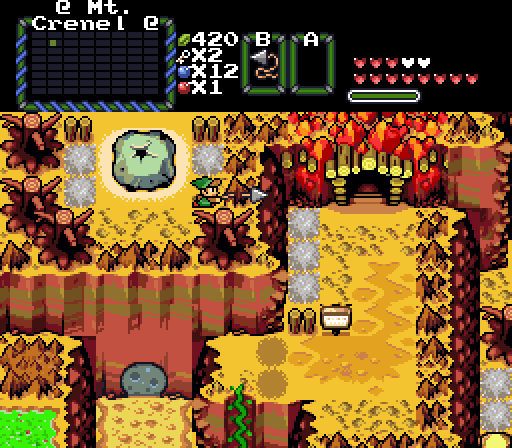
Shane: This is 2016, you can't be serious. If I wanted ancient-looking graphics like these, I would of played the Atari or something.
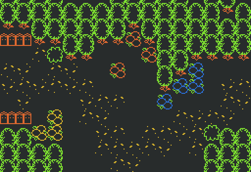
Anthus: Great rips! Feels so much like Minish Cap as Eddy pointed out. Even without enemies and proper context, this area has a dangerous atmosphere to it. The green, despite how little amount there is, brings the shot together very nicely. It also has a natural flow.
Joelmacool: You showed me this on Skype and I'm glad to have addressed by previous criticisms. The screen presented is much better and I love the variety that's featured. I will admit it is a bit cluttered for my tastes but nonetheless my vote would of gone here for its natural design and flow.
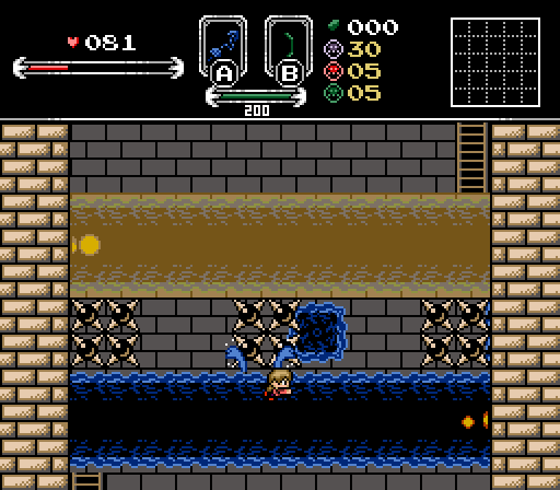
Russ: Looks interesting and evil that's for sure. I can see what's happening due to its pleasing simplicity and I think it looks fun and challenging! I would love to play it and see if I can overcome it. Though in a contest with tough competition this isn't my pick unfortunately.
Great entries! I can see how my shot feels like Undertale but I was making a reference to an old project of mine that existed around 2014. But maybe Undertale did subconsciously influence the graphics, we will never know now. 

 This topic is locked


