Joelmacool12
My first attempt at Pureset... good? Any thoughts?
Rocks4Free
"Whee~"
ywkls
Is it just me, or is it a bit chilly in here?

 This topic is locked
May the way of the Hero lead to the Triforce.

Posted 07 June 2015 - 04:39 PM
Joelmacool12
My first attempt at Pureset... good? Any thoughts?
Rocks4Free
"Whee~"
ywkls
Is it just me, or is it a bit chilly in here?
Master

Posted 07 June 2015 - 04:46 PM
Nulled my vote, since I'm in this one (again...)
Here's my thoughts on the others.
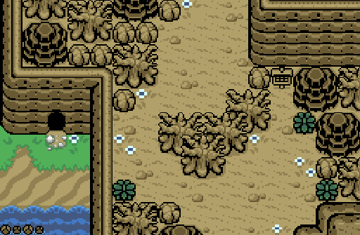
Joelmacool12- for a mountaintop covered in dirt, it's not bad. There is a good amount of variety in the dirt, which makes it look natural. You might want to change the tile on the bottom part of the cliff that is at the left side since it might cause someone coming from the next screen over to run into an obstacle.
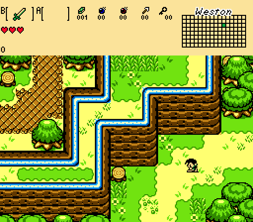
Rocks4Free- this is a very bright and sunny screen. That character is most definitely not your standard Link, either. I like the path at the left, and the fact that all of the trees aren't the same.
Pretty good job by all!
Trofessional Pransposer

Posted 07 June 2015 - 04:54 PM
Joelmacool12
Not bad. The location looks pretty desolate judging by the abundance of dead trees, rocks, and brown hues. The aspect that irks me is the gameplay flow of the screen. You force players around the bank of dead trees in the middle, and the sign is placed away from the path most players would take through the area. I think opening the scene up by relocating a few trees would make this a better shot overall.
Rocks4Free
It's hard to fit three independent paths in one screen, but you manage to pull it off. Somehow the screen feels empty, but I can't put a finger on why. Sorry I can't be of more help.
ywkls
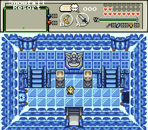
An attractive shot that uses symmetry well. I do find the perspective a little confusing, though. The statue is on a platform that's elevated off the ground, right? Perhaps some shadows would convey this elevation difference better.
In the end, I voted for ywkls. Close match!
What's up my playas

Posted 07 June 2015 - 07:17 PM
Edited by ZeldaPlayer, 07 June 2015 - 07:17 PM.
Defender

Posted 07 June 2015 - 08:26 PM
All these screens look pretty good, Joelmacool12 gets my vote since it's the most beautiful out of the bunch
My List: Best to Worst (please do not be offended)
Joelmacool12, ywkls, and Rocks4free
Brief Reviews
Joelmacool12
ywkls
Rocks4free
Edited by SyrianBallaS, 07 June 2015 - 08:34 PM.
Apprentice

Posted 07 June 2015 - 09:06 PM
Seems I am the odd man out voting for Rock4free. To me it is by far the best. It all just works and I won't blame him for the stock ezgbz palette that is just too bright.
ywkls (I assume that is pronounce yah-wil-kus) There are just too many things that don't look very good at the bottom.
joelmacool, no complaint. Didn't love or hate anything about it. The flowers definitely improve the mass of brown.
Master
Posted 07 June 2015 - 11:05 PM
ywkls (I assume that is pronounce yah-wil-kus) There are just too many things that don't look very good at the bottom.
Actually, you sound out each letter separately. Thanks to everyone who has voted for me so far!
Apprentice
Posted 07 June 2015 - 11:52 PM
Actually, you sound out each letter separately. Thanks to everyone who has voted for me so far!
Sorry that is much too long, yawilkus!
The Sparking Spark of ZC

Posted 08 June 2015 - 01:14 AM
Doyen(ne)

Posted 08 June 2015 - 04:38 AM
Joelmacool12: My vote for the week. Pureset isn't my favorite tileset, but you play it out well. Lots of brown, though- the dead trees, some of the rocks... could have been a slightly different shade, maybe? Maybe a yellow flower among the white, just to give it a little life?
Rocks4Free: For what it's worth, the screen isn't bad. It is nice to see three paths available on one screen- you'll be coming back here at least twice. Not a fan of square blocks of tall grass though, especially when there is no transition. The electric blue neon tubing is an interesting touch. Is that the path to a rave?
ywkls: This one should have had my vote- it's bright, chilly, and fun to look at. BUT, I just couldn't get past the perspective. The white at the base of the top wall looks like snow/frost accumulation. But on the taller walls left, right, and bottom, the 'snow' accumulates twice- once at the base and again about halfway up the wall! In a perfect world, that upper accumulation wouldn't be there, or evidence of a 'shelf' or some other explanation would be needed.
ringle

Posted 08 June 2015 - 10:14 AM
This is a pretty awesome set of screens this week!
Joelmacool12 - I'm loving this screenshot. I haven't really seen a Pure shot in quite a while and you seemed to have made a really good one. The detail here is superb and I really would want to know what's in that cave ![]()
Rocks4Free - It's a pretty neat shot. The design here is pretty good and I do like the split between both sides of the screen. There's nothing else I can really say though.
ywkls - A pretty chilling shot. The design is pretty cool though the perspective looks a bit... off to me. Maybe there isn't any perspective issues but it does look pretty weird. The doors in particular look like they are going inside the walls when I don't think they really should be.
Either way, I voted for Joelmacool12 this week. Great job everyone ![]()
Unbeknownst to danger we call upon your help

Posted 08 June 2015 - 06:03 PM
Joelmacool12 -Looks excellent. -Needs diagonal 'pale' transparent over-layered Sun-Light effect beams thoughs, is the new trend latelys.' ~ is what's in.*

Rocks4Free -When is somebody just going to make a sequel to links awakening? -Script all the features the game had in rights? Write how the sequel should be.
ywkls -Pretties and is Perfect symmetry, I know is firebird, but 'Perfect symmetry.' - is my weakness.
Edited by SkyLizardGirl, 08 June 2015 - 06:14 PM.
To Discover

Posted 08 June 2015 - 09:45 PM
Joelmacool12 - A good attempt with Pure. You managed to create a mountaineous landscape that is interesting and easy on the eyes. The similar colors is actually done very well here, though, for future screenshots, having something to break up the similarity, while still sticking to a theme, helps a lot. I agree with SkyLizardGirl that you could have used some additional layer work to brihgten the environment, but if you are new to Pure that can be difficult to pull off while looking good (Sun Tower has this problem a bit too). For a first attempt, it was really well done.
Rocks4Free - great use of the gameboy graphics, which still remains one of my favorites.
ywkls - I love the bright use of colors and the layout of the room. It makes me want to explore whatever dugeon that is at a glance.
Good job to all.
 |
TheManHimself
→
Screenshot of the Week (Old) →
Poll Screenshot of the Week 756Started by David , 27 May 2021 |
|

|
|
|
|
Aslion
→
Screenshot of the Week (Old) →
Poll Screenshot of the Week 748Started by Aevin , 02 Feb 2021 |
|
|
|
|
|
Matthew
→
Screenshot of the Week (Old) →
Poll Screenshot of the Week 727Started by Aevin , 12 Apr 2020 |
|

|
|
|
|
Shane
→
Screenshot of the Week (Old) →
Poll Screenshot of the Week 713Started by Aevin , 22 Sep 2019 |
|

|
|
ZQuest Classic →
Custom Quest Discussion →
Destiny of the OraclesStarted by sctmorgan , 14 Sep 2019 |
|

|
0 members, 1 guests, 0 anonymous users


