Jump to content

Photo

Screenshot of the Week 482

Orithan ZeldaPlayer Twilight-Prince Dwiese1998 Shane

  • This topic is locked This topic is locked
18 replies to this topic

Poll: Screenshot of the Week 482 (64 member(s) have cast votes)

~

You cannot see the results of the poll until you have voted. Please login and cast your vote to see the results of this poll.
Vote

#1 The Satellite

The Satellite

    May the way of the Hero lead to the Triforce.

  • Members
  • Real Name:Michael
  • Pronouns:He / Him

Posted 16 November 2014 - 08:02 PM

ZeldaPlayer

ZeldaPlayer.png

What a future desert would look like.


Orithan

Orithan.png

Just as Hal enters the Crystal Caverns for the first time, he has already discovered the essence that lies in the area. Now he just has to find out how to get to it. If only he had Super Bombs...


Twilight-Prince

Twilight-Prince.png

A screen from a quest idea I'm working on. The entrance to Solunus Temple, a dungeon you'll be re-visiting several times over the course of the game. Though what looks pure on the outside may not be the case inside...


Dwiese1998

Dwiese1998.png

Lost in the woods? Maybe..


Shane

Shane.png

i have no regrets


#2 nicklegends

nicklegends

    Trofessional Pransposer

  • Contributors
  • Real Name:Ed
  • Pronouns:He / Him

Posted 16 November 2014 - 08:02 PM

ZeldaPlayer
The outlined graphics are handsome for the most part, but the screen itself strikes me as a bit busy. It's tough to tell what's going on in one glance.

Orithan
The tiles look nice on an individual basis, but combined, the screen looks cluttered. Still, I like the use of color in the gems on the ground.

Twilight-Prince
Pretty solid. The walkability on the bottom of the screen could be an issue, but it doesn't hamper the screen from an aesthetics standpoint.

Dwiese1998
Hmmm. The colors are nice and the tree arrangement makes this look like a convincing forest. I wonder how tedious it would be to play, though, having to hack through all those bushes to get around?

Shane
I'll just say it: the tree doesn't match. Sorry.

It's a tough decision between Orithan, Twilight-Prince, and Dwiese1998, but I will give my vote to the latter for accomplishing everything he set out to, even if he didn't take many risks in the process.
  • Shane and Twilight-Prince like this

#3 ZeldaPlayer

ZeldaPlayer

    What's up my playas

  • Members
  • Location:USA

Posted 16 November 2014 - 08:12 PM

When I saw Orithan's, I was like, OMG, Orithan is so gonna win this one.


#4 Shane

Shane

    💙

  • Moderators
  • Pronouns:He / Him
  • Location:South Australia

Posted 16 November 2014 - 08:31 PM

If I had not entered, I would have voted for Orithan's amazing shot.


I have to agree with nicklegends about the tree in my entry. I tried fixing the perspective somehow, but it was a pain in the butt and I couldn't really find a way. I'll probably get around replacing it eventually. My shot has an inside joke (not the purple tree, lol), but only very few people will see it and get it.


#5 Twilight-Prince

Twilight-Prince

    The Adversary

  • Members
  • Real Name:Starts with a letter of the alphabet.
  • Location:Way Out There

Posted 16 November 2014 - 09:43 PM

Holy crystals, Batman...seriously, there's a lot of good competition here.


  • Shane likes this

#6 Rastael

Rastael

    Wizard

  • Members
  • Real Name:Raphael
  • Location:Austria

Posted 17 November 2014 - 03:29 AM

Nice Job, everyone! :D


Voted for Dwiese 1998. Big tree-Screens are hard to make, but you did it! ;)


  • Dwiese1998 likes this

#7 Jenny

Jenny

    Hero of Time

  • Members
  • Real Name:Jennette
  • Pronouns:She / Her

Posted 17 November 2014 - 04:00 AM

nice screens zeldaplayer and shane 


i voted for shane although i agree the tree is a bit awkward. the screen design is clean overall.


  • Shane likes this

#8 Colin

Colin

    Coblin the Goblin

  • Members

Posted 17 November 2014 - 04:28 AM

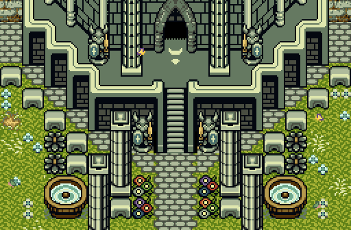
I voted Twilight-Prince. The arched doorway looks a bit messy and mismatched, so I'd recommend some work on that, but otherwise I like the subject matter of the shot.

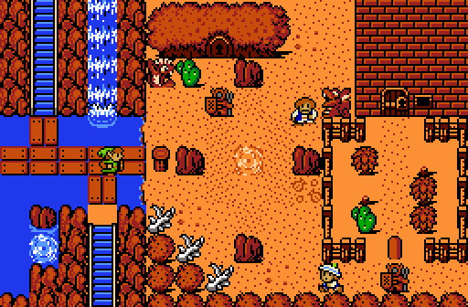
ZeldaPlayer - there are indeed many intricacies of this shot, but that is sort of working against it. I think you have good detail-sense, but there are far too many "subjects" on this screen. By this, I mean in a single screenshot you have worked in waterfalls, cliffs, deserts, a tall tower, and a shrub house. It probably works in-game, but for purposes of presentation in this contest, I'd suggest you present a screen with 1 or 2 subjects (i.e. just the desert and tower, or tower and waterfall, and so on) and frame those as best as you can.


Orithan - The design's solid, the screen looks great. I don't have any critiques on this screenshot. Maybe the screen is too busy and colorful? Honestly, that may be the only thing that kept me from voting here.


Dwiese1998 - actually a very good shot too, looking at this evokes memories of Baldur's Gate in my mind which is a good thing. The one thing that I have issue with this shot is basically the opposite of ZeldaPlayer's shot, in that there isn't really a subject to observe, I suppose. It's a good screenshot all things considered, but I'd say for this contest, there needs to be something in the shot to make it memorable.


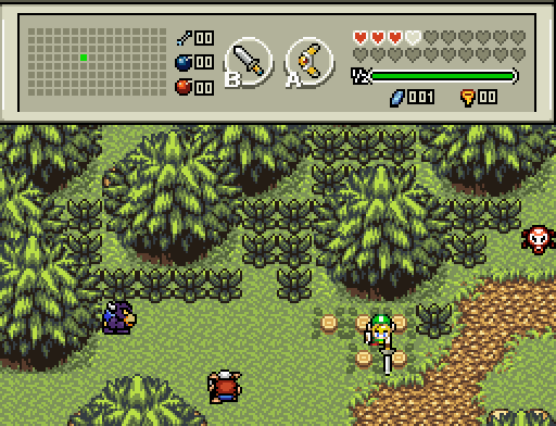
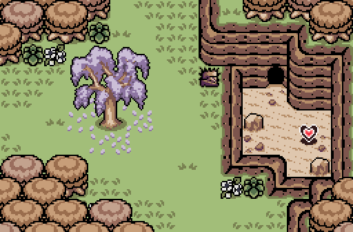
Shane - good shot overall, the design's good, but the tree in the middle is not doing you any favors though. Also I don't know if I'm a fan of the lit stairway, it looks less like a stairway, and more like a weird drawing in the dirt.


  • Shane, Twilight-Prince and Dwiese1998 like this

#9 MarinaraSauce

MarinaraSauce

    Magus

  • Members
  • Real Name:Grant
  • Location:New York

Posted 17 November 2014 - 06:58 AM

I would have voted for Shane but purple tree 0/10.


  • nicklegends, Shane and Eddy like this

#10 Eddy

Eddy

    ringle

  • Moderators
  • Real Name:Edward
  • Pronouns:He / Him
  • Location:London, United Kingdom

Posted 17 November 2014 - 11:16 AM

Orithan gets my vote this week. That is seriously one amazing shot, with really nice crystal-like details put in.


2nd place would've been Shane or ZeldaPlayer. Shane's tree looks really nice in that shot, but it's purple so 0/10.


  • Shane likes this

#11 strike

strike

    life is fragile, temporary, and precious

  • Members
  • Real Name:Olórin

Posted 17 November 2014 - 11:31 AM

I think the main problem with 1998's shot is lack of ground detail. I don't mean anything crazy and overboard but a little added detail would help make it feel more alive. Also maybe curving in the greenery a little more to fit the road. It's a good shot but I couldn't quite vote for you.

I voted for Orithan. There are some problems though. I think the jewels stick out too much on the floor. I think it would help to add a little shading on the ground or something. Good shot!

-Strike
  • Dwiese1998 likes this

#12 Tree

Tree

    Everything must go away

  • Members
  • Real Name:Mundy Fumple McStroodlestein
  • Location:The Milky Way Galaxy

Posted 17 November 2014 - 12:41 PM

ORITHAN WINS.


#13 Dawnlight

Dawnlight

    My name is NOT Jason!

  • Members
  • Real Name:Justin
  • Location:Chicago, IL

Posted 17 November 2014 - 04:03 PM

ORITHAN WINS....my vote.


#14 Shoelace

Shoelace

    The Shaman of Sexy!

  • Members
  • Real Name:Michael
  • Pronouns:He / Him
  • Location:Arizona

Posted 17 November 2014 - 04:28 PM

Orithan gets my vote this week. Great job indeed.

#15 Nathaniel

Nathaniel

    Deified

  • Members

Posted 17 November 2014 - 05:14 PM

ZeldaPlayer - The screen is crowded in places, but more consistent than your last entry.

Orithan - I love the atmosphere of your screen.  Nice job putting together a crystal cave screen, something we don't often see in ZC.

Twilight-Prince - The grand symmetrical entrance looks nice, and the ground details do a decent job of complementing it.

Dwiese1998 - Certainly not the most interesting screen in this contest, but the design is pretty good.  The grass feels a bit underdetailed when using mostly just the one tile, so it could use a little extra flavor, but not too much extra.

Shane - I agree with others that the purple tree doesn't fit with the rest of the graphics.  Add the fact that the thick black outlining of it makes it feel more as if it was shopped in rather than part of the surrounding environment.  The tile and fallen leaves by themselves look nice though.  The rest of the screen is good.

This vote was not as easy for me as it probably was for a lot of others here.  I voted for Orithan's screen due to its uniqueness and creativity being slightly better than Twilight-Prince's screen.  The other three were not bad, but fell short in comparison.


  • Shane and Twilight-Prince like this


Also tagged with one or more of these keywords: Orithan, ZeldaPlayer, Twilight-Prince, Dwiese1998, Shane

0 user(s) are reading this topic

0 members, 0 guests, 0 anonymous users