Jump to content

Photo

Screenshot of the Week 480

Jared joelmacool12 Duck ZeldaPlayer Anthus

  • This topic is locked This topic is locked
41 replies to this topic

Poll: Screenshot of the Week 480 (64 member(s) have cast votes)

~

You cannot see the results of the poll until you have voted. Please login and cast your vote to see the results of this poll.
Vote

#1 The Satellite

The Satellite

    May the way of the Hero lead to the Triforce.

  • Members
  • Real Name:Michael
  • Pronouns:He / Him

Posted 02 November 2014 - 09:37 PM

joelmacool12

joelmacool12.png

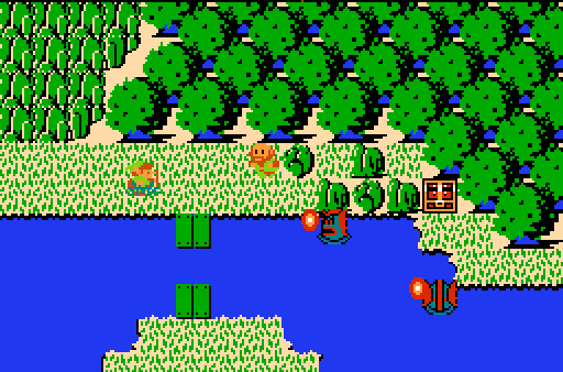
That Lake Is Haunted By Zoras! Good Work Guys!


Duck

Duck.png

soon


ZeldaPlayer

ZeldaPlayer.png

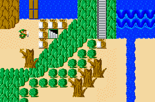
Damn armos, always in my way to an entrance.  :aggravated:


Anthus

Anthus.png

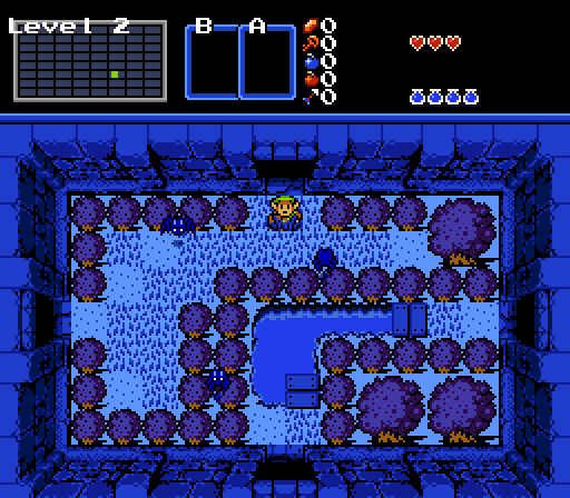
"This just seems mean. Is this really only the second dungeon?"


Jared

Jared.png

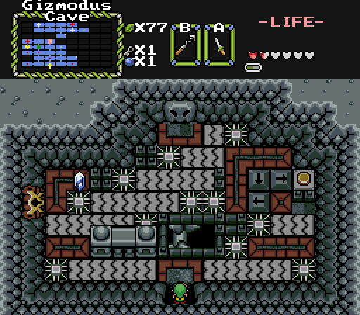
Not too much yet. Does everything flow alright, including Link? Looking for your thoughts. :)


#2 HavoX

HavoX

    Has more posts in Doomworld than in PureZC

  • Members
  • Real Name:Jon
  • Location:Republic, Missouri

Posted 02 November 2014 - 09:40 PM

Anthus' SS just screams "QUALITY!" all over the place.


Gets my vote.


EDIT: I take back that vote (my sincerest apologies, Anthus), Jared's SS has "QUALITY" splattered all over the place and shoves it right down your throat. Voted.


Edited by HavoX, 03 November 2014 - 02:40 PM.


#3 ZeldaPlayer

ZeldaPlayer

    What's up my playas

  • Members
  • Location:USA

Posted 02 November 2014 - 09:44 PM

We all need more votes!


Edited by ZeldaPlayer, 03 November 2014 - 06:17 AM.

  • coolgamer012345 likes this

#4 Shane

Shane

    đŸ’™

  • Moderators
  • Pronouns:He / Him
  • Location:South Australia

Posted 02 November 2014 - 10:14 PM

I voted for Jared because it has Firebird in it.


But isn't quite Firebird. It looks amazing too and reminds me of my LttP-esque tileset from long ago.


#5 Demonlink

Demonlink

    Lurking in the shadows...

  • Members
  • Real Name:Miguel
  • Location:Wouldn't you like to know?

Posted 02 November 2014 - 10:20 PM

Voted for Jared, seems that "Hybrid" tilesets are all that's popular on them young kids now :lol: Seriously, I like it, I dig it, and I desire more! Bravo to you good sir! Although, I'd suggest that instead of having a Darker Green Tree, swap it for, say, a red one? Then this would be more sexier! :D


Oh, and I'd leave the MC rocks instead of those BS ones as well ;)


Edited by Demonlink, 02 November 2014 - 10:21 PM.


#6 Dawnlight

Dawnlight

    My name is NOT Jason!

  • Members
  • Real Name:Justin
  • Location:Chicago, IL

Posted 02 November 2014 - 10:27 PM

I voted for the screen that makes me think of Schwa whenever I see that Link sprite.


#7 Eddy

Eddy

    ringle

  • Moderators
  • Real Name:Edward
  • Pronouns:He / Him
  • Location:London, United Kingdom

Posted 03 November 2014 - 10:42 AM

Very close between Jared and Anthus, but I went ahead and voted for Jared. That is one beautiful screenshot and I admire it in every way, I cannot think of anything bad to say about it, it's just amazing. Voted.


(oh and everything seems to flow really well with that shot)


#8 Omega

Omega

    Yes

  • Members

Posted 03 November 2014 - 02:22 PM

Went with Jared, looks the cleanest to me.


A little note for quest makers: If your screen is not clean cut looking, it has to be interesting. Otherwise it will look sloppy.


  • HavoX likes this

#9 Sheik

Sheik

    Deified

  • Members

Posted 04 November 2014 - 03:47 AM

Jared have you tried how the grass/dirt transition would look if you made it dark like the grass/mountaintop transition? Might make clearer lines. Otherwise pretty good!


  • Jared likes this

#10 Alucard648

Alucard648

    Wizard

  • Members
  • Location:castle Dracula

Posted 04 November 2014 - 07:16 AM

Voted for Anthus. Those spikes should deal 8 hearts in damage per touch.


  • Anthus likes this

#11 Chris Miller

Chris Miller

    The Dark Man

  • Banned
  • Real Name:King George XVII
  • Location:The Dark Chair

Posted 04 November 2014 - 07:19 AM

I voted for ZeldaPlayer, 'cause, you just can't beat those tiles.


#12 Omega

Omega

    Yes

  • Members

Posted 04 November 2014 - 12:23 PM

I voted for the screen that makes me think of Schwa whenever I see that Link sprite.

You mean the one where a tree is on top of a moutain, in a funky looking way? But yeah ZP, might wanna stray from that. To me it's equal to having cutoff, which is a big no-no! :shiver:


#13 Jared

Jared

    Deified

  • Members
  • Real Name:Jared
  • Pronouns:He / Him
  • Location:New Hampshire

Posted 04 November 2014 - 03:06 PM

Jared have you tried how the grass/dirt transition would look if you made it dark like the grass/mountaintop transition? Might make clearer lines. Otherwise pretty good!


I was actually planning on trying that! :)


#14 nicklegends

nicklegends

    Trofessional Pransposer

  • Contributors
  • Real Name:Ed
  • Pronouns:He / Him

Posted 04 November 2014 - 04:10 PM

joelmacool12
Not much to talk about; the shot is neither boring nor extraordinary. You might consider pulling the forest back a few trees to give Link more room to move around and dodge the Zoras.

Duck
Interesting layout and deep, moody colors. Currently, only trees are used as borders... Maybe throw in a rock or other obstacle every so often for variety?

ZeldaPlayer
The cliffs look strangely flat and unnatural... Maybe it's the low contrast.

Anthus
I sure as hell wouldn't want to play this screen, but it looks great. The tiles, as expected, meld together well; the grays and dark shading befit the grungy, industrial nature of the room. You would be vote on most weeks.

Jared
I love this screen. Usually, I point out when a shot lacks a central focus like a big waterfall or bridge or statue or environment, but this time, the draw is really how well the tiles fit together. My only graphical complaint is that the dirt–grass transitions look a little odd. You might entertain Sheik's suggestion about using a darker green in those areas. Great job overall. (And I've always been a particularly big sucker for those trees. <3)
  • Jared likes this

#15 Rambly

Rambly

    Hero of Time

  • Members

Posted 04 November 2014 - 08:03 PM

Jared's is gorgeous.  the flow of the screen itself is wonderful and it synthesizes elements from different tilesets beautifully.  plus, i love the palette.  i'll echo the sentiment about the grass borders being a bit too light, but otherwise, this screen is perfect.


  • Jared likes this


Also tagged with one or more of these keywords: Jared, joelmacool12, Duck, ZeldaPlayer, Anthus

0 user(s) are reading this topic

0 members, 0 guests, 0 anonymous users