Jump to content

Photo

Screenshot of the Week 468

Linkus MonopolyRubix RedTribeLink Shane GrantGreif

  • This topic is locked This topic is locked
9 replies to this topic

Poll: Screenshot of the Week 468 (58 member(s) have cast votes)

~

You cannot see the results of the poll until you have voted. Please login and cast your vote to see the results of this poll.
Vote

#1 The Satellite

The Satellite

    May the way of the Hero lead to the Triforce.

  • Members
  • Real Name:Michael
  • Pronouns:He / Him

Posted 10 August 2014 - 06:29 PM

MonopolyRubix

MonopolyRubix.png

Well, that's one way to get around...


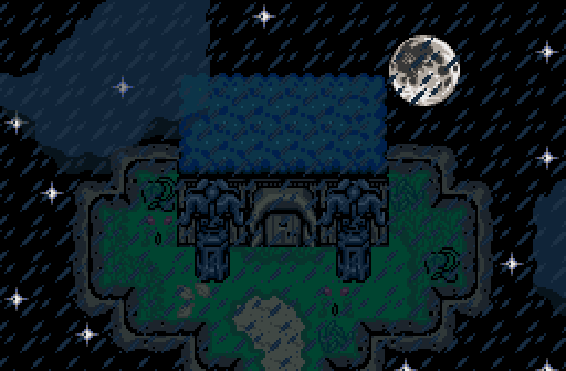
RedTribeLink

RedTribeLink.png

Preview of the opening screen for a new side project.


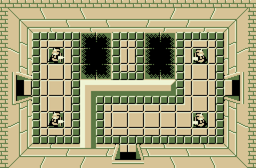
Shane

Shane.png

rule no 468 of sotw never submit classic sho- too bad


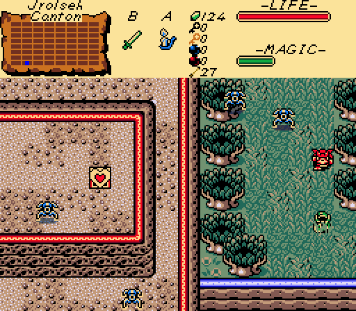
GrantGreif

GrantGreif.png

Moblin: Yes, Link, just keep staring at the plains...


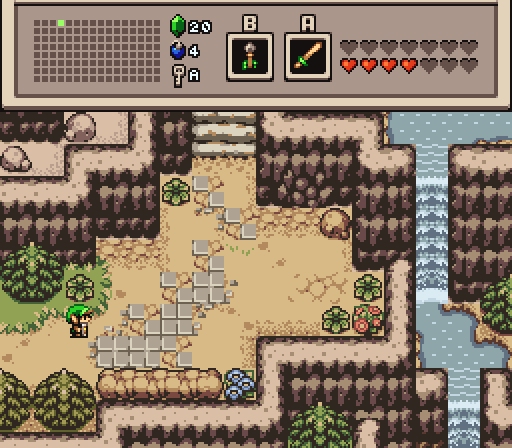
Linkus

Linkus.png

going up down the mountain...


#2 sutibu

sutibu

    Initiate

  • Members

Posted 10 August 2014 - 07:10 PM

Been forever since I posted in one of these.


Mr. Monopoly - Love the nostalgia feel to it and it's intriguing to see how it will play out in a quest. I think it would fit with a good action quest. For a SOTW entry though it lacks the screen design factor.


Red Tribe - Looks good and I think it's a nicely designed screen. Nice use of the clouds and the detail is right on (3 / 5)


Shane - I dig the palette, a lot actually. Screen looks great for classic with the right amount of detail without being too bland. Love the look of the pits. (3.5 / 5)


Grant - My vote went here. It's not the most spectacularly designed screen but something about it pulls me in. I love the contrast of the forest and the mountain and the palette is right on. Also seeing the heart container piece gives me that classic Zelda sense of adventure (4 / 5)


Linkus - My second place vote, only by a smidgen. This screen is fantastic in all ways. Love the palette, the subscreen, the tileset. The way the mountains stack looks great. Love the bombable wall entrance too. Ground detail is perfect and by far the best of the bunch. Awesome screen. (4 / 5)


All in all great turn out. For me screens that are well designed and that I want to play really do it for me and Grant and Linkus really stood out for me this week. Nice job everyone.


スティーブ


#3 Demonlink

Demonlink

    Lurking in the shadows...

  • Members
  • Real Name:Miguel
  • Location:Wouldn't you like to know?

Posted 10 August 2014 - 09:41 PM

My counterpart has done an excellent job with dem mountain tiles. Curse, yet again I vote for him!

#4 Eddy

Eddy

    ringle

  • Moderators
  • Real Name:Edward
  • Pronouns:He / Him
  • Location:London, United Kingdom

Posted 11 August 2014 - 04:02 AM

Linkus wins this week, I love that screen so much. The screen design is well made and it looks like such a great screen to play through. Vote went here this week.


#5 DCEnygma

DCEnygma

    you're going to have a bad time

  • Members
  • Real Name:Justin
  • Location:Indianaland

Posted 11 August 2014 - 08:38 AM

MonopolyRubix - Interesting concept for an area in a quest, but not really a super interesting screen. This certainly makes me curious for how it'd work in a quest (or if it'd just be an easter egg).


RedTribeLink - A nice establishing shot, perfect for a cutscene, as indicated. However, there's just something about how the cloud looks with the roof of the building that just bugs me. It's very likely that in motion, this screen will look much better than still.


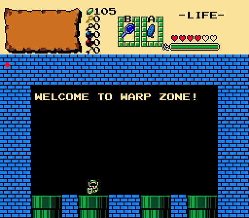
Shane - While I really like what's going on here as far as usage of the classic set, it's a bit hard to differentiate the wall extension from everything else. The colors also make it a bit hard on the eyes, as it took me a few seconds to actually comprehend the layout of the room. I feel that some different color choices would tie everything together much better.


GrantGreif - While the screen is perfectly fine, it comes across as having way too many hard angles. It seems everything is straight lines and hard corners and makes it feel more like a placeholder screen that would be tightened up later. It just feels kind of basic and simple because of that.


Linkus - Good, simple screen that would work as an approach to an important NPC cave or a dungeon I feel, if it were left without enemies as it is now. It's not a super interesting screen, but it does have a lot of atmosphere to it. The hidden cave is a nice touch as well, being both subtle and visible.


Overall I have to go with Linkus this week, as I feel it's the most complete screen.


#6 David

David

    Fallen leaves... adorn my night.

  • Administrators
  • Real Name:David
  • Pronouns:He / Him

Posted 11 August 2014 - 08:38 AM

I voted for Linkus this week. The screen looks really great visually and the screen design is very decent as well. :)


#7 ZeldaPlayer

ZeldaPlayer

    What's up my playas

  • Members
  • Location:USA

Posted 12 August 2014 - 09:34 AM

I voted for Shane this week. His was awesome!  :D


#8 Nathaniel

Nathaniel

    Deified

  • Members

Posted 12 August 2014 - 09:54 AM

MonopolyRubix - While certainly something different for Zelda Classic, it's not really that creative, and it still makes for a pretty dull screen.  It does bring on some memories, though.

RedTribeLink - The sky background is okay, along with the addition of bringing on the moon.  Not much room for screen design here, but it's not bad for the limited space.

Shane - It's a dungeon screen with Darknut Statues.  The floor edge treatments are certainly a bonus.  I'm not sure what else to say.

GrantGreif - The ground design is decent, but the barren elements feel artificial with the very rectangular framework.

Linkus - Now we are talking!  It's beautiful, well detailed, very pleasing to the eyes, and completely makes sense.  Tasteful and fitting subscreen included.  This one is no contest.


#9 Astromeow

Astromeow

    RESPECT DA OBOE SOLO

  • Members

Posted 12 August 2014 - 06:47 PM

Monopoly has balls to the walls I vote

Red has a beautiful shot but only if the colors were better

Shane screen has a face in it that made me lol. Thanks it brightened my evening

The Oracle shot unfortunately is too generic but aimed towards the right direction

Links brings in a superb screen as well however I'm not feeling it. Perhaps some action would bring the screen to life
  • Shane likes this

#10 The Satellite

The Satellite

    May the way of the Hero lead to the Triforce.

  • Members
  • Real Name:Michael
  • Pronouns:He / Him

Posted 17 August 2014 - 01:51 PM

With 60.00% of the vote, the winner of Screenshot of the Week 468 is Linkus!


Linkus.png


Congratulations!


Voting totals:

- MonopolyRubix (5 votes [10.00%])
- RedTribeLink (8 votes [16.00%])
- Shane (4 votes [8.00%])
- GrantGreif (3 votes [6.00%])
- Linkus (30 votes [60.00%])


Also tagged with one or more of these keywords: Linkus, MonopolyRubix, RedTribeLink, Shane, GrantGreif

0 user(s) are reading this topic

0 members, 0 guests, 0 anonymous users