Jared
I wonder what I'll find in that cave...
BigJoe
A flock of seagulls.
Shane
Demonlink
Decora Village Cave... courtesy of upcoming Hylian Legacy ![]()

 This topic is locked
May the way of the Hero lead to the Triforce.

Posted 20 July 2014 - 06:21 PM
Jared
I wonder what I'll find in that cave...
BigJoe
A flock of seagulls.
Shane
Demonlink
Decora Village Cave... courtesy of upcoming Hylian Legacy ![]()
What's up my playas

Posted 20 July 2014 - 06:27 PM
Wow, I can't believe it! I was the first one to vote!  I voted for Demonlink's!
RESPECT DA OBOE SOLO

Posted 20 July 2014 - 06:31 PM
Had to null... none appealed to me. Good stuff though
My name is NOT Jason!

Posted 20 July 2014 - 07:54 PM
I voted for the user whose name rhymes with PAIN.
Everything must go away

Posted 20 July 2014 - 08:26 PM
I voted for Demonlink because DoR needs some lovin'.
one point nine hero

Posted 20 July 2014 - 09:17 PM
Had to null... none appealed to me. Good stuff though
same.
Trofessional Pransposer

Posted 20 July 2014 - 09:22 PM
🤍

Posted 21 July 2014 - 12:43 AM
Thanks for everyone who voted for me. Obviously appreciate the criticism and support. I like Jared's; his is nice and clean. The atmosphere is subtle, but it works. You can easily see it has colour and personality, and that's why I voted. BigJoe was close second for the same reasons. Demonlink's has a very nice screen structure, but the palette is slightly painful to look at. The side-by-side lock blocks also make the screen feel tad unpolished if you know what I mean.
It's not a bad screen by any means. Far from it actually. But I think Jared's and BigJoe's are slightly more appealing.
There is great power in knowledge.

Posted 21 July 2014 - 09:06 AM
I always have a hard time picking one... I really like all of them and could see all of them being in a quest. I ended up picking BigJoe. Not sure why exactly I picked it over the others, as they all were good.
Unburdened By What Has Been

Posted 21 July 2014 - 11:57 AM
All four screens show evidence of plenty of experience with screen design, so there are no too obvious ways to vote here. They all make a good conscious effort at detail. I do like them all.
As for some of the differences...
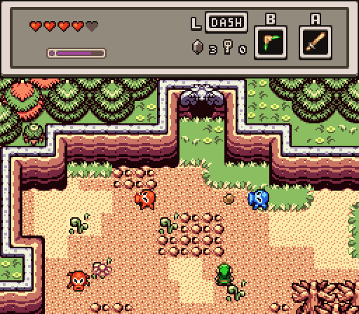
Jared - The ground detail doesn't look as sharp to me compared to the other three, but that is mostly due to the abrupt straight line color transitions on the sand, mainly due to tile choice decisions.
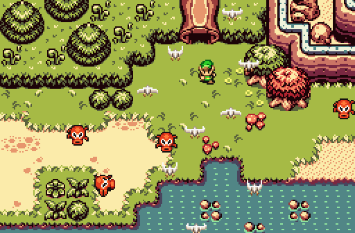
BigJoe - Same tileset, with more ground emphasis on grass, but certainly with some other sand options at play.
Shane - Great attention to natural detail, but nothing from the animal kingdom makes it duller than the others in the action department, but I do understand that not all screens are meant to focus on that.
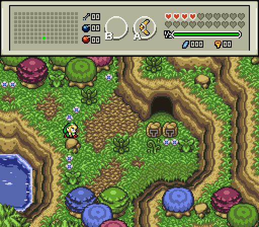
Demonlink - Another well designed screen with an easy to look at palette, and my vote for this week.
you're going to have a bad time

Posted 22 July 2014 - 06:37 AM
Jared - Nice looking screen here. I really like the way the grass and sand tiles interact with each other. One odd thing I noticed is the tile up and right of the bottom left red ocktrok looks... odd? I'm not sure if that's something strange going on with the layering or a leever is trying to appear there, but it actually stands out a bit to me.
BigJoe - This looks like the outskirts of a forest running alongside a lake or river, so I feel it's accomplishing what it's trying to do. I like the variety of bushes/small trees in that they don't clash with one another or make the screen seem too busy. The seagulls are a nice touch, but for some reason I want to run so far away.
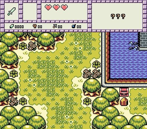
Shane - Strikes me as a very OoX-style traditional screen. I like the rock blocking the chest, since it immediately conveys a need to return with an upgrade later. It kind of tells a story. My only concern that comes up here deals with potential consistency in layering. Are you always able to walk behind the tree tops? Because if so, you'll be able to scroll left on this screen. If that's intentional, cool, but if you can't walk past those trees, it'll seem very unusual.
Demonlink - Another screen with great coloring that makes the scene pop out. Also much like other screens you've done, despite the amount of variety in the tiles being used the screen doesn't feel cluttered or busy. My only recommendation here is I'd change the 2 lock blocks into 1 longer lock block if you can, because it just looks a bit unusual this way.
I have to say, while all of the screens are competent and well made, none of them stand out in a big way. It just feels like a very "play it safe" kind of week, which is perfectly fine, but makes it harder to vote. As such, I'll vote for the one that I didn't see anything with that distracted from how it looks, which is BigJoe's this week.
🤍
Posted 22 July 2014 - 07:00 AM
Shane - Strikes me as a very OoX-style traditional screen. I like the rock blocking the chest, since it immediately conveys a need to return with an upgrade later. It kind of tells a story. My only concern that comes up here deals with potential consistency in layering. Are you always able to walk behind the tree tops? Because if so, you'll be able to scroll left on this screen. If that's intentional, cool, but if you can't walk past those trees, it'll seem very unusual.
Thanks for commenting! One thing I enjoyed about the oracle games is seeing objects that you can't interact with until later, and serve to tease you early on. It made exploration so enticing. Speaking of those games, the trees are fully solid, just like in every official Gameboy Zelda title (example). I can't blame you if you're used to half solid GBZ trees in ZC quests, but half solid GBZ trees has always been a personal pet peeve of mine, so I decided to stay faithful with the GBZ titles and keep them fully solid. Hopefully when you play the quest you become accustomed to it. If not I may add in a purple tree to add insult to the injury.
Anyway, I wish I had the time to throw in some enemies (was in a hurry to get to bed for school). Link was also meant to be present, but he was facing north (or maybe south, I dunno anymore) when I took the pic and currently I lack north facing Link sprites. And I figured everyone is sick of seeing my custom Link facing left and right in all my pics. ![]()
Deified

Posted 22 July 2014 - 06:34 PM
Jared - Nice looking screen here. I really like the way the grass and sand tiles interact with each other. One odd thing I noticed is the tile up and right of the bottom left red ocktrok looks... odd? I'm not sure if that's something strange going on with the layering or a leever is trying to appear there, but it actually stands out a bit to me
Yeah, I didn't even notice that. That's a Leever trying to emerge. ![]()
May the way of the Hero lead to the Triforce.
Posted 27 July 2014 - 04:27 PM
With 32.61% of the vote, the winner of Screenshot of the Week 465 is Shane!
Congratulations!
Voting totals:
Jared (5 votes [10.87%])
BigJoe (14 votes [30.43%])
- Shane (15 votes [32.61%])
Demonlink (12 votes [26.09%])
PureZC Events →
Screenshot of the Week →
Poll Screenshot of the Week 893Started by Anthus , 20 Jul 2026 |
|

|
||
 |
Shane
PureZC Events →
Screenshot of the Week →
Poll Screenshot of the Month 222Started by Anthus , 29 Jun 2026 |
|

|
|
|
|
Shane
PureZC Events →
Screenshot of the Week →
Poll Screenshot of the Week 890Started by Anthus , 22 Jun 2026 |
|
|
|
|
|
Matthew
PureZC Events →
Screenshot of the Week →
Poll Screenshot of the Month 220Started by Anthus , 04 May 2026 |
|
|
|
|
|
Shane
PureZC Events →
Screenshot of the Week →
Poll Screenshot of the Week 882Started by Anthus , 27 Apr 2026 |
|
|
0 members, 1 guests, 0 anonymous users


.png)