Posted 23 June 2014 - 02:22 PM
Nexas
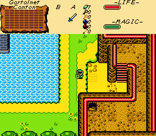
A simple shot with a nice open structure for the most part. Overall, the scene is neither bad nor special. It befits the first screen of a quest where everything feels cozy and nonthreatening but also somewhat boring.
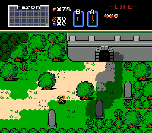
NewJourneysFire
Your use of independently-layered cliffs and the shadows they cast really make that chasm look huge! All too often, canyons look shallower than they ought in that tileset because the entirety of the descent merges into a single tile of ambiguous depth.
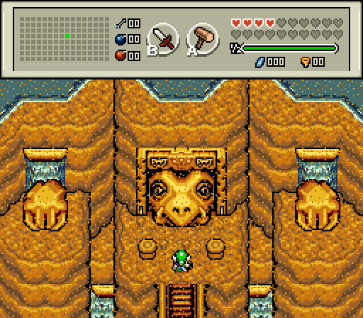
CDi-Fails
The water at the top off the cliffs looks a little odd, especially since there is no water at the bottom of the cliffs to complement it. Beside that, this is a well-executed shot that elevates the significance and mystery of the dungeon the player is about to enter.
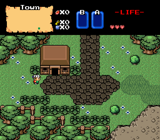
-DuCkTApE-
The building's facade is sorely missing detail when compared to the foliage on the screen. But all in all, I like the colors, design, and overall vibe of the screen.
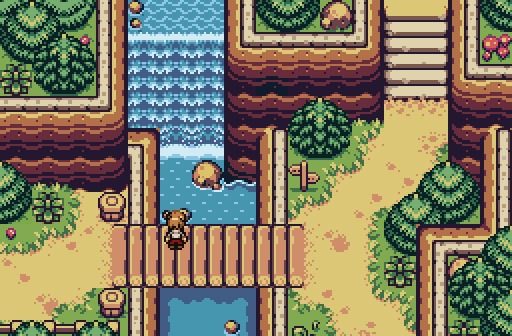
Linkus
Beautiful, natural colors combine with subtle but effective details to make this a hell of a screen.
GrantGreif
The right half of the screen looks great.
I voted for Linkus.

 This topic is locked