QUOTE(Jupiter @ Mar 1 2010, 09:41 PM)

Thanks GK for giving me your vote, even though it was reluctant.
So that I can address the problem, what issues are there that stand out to you with the shading?
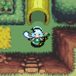
I'm an agreement with the pot on the stump. I'm trying to make it so that it looks like a sort lived in out of the way cottage, hence trying to have some stuff lying around, like the pot, as if it was just left there the last time it was used. But it doesn't fit on that stump...I really just need a different item to put on there.
As for the font. You're not the first to criticize that. I get the problems some people are having with it...but I'm trying to give the quest an overall atmosphere of menace, I think the font adds to that a little. I like it for now, but will keep reconsidering it until I finish the quest I'm sure.
The ground/wall/stumps/etc all have rather high detail level. Those tiles are also using a very smooth shading.
The walk able sprites on the other hand lack very much detail, this is however good as the sprites should stand out and be easy to identify. The problem is mainly, the trees from the oracle series, pots and such that simply lack that level of detail as the rest of the graphics have. In order to make those tiles stand out more the choice of palette is not as smooth, this is generally good when using more tiles like this, but it simply clash to much here.
The pot on the stump is generally not a bad idea, but no sane person would just put it on the edge of it like that, it's much higher risk of it falling of a breaking!

As for the font: The problem is not the color of the font per se, it's how bright it is. It's also it that it red and green clashes so that makes it stand out even more. I would suggest at least making the red a bit darker and maybe making the green in another color. Obviously this won't be one of the biggest matter when you play the quest (sticks out while looking at screens though) but making it better will improve it in at least some way. =)

 This topic is locked