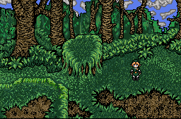
Link navigating Mystic Woods of the Dammed.
Linkus
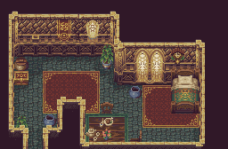
Just a regular guest room in a palace.
Shoelace
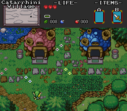
Welcome to Catarrhini Village
Trimaster001
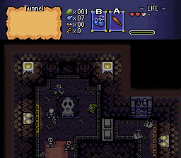
What will Link find in this secret cave?
And let the voting begin!

 This topic is locked
The Shaman of Sexy!

Posted 02 December 2007 - 02:56 PM
Dolphinslayer

Posted 02 December 2007 - 02:59 PM
May the way of the Hero lead to the Triforce.

Posted 02 December 2007 - 02:59 PM
Why, must I clean out Old Lady Simmon's Cave?
Posted 02 December 2007 - 03:04 PM
End Fascism

Posted 02 December 2007 - 03:08 PM
Edited by gray0x, 02 December 2007 - 03:09 PM.
Deified
Posted 02 December 2007 - 03:09 PM
Retired

Posted 02 December 2007 - 03:10 PM
Recipient of Ways

Posted 02 December 2007 - 03:19 PM
Why, must I clean out Old Lady Simmon's Cave?
Posted 02 December 2007 - 03:27 PM

Chosen One
Posted 02 December 2007 - 03:51 PM
.

Posted 02 December 2007 - 03:58 PM
Why, must I clean out Old Lady Simmon's Cave?
Posted 02 December 2007 - 04:25 PM
My name is NOT Jason!
Posted 02 December 2007 - 04:32 PM
The Shaman of Sexy!
Posted 02 December 2007 - 04:34 PM
My name is NOT Jason!
Posted 02 December 2007 - 04:46 PM
0 members, 0 guests, 0 anonymous users

