Jump to content

Photo

Screenshot of The Week 178


  • This topic is locked This topic is locked
47 replies to this topic

Poll: Contestants (54 member(s) have cast votes)

Which shot?

You cannot see the results of the poll until you have voted. Please login and cast your vote to see the results of this poll.
Vote

#1 Teilyr

Teilyr

  • Members
  • Real Name:Adam
  • Location:Louisiana

Posted 23 September 2007 - 04:35 PM

Sorry about the delay. I had business to attend to.

TriMaster001
IPB Image
How on earth does Link get out of this tunnel?

The Satellite
IPB Image
Always winter but never Christmas. ... I sense a clich.

Evan the great
IPB Image
Link finds a fortress in the enchanted forest.

Ebola Zaire
IPB Image
These Minimentuses won't know what hit them...

/M/
IPB Image
Still a WIP..


#2 The Satellite

The Satellite

    May the way of the Hero lead to the Triforce.

  • Members
  • Real Name:Michael
  • Pronouns:He / Him

Posted 23 September 2007 - 04:41 PM

Took a null.

- TriMaster001 -

Dungeon shot... Not much to say. icon_shrug.gif

- The Satellite -

>:O

- Evan the great -

Very good usage of tiles. I freakin' love your tileset/palettes/etc. Nice layout, and light beams. Good show.

- Ebola Zaire -

I don't like the new mountains in that color. Just... kinda bland.

- /M/ -

Nice palette, tiles, usage. You need a Link sprite, though. icon_deformed.gif

#3 Plissken

Plissken

    What's with these homies dissing our girls?

  • Members

Posted 23 September 2007 - 04:54 PM

Trimaster: Nice dungeon shot as always but it's just not as eyecatching as others.

The Satellite: Good shot, but as I said before, don't really like how the trees are grouped.

Evan: WOW, nice palette! I love your forest shots!

Ebola Zaire: Again WOW, great mountain usage and great detail.

/M/: Jeez way to many great shots this week. This shot is really cool and the graphics and palette is just amazing.

My vote goes to Ebola, so close between you last three but that's the one that I seem to like the best.

#4 The Satellite

The Satellite

    May the way of the Hero lead to the Triforce.

  • Members
  • Real Name:Michael
  • Pronouns:He / Him

Posted 23 September 2007 - 04:56 PM

I just noticed, this isn't pinned, and 177 still is.

#5 Evile

Evile

    Dolphinslayer

  • Members

Posted 23 September 2007 - 05:15 PM

Nulled of course.

Would've voted for TM or /M/ if I voted. Good show everyone.

#6 Feenicks

Feenicks

    still the harpy guy

  • Members
  • Real Name:Robert
  • Location:dn ǝpᴉs ʇɥƃᴉɹ

Posted 23 September 2007 - 05:53 PM

TM001's: I like that dungeon screen. Somehow it looks more detailed than the other screens. [votes]
TS: That's from The Lion, the Witch and the Wardrobe! Add more detail to the snow and it would look better.
Evan: Aren't those fortress walls normally used as dungeon walls instead? Anyway, it looks good but the beams of light look a bit odd...
Ebola Zaire: I like those mountain tiles. Bit too brown for my liking, though...
M: Looks like there's mist all over the screen. Whether that's good or bad still needs to be determined...

#7 Dawnlight

Dawnlight

    My name is NOT Jason!

  • Members
  • Real Name:Justin
  • Location:Chicago, IL

Posted 23 September 2007 - 07:34 PM

icon_omg.gif Holy Cow! 7 votes already. I never thought I would get that many votes! I guess it was the video?

Anyway my vote goes to Evan the Great. That new palette left me drooling.

Sattelite: Too underdetailed.

Ebola: My second choice.

/M/: Nice but not nice enough.


#8 DarkFlameWolf

DarkFlameWolf

    Murana Wolford

  • Members

Posted 23 September 2007 - 08:31 PM

Trimaster: Would have gotten my vote, if it wasn't so dark. Dark screenshots = not good for SOTW. Great for gameplay though. Second place.

Satellite: Too bland, not really much going on and very minimal detail.

Evan the Great: Nice shot, good graphics, but there are some empty spots which you could fill along the top, right side and bottom left. Make it a bit more interesting. Right now, nothing is jumping out besides those trees and that alone won't cut it.

Ebola Zaire: My vote goes here. Its not entirely the best, the palette is kinda yucky. But the design is great and its very busy in terms of stuff happening in the screen. Good use of mountains, you're as good as I am.

/M/: Ugh, no. I know its a WIP, but the palette sucks, the graphics are not used correctly. WIP are not good for SOTW.


#9 Mitchfork

Mitchfork

    no fun. not ever.

  • Contributors
  • Real Name:Mitch
  • Location:Alabama

Posted 23 September 2007 - 09:52 PM

Null'd, of course.

TriMaster001: I love this shot. It's refreshingly different from what we've seen in the past... IMO, your dungeon shots are amazing.

The Satellite: Not so hot on the GB + LttP + Pine tree thing you got going on there. icon_unsettled.gif

Evan the Great: Your palette is great, but it's almost like we've seen this before... well, except those light beams. Which are amazingly better than the Pure counterparts.

Ebola Zaire:
QUOTE
Ebola Zaire: My vote goes here. Its not entirely the best, the palette is kinda yucky. But the design is great and its very busy in terms of stuff happening in the screen. Good use of mountains, you're as good as I am.
I like the palette... kind of a dusty/worn down look that's excellent for the area. Granted, the palette didn't have a high enough contrast for the mountains... I'll have to fix that later, I was really in a rush to get this out before Xavier started 178. And I wouldn't say I'm as good as you... I just had a spur of creativity, is all. icon_wink.gif

/M/: A work-in-progress, I understand, so I won't grade too harshly... but the palette really isn't very saturated at all... it's almost as if you're viewing it through foggy glass. I also like how you tried to make the mountains more organic, but it didn't really turn out well... I can spot a few height and tile errors in their. I say, stick the the LttP style with those.


#10 Freedom

Freedom

    Warrior

  • Members

Posted 23 September 2007 - 10:03 PM

Ebola, those stairs look really out of place to me, but you got the vote regardless.

Edited by Freedom, 23 September 2007 - 10:03 PM.


#11 Mitchfork

Mitchfork

    no fun. not ever.

  • Contributors
  • Real Name:Mitch
  • Location:Alabama

Posted 23 September 2007 - 10:06 PM

QUOTE(Freedom @ Sep 23 2007, 10:03 PM) View Post
Ebola, those stairs look really out of place to me, but you got the vote regardless.
Colorwise, or stylewise? Colors are an easy fix, but style... a slightly harder fix.

#12 /M/

/M/

    6♣7♠8♥9♥10♥

  • Members
  • Location:Gotham City

Posted 23 September 2007 - 10:21 PM

QUOTE
/M/: Ugh, no. I know its a WIP, but the palette sucks, the graphics are not used correctly. WIP are not good for SOTW.


Yeah the palette + mountains suck (only graphics that is use correctly, the trees can't be used incorrectly.), I made this screen in a minute. I just wanted some suggestions on things I could add or remove, such as the mountain tiles. a WIP tileset is actually a good idea for SoTW, since SoTW is mostly to get criticism, you'll know what to change before you finish it. I've also started yet another WIP palette, though it doesn't really look the same as the first.

IPB Image

Before I get someone saying "Its too dark now!", it doesn't look dark in ZC, so its fine as it is.

#13 Colin

Colin

    Coblin the Goblin

  • Members

Posted 23 September 2007 - 11:10 PM

QUOTE(/M/ @ Sep 23 2007, 09:21 PM) View Post

Yeah the palette + mountains suck (only graphics that is use correctly, the trees can't be used incorrectly.), I made this screen in a minute. I just wanted some suggestions on things I could add or remove, such as the mountain tiles. a WIP tileset is actually a good idea for SoTW, since SoTW is mostly to get criticism, you'll know what to change before you finish it. I've also started yet another WIP palette, though it doesn't really look the same as the first.

IPB Image

Before I get someone saying "Its too dark now!", it doesn't look dark in ZC, so its fine as it is.


Ah man, that comment's annoying, I got it a lot on my first SotW I ever won, if anyone remembers... LINK icon_razz.gif

Anyway, onto C&C...


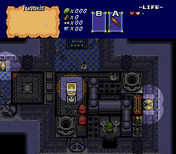
Trimaster: Extremely well designed and well thought of dungeon shot, the only true problem I have with it is that NOTHING'S NEW! It's all the stuff you normally see in Pure besides the chu jellies. Bring something new, something awesome into the shot, and I'd vote for it...

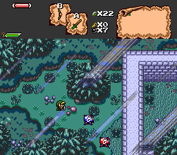
The Satellite: Pretty good, cept, I suggest you either go with LttP sized trees, or Oracle sized trees, they honestly don't look good together in my opinion, too much clashing style.

Evan the Great: Lesee, what makes people take your vote... palette... purty trees... see, you're actually doing something good with nintendo's graphics something new, the only thing I don't like about it is your darkest blue is too... blue... I suggest you take a little blue from it, and add a little green.

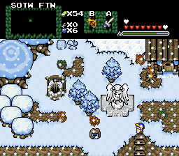
Ebola Zaire: Are we seeing a trend now? 4 people using those mountains? Cuz they are good mountains... anyway those mountains fit the style of that shot than those oracle mountains did. Good job.

/M/: Great shot, but the palette kinda... is like BLAM! WHITE! I dunno, I suggest you add a little more contrast from the darker to lighter colors or something, kinda like the shot with the palette you just made, but brighter.

With that all said and done, Ebola Zaire gets my vote.


#14 Freedom

Freedom

    Warrior

  • Members

Posted 23 September 2007 - 11:38 PM

QUOTE(Ebola Zaire @ Sep 23 2007, 09:06 PM) View Post

Colorwise, or stylewise? Colors are an easy fix, but style... a slightly harder fix.


The two on the left colorwise, that one on the right may be another story, if it's leading up to a dungeon entrance it's probably ok though.
I would think the people building the stairs would use materials at hand, so it would be more like they would carve them out of the same stone as the mountains are. icon_wink.gif

Edited by Freedom, 23 September 2007 - 11:39 PM.


#15 Moonbread

Moonbread

    Playing With Psychos

  • Members
  • Pronouns:They / Them

Posted 24 September 2007 - 01:57 AM

I like /M/'s style. The other shots are good, but I like uniqueness the most, as long as it's used well.


0 user(s) are reading this topic

0 members, 0 guests, 0 anonymous users