Jump to content

Photo

Screenshot of the Week 163


  • This topic is locked This topic is locked
70 replies to this topic

Poll: Screenshot of the Week 163 (54 member(s) have cast votes)

Contestants

You cannot see the results of the poll until you have voted. Please login and cast your vote to see the results of this poll.
Vote

#1 link3505

link3505

    Ancient

  • Members
  • Real Name:Ben
  • Location:The Edge of Infinity

Posted 27 May 2007 - 06:37 PM

Billy Ronald
IPB Image
The new castle town only in HvT

ennonfenom
IPB Image
Link is checking out the water in front of old lady Simmons, wanting to take a dip, but old lady Simmons said "Not until you clean the monsters out of my cave!" 0_o?

Sharon Daniel
IPB Image
Link wishes he had a potion.

The Satellite
IPB Image
The forest suddenly turns to desert, and there is another Triforce shrine here... How many questions will go unanswered?

Trimaster001
IPB Image
"I must hurry and see Princess Zelda!" - Link

#2 Colin

Colin

    Coblin the Goblin

  • Members

Posted 27 May 2007 - 06:39 PM

I think Sharon Daniel's shot was the best, the colors looked really cool together, the red trees with the brown mountain, it just looks awesome.

Billy Ronald: I have to admit, your screen composition is getting better, but the main problems with this screen is that there are no water details, and there aren't any grass details on what little grass there is, if you simply added these details, it would look better. Oh, and you should probably put trees or blocks or whatever on the corners of the shot somehow.

Ennonfenom: I don't know, the transparent water in this shot is just weird, maybe it's just me. Also, you probably should add some flowers to that grass, all of your details are too similar.

OK, I read system error's comment, I think I know what's wrong with the water now.
1: Add white like system error said.
2: Waterfalls are really white, not really blue. You should probably make it white considering that you're going for realistic water.

Sharon Daniel: Vote, I don't see anything wrong with this shot.

The Satellite: It's nice, the pedestal looks really nice, but all the trees along the left border are the same and too repetitive, take out a couple, and you'll be good to go, oh and you also might want to make your forest vegetation a little less boxlike as a whole, and add some juts and bumps around the edges.

Trimaster001: I know it's a temple/dungeon, but the first room doesn't necessarily need to symmetrical, other than that, it's fine.

Edited by Nuvo, 27 May 2007 - 07:18 PM.


#3 Dawnlight

Dawnlight

    My name is NOT Jason!

  • Members
  • Real Name:Justin
  • Location:Chicago, IL

Posted 27 May 2007 - 06:50 PM

Billy Ronald: Looks a little too empty.

ennonfenom: It doesn't seem too fair that your shot can be animated. and work on the grass.


Sharon Daniel (vote): Awesome shot with everything a quest should have, but it's kinda like playing Link's Birthday DX.

The Satellite: It's pretty messy. In my opinion there's way too many trees and it's a little overcrowded.

Trimaster001: Last week, I submitted an overworld shot, now it's an interior shot. I admit, the outer walls should be brighter.


#4 EnnonFenom

EnnonFenom

    Why, must I clean out Old Lady Simmon's Cave?

  • Banned
  • Real Name:Eric Dethel

Posted 27 May 2007 - 06:55 PM

QUOTE(Trimaster001 @ May 27 2007, 04:50 PM) View Post


ennonfenom: It doesn't seem too fair that your shot can be animated. and work on the grass.


well I sent in two shoots one plain unanimated, and the animated one, after seeing in sotw archive an animated shoot, But yes I no I need to add more detail too that screen.

#5 Dawnlight

Dawnlight

    My name is NOT Jason!

  • Members
  • Real Name:Justin
  • Location:Chicago, IL

Posted 27 May 2007 - 06:58 PM

I see, anyway it was a hard decision between you and SD. Your shot looked really good.

#6 System Error

System Error

    Doyen(ne)

  • Members

Posted 27 May 2007 - 07:02 PM

Billy Ronald: Very plain. The enemy stuck in the corner is a sign of bad design. What's with the section of the right part of the gate that's dark for no real reason?

ennonfenom: The best transparent water I've ever seen. And it still needs work. Put in some white, nontransparent water, particularly around the rock and waterfall. Nevertheless, the best shot here, with good design.

Mighty Darknut: Nothing too special about this screenshot. Dull grey bushes look odd.

The Satellite: There's a green shell in the sand. The twin Pokemon trees should both be the same color for best results. The triforce pedestral looks bad, and needs some texturization.

Trimaster001: The LttP dungeon roofs don't really work with the given walls. The red ground under the lamps looks bad.

#7 lucas92

lucas92

    Defender

  • Members

Posted 27 May 2007 - 07:13 PM

Voted for Trimaster001. The arch is a very nice touch, and it has a nice entrance feeling in there.

#8 Nathaniel

Nathaniel

    Deified

  • Members

Posted 27 May 2007 - 08:57 PM

Pros

Billy Ronald: You kind of know what it is about. It is organized.

ennonfenom: It takes advantage of nice features that are appropriate for its environment. The see through water is awesome.

Sharon Daniel: Very organized and very purposeful. A great quest has many shots of this quality. It is both complete and makes you think of the shots next to them.

The Satellite: The focus of this shot is very well seen.

Trimaster001: This shot is beatiful and makes great usage of the chosen tiles. The grand entrance is exactly what it is, as it is one to remember. Overall, the shot is complete and doesn't have me begging for more. A very stellar job.


Constructive Criticism

Billy Ronald: I am not sure what else can be placed in the shot, but I am sure other details could be introduced with a creative mind. While the center of the shot is good, that and the road around it don't leave much room to do much else. The stream looks like it is barely fitting in, so perhaps the bank in the upper left would be best placed in the next screen, as it looks like you are simply trying to cram it in from the perspective of this shot alone.

ennonfenom: The bridge seems quite long for its width. I am not sure how architctually sound that is, but I could be wrong on that thinking. Also, the right half of the subscreen portion is blank. Lots of blank space on a subscreen does not look attractive. It should all be used, unless you have a reason for leaving it blank in some situations, depending on what you have in mind for the quest as a whole.

Sharon Daniel: I am not sure how I can criticize this in terms of design, as that seems to be a very strong point for you. It seems to me that the stairs leading up to the screen north make me think of how good looking that screen will be, but I suppose that depends on how long they will be. I would certainly be interested in knowing what that screen will look like, so criticism in that regard can't be done unless I know. Not sure what else I could say.

The Satellite: The desert portion looks like its features are being crammed into the shot. Perhaps a few less trees will fix it, as the edges of the shot should make me anticipate what the next shots might have in it. Also, the north and west edges are very straight, which is not how nature intends it to be. The border between the grass and the sand is also very straight, which goes against nature. Do your best to bring some curve to it within the limitations that you have.

Trimaster001: Like Sharon's shot, I also find this hard to criticise on design.

Between Sharon and Trimaster001 it was tough to decide, but in the end I went with Sharon. I would be very happy if either one of them won.

#9 EnnonFenom

EnnonFenom

    Why, must I clean out Old Lady Simmon's Cave?

  • Banned
  • Real Name:Eric Dethel

Posted 27 May 2007 - 10:50 PM

QUOTE(Nathaniel @ May 27 2007, 06:57 PM) View Post

]
ennonfenom: The bridge seems quite long for its width. I am not sure how architctually sound that is, but I could be wrong on that thinking. Also, the right half of the subscreen portion is blank. Lots of blank space on a subscreen does not look attractive. It should all be used, unless you have a reason for leaving it blank in some situations, depending on what you have in mind for the quest as a whole.


Yeah I know, That blank spot has a mini map there but its not showing up for some reason icon_shrug.gif I kinda wish I would have waited to submit that screen a little whil longer cause I have updated it. Just shortly after submitting it. Oh well. Well I'm of to read up on subscreen tutorial to figure out the mini map!

Edited by ennonfenom, 27 May 2007 - 10:51 PM.


#10 Majora

Majora

    Unironic Marxist-Leninist

  • Members

Posted 27 May 2007 - 11:50 PM

I failed to submit anything because it all sucked T_T

*regains composure*

Ahem:

BR: You are getting better, keep at it and you'll win in no time icon_wink.gif The screen design is average, and it's a bit too symmetrical. NoeL mentioned something about the rule of 3's in SotW 161 (or 162), that should help you.

ennonfenom: This would have gotten my vote if the grass was as awesome as the water. That was the only flaw. The fact that the screen has a bit empty is OK. Even real-life nature isn't full to the brim with trees and stuff (well, thanks to people anyway icon_blah.gif)

Sharon: Well, not much I can say. It's average, but at the same time not average enough to warrant criticism icon_shrug.gif

The Satellite: it has an epic-ee-ness feel to it, and the idea is generic, yet original (as in something happens to a very used area, but not something you really expect). The trees are a bit too crammed, but by only one or two. The shrine looks concave (unless thats what you wer going for)

Trimaster001: Generic castle shot. Although the layering and perceived height of the walls make it above average.


Exceptional SotW this week! Hopefully I will submit something next week. Like from my quest or something.

Edited by Majora's Wrath, 27 May 2007 - 11:55 PM.


#11 NoeL

NoeL

    Legend

  • Members
  • Real Name:Jerram

Posted 28 May 2007 - 12:19 AM

Voted for SD... although that puzzle seems needlessly easy. What, you step on the switch and the barriers come down? What's the point, to make the player walk a bit more? You can be more creative than that! icon_razz.gif

and ennonfenom... it's probably already been said, but a waterfall flowing into a tiny basin that doesn't overflow? At least have some shallow water joining the basin to the lake.

#12 Sharon Daniel

Sharon Daniel

    .

  • Banned

Posted 28 May 2007 - 12:46 AM

It's not a puzzle. I took the idea from Mr. Z; it's a warp station. You need to visit the area normally and lower the barriers so you can warp back through the cave.

#13 NoeL

NoeL

    Legend

  • Members
  • Real Name:Jerram

Posted 28 May 2007 - 02:46 AM

Ah, gotcha.

#14 Old Inactive Member

Old Inactive Member

    I'm back sorta.

  • Members

Posted 28 May 2007 - 04:16 AM

QUOTE(Nuvo @ May 28 2007, 12:39 AM) View Post
Billy Ronald: I have to admit, your screen composition is getting better, but the main problems with this screen is that there are no water details, and there aren't any grass details on what little grass there is, if you simply added these details, it would look better. Oh, and you should probably put trees or blocks or whatever on the corners of the shot somehow.


There are no water detiles becasue it is a mote around Hyrule Castle

BR: voted for it becasue it is mine (vote)
ennonfenom: not bad but could have had more detiles
Sharon Daniel: Not much wrong with that shot the only thing is well nothing
The Satellite : just a normal DOR shot
Trimaster001: I like what you have done but the overhead looks a wee bit to high


So a lot of good shots this week


#15 The Satellite

The Satellite

    May the way of the Hero lead to the Triforce.

  • Members
  • Real Name:Michael
  • Pronouns:He / Him

Posted 28 May 2007 - 10:18 AM

Time to get started. My first SotW, and now I can learn how to improve my shots.

- billy ronald -

It's a nice shot and all, not too many complaints. Good job. icon_wink.gif

- ennonfenom -

Voted this because I'm sick of Pure. icon_razz.gif Actually, it does work well together, some nice variation, and it's just altogether pretty. Gets my vote.

- Sharon Daniel -

Even though it's Pure, it works and has coherence. Something to do with colors is holding me back, though. Not sure what. Oh, and the fact that it's Pure. icon_blah.gif

- The Satellite -

I decided to take the plunge and submit a shot. By gaining experience, I'll take your constructive criticism and learn how to make a shot really work. btw, the pedestal was custom-made.

- Trimaster001 -

Well, it's a nice usage of dungeon tiles, but it's lacking alot. The torches(?) break the flow, IMO. It's also pretty empty, considering all of these other OVERWORLD shots. icon_razz.gif Actually, it is pretty empty, but it doesn't look like you should put anything else in the shot. Maybe a different shot would've been better? (that was a compliment, btw: means it's a good shot icon_wink.gif )

Now, let me take the time to reply to you all so far.

@Nuvo:

Thanks. I was wondering about those trees on the left side. icon_unsettled.gif The reason for the boxiness of the vegetation was to conserve room for other shots. The problem is that this is coming out of SoP, and I kinda like how it is, minus the problems with the bottom-right portion. I'm considering making separate .qst files solely for the purpose of SotW.

@Trimaster001:

I played it first, to see whether it's difficult to get around or no. The answer is: not really. It's fine for a walk-through screen. I think the "too many trees" part has to do with the desert trees. I think it does, too.

@System Error:

I see I'm not the only person you ripped on, which makes me feel better. icon_razz.gif As for the trees being of different color, there is a reason for that in the story. Just compare this shot:
IPB Image
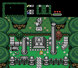
(which I'm truthfully not completely done with, btw, and this hasn't even been updated yet) There is a significance to the shrine here, and the one in my entry. There will be several of these littered throughout Hyrule in my quest, with the same two trees. So that's the reasoning. What I change to one shot, I must change to the others. icon_unsettled.gif Oh, and I'm new at custom work. icon_heh.gif

@Nathaniel:

I see the focus very well, too. icon_razz.gif Yeah, I kinda rushed on this shot, and submitted it with a good chunk of the week still ahead I could've used to work on it. I see the desert problems, now. I'll tone down the straightness/crammed trees for my quest's sake, but not for SotW's sake. Thanks.

@Majora's Wrath:

Yeah, I was going for concave. icon_smile.gif Yeah, thanks for the originality bonus. icon_w00t.gif I keep hearing the same complaints about crammed trees, though. I'll get to work on a better shot for next week, though it may end up being a Mario tileset shot. icon_razz.gif

@billy ronald:

just a normal SotW post. icon_xd.gif


Again, I thank you all for the critiquing, and I'll take it to heart. icon_biggrin.gif


0 user(s) are reading this topic

0 members, 0 guests, 0 anonymous users