Jump to content

Photo

Screenshot of the Week 155


  • This topic is locked This topic is locked
45 replies to this topic

Poll: Screenshot of the Week 155 (72 member(s) have cast votes)

5 entries to show off this time around!

You cannot see the results of the poll until you have voted. Please login and cast your vote to see the results of this poll.
Vote

#1 Neppy

Neppy

    Grand Overlord Empress

  • Members
  • Real Name:It's dangerous to go alone. Take Nep!
  • Location:Minnesota

Posted 12 February 2007 - 04:14 AM

Here are the shots for this week! Enjoy!

Daiv
IPB Image
'I'll have a blue ZC without you icon_deformed.gif '

Radien
IPB Image
Lost within the confines of an abandoned monastery, a drafty dining hall presents Serenia with the most puzzling riddle yet.

Solarrain4
IPB Image
Why are there Moblins here? I thought this was a peaceful forest...

Limzo
IPB Image
Watch out Link, Octoroks can strike at any moment!

Sharon Daniel
IPB Image

Enjoy, and remember to get them screens ready for next week! icon_wink.gif

#2 Colin

Colin

    Coblin the Goblin

  • Members

Posted 19 February 2007 - 01:07 AM

I think Radien just won... I will get to my CC tomorrow morning when I am awake.
Okay, now I am getting around to my CC...
Daiv: The screen looks okay, but most of the grass in the shot is plain straight grass, you know how to change this though I hope. And also, there just seems to be too much open space... but that is just my feeling.

Radien: Quite an awesome screenshot, the graphics are great. But, there is something that would make it better. The screenshot would simply look better if the table ran off the south end of the screen. If it doesn't mess anything up, I suggest that you should make the table go vertically off of the screen instead of horizontally restricted within the screen... rock awesome screenshot anyway though. Gets my vote.

Sollerain: Pretty good pure shot. But just like with Daiv, most of the grass is straight plain. What would make this better is if you varied the grass more, say have most of the grass not be plain, but have flowers and tufts and so forth. Also, you might want to put something like a tree or five in the central east area of the shot just to break up the shot more.

Limzo: It's pretty good I guess... the problem is that there is a huge 'block' of flowers in the north end while there is hardly anything underneath. All four corners of the shot are also open, you may want to change this unless you depend on the supposed "Z3 scrolling" to change this.

Sharon: Rock awesome dungeon shot, everything in there has quite a function, but the canal stood out the most in my eyes. This simply is a cool dungeon/screen. Has my second vote. If this had awesome customs, then it would have gotten my vote.

Edited by Nuvo, 19 February 2007 - 09:17 PM.


#3 /M/

/M/

    6♣7♠8♥9♥10♥

  • Members
  • Location:Gotham City

Posted 19 February 2007 - 01:11 AM

Hmm... Nothing special this week beside Radien's house interiors. ( Or dungeon?)

Davi:


Unique screen here. The sprites need to be fixed, they don't use any outline while the rest of the set does. The BS mountain is missing a few tiles or was misused. The palette could use some editing too.

Radien:


Nice, nothing wrong besides the subscreen. IMO, those borders are too big, and looks out of place. Either way, * Votes *

SolarRain4:


Average shot, though I must give you credit for trying. ;-]

Limzo:


Would have been my first vote if you would have taken the time and setup a good screen. Looks like you just randomly put things in no given order.

Sharon_Daniel:


Nothing to say about this screen.

Edited by /M/, 19 February 2007 - 01:13 AM.


#4 Evile

Evile

    Dolphinslayer

  • Members

Posted 19 February 2007 - 01:19 AM

Radien gets my vot for that beautiful house interior. Limzo was pretty close thugh.

#5 Revfan9

Revfan9

    Hero of Time

  • Banned
  • Real Name:Dr. Pajamas
  • Location:In front of a screen

Posted 19 February 2007 - 01:24 AM

Daiv: OW!!!! That palette burns my eyes a bit, and most of the screen is plain blue "grass". The incorrect usage of the BS-Mountains is no good either...

Radien: I see lots of incredible custom and edited graphics in this shot, which is always nice to see. The table could use a few more objects, however, and the floor is rather monotonous and could use some details. Aside, I'm not allowed to vote for you anyway.

Solarrain4: Average Pure shot, but at least a little effort was put in. Some sort of variety with the trees, as well as more ground details can easily bump this shot above-average.

Limzo: Hmm... a good work of Minish Cap graphics there, nicely ripped from the ROM image, and I like the more subtle palette edit so there aren't so many distracting colors. The issue here is Screen balance. The trees at the top distracts the viewer from the rest of the shot, and all they see are those trees.

Sharon: Meh Pure dungeon shot. Again, another issue of screen balance. All that bright blue with the light shades of tan is distracting, but in a way that makes the player want to look away from the shot instead of wanting to look at it. The floor tiles could use some variety as well.

Null'd, although it's sad that Radien has already won, pretty much...

#6 Sharon Daniel

Sharon Daniel

    .

  • Banned

Posted 19 February 2007 - 01:33 AM

I like the ripped walls in Radien's shot, but that table, the chairs, and barrels all look overly detailed to be used alongside Minish Cap tiles.

Solarrain4, it's a perfectly accaptable screen for a quest, but not SotW.

Limzo's screen has trees and mountains placed one combo away from the edge of the screen... That ain't good.

My screen sucks. I'd say "Don't expect to see that in the finish quest.", but that would imply that my quest will eventually be finished...


I skipped Daiv's screen intentionally. He's hopeless, as far as I'm concerned.


*null*


#7 link3505

link3505

    Ancient

  • Members
  • Real Name:Ben
  • Location:The Edge of Infinity

Posted 19 February 2007 - 02:10 AM

Yeah, Radien pretty much owns this week. Personally, I'd like to see the whole center area moved up one tile, or decreased by one tile vertically from the southern side (If that made any sense), but otherwise it's very nice

#8 Freedom

Freedom

    Warrior

  • Members

Posted 19 February 2007 - 02:19 AM

Radien's shot is really good, but Limzo really captured the Minish feel in his shot, so I let the vote go to him this round.

#9 Twilight Knight

Twilight Knight

    Tell all with glee, Argon's on PureZC

  • Members
  • Real Name:Sven
  • Location:Rotterdam, NL

Posted 19 February 2007 - 02:46 AM

It was hard to choose between Radien and Limzo, but Radien really catched my eyes with his screenshot as ussual, so my vote goes to Radien. icon_smile.gif

Btw: @ Evan The Great: You said it has a house interior, that's true, but actually it's a dungeon.
Can't wait to play the full DOR. icon_heh.gif

Edited by Twilight_Knight, 19 February 2007 - 02:52 AM.


#10 Radien

Radien

    Courage

  • Members
  • Real Name:Steve
  • Location:Oregon

Posted 19 February 2007 - 03:23 AM

/M/:

The subscreen is in progress. I figured it was good enough that I didn't need to crop it, though.

What borders...? icon_shrug.gif Um... are you talking about the lower walls?... That's not a border, that's actually part of the wall itself, ripped directly from Minish Cap. I don't have any reason to change those tiles, but if you thought they were borders rather than lower walls, well, I suppose I could lighten the darkest brown so it doesn't look so... um... "indented."
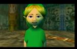
Evan the Great:

Hey, thanks... just so you know, this is actually a dungeon... though it has a lot of "house interior" elements, so visually it sorta blurs the line. icon_wink.gif

Revfan9:

Hmm, 5 different objects isn't enough for one empty table?... Well, I do see your point, although I think it's more a question of what goes on the table, rather than how much. I may rip or draw other objects as this dungeon goes on; I'll see what I have later on and perhaps revisit the table.

It's funny that you commented on the floor being repetitive, because I was particularly worried about that and ended up using 6 different variations on the original floor tile which are all scattered about this shot. Floors have become a major headache for me, since most LTTP floors are ugly IMO, Minish Cap floors are too simple, and everything else I find ends up being too detailed to look good in a 5-color gradient. icon_confused.gif At this point I'm happy with floors that are just "unobstrusive." Oh well... I'll keep at it.

Sharon Daniel:

I'd agree with you about some Minish Cap tiles, but personally I think MC dungeon walls are the most detailed of any 2D Zelda game. Well, at this point I think I'll just respectfully disagree.

Relic:

Hmmm...I was thinking about that. icon_smile.gif I originally moved it down one tile to where it's at, because the upper portion was getting a little cramped (the walk flags, I mean), and as you can see this is only the northern half of a long room. I may just take your suggestion, now that the thought has been confirmed.


Thansk for the comments so far; it's good to be back in ZC and active enough to return to the SOTW competition. icon_smile.gif

By the way, fun fact: my screenshot contains elements ripped from at least 9 different games. That doesn't include the custom-edited and original tiles, with elements drawn or edited by at least 3 graphical artists in addition to myself. Also, within just the Minish Cap tiles, pieces from three different dungeon sets were used.

IPB Image

IT LIVES.

#11 link3505

link3505

    Ancient

  • Members
  • Real Name:Ben
  • Location:The Edge of Infinity

Posted 19 February 2007 - 03:38 AM

QUOTE(Radien @ Feb 19 2007, 12:23 AM) View Post
Relic:

Hmmm...I was thinking about that. icon_smile.gif I originally moved it down one tile to where it's at, because the upper portion was getting a little cramped (the walk flags, I mean), and as you can see this is only the northern half of a long room. I may just take your suggestion, now that the thought has been confirmed.
Thansk for the comments so far; it's good to be back in ZC and active enough to return to the SOTW competition. icon_smile.gif

Another thought would be to move/extend the table down into the next screen, so it's in both screens. Dunno how that would look, though

#12 Radien

Radien

    Courage

  • Members
  • Real Name:Steve
  • Location:Oregon

Posted 19 February 2007 - 03:52 AM

QUOTE(Relic @ Feb 19 2007, 12:38 AM) View Post
Another thought would be to move/extend the table down into the next screen, so it's in both screens. Dunno how that would look, though

More importantly, it would mess up the puzzle.

Otherwise I would do it... but... Z1-scrolling screens, and all...

Anyway, I've got the rest of the dining room planned as something that I think makes sense.

#13 .TakaM

.TakaM

    Junior

  • Members

Posted 19 February 2007 - 04:05 AM

Daiv
Problems:
  • Various tiling errors
  • Bizarre saturation and contrast levels
  • dull sprites
Solutions:
  • fix the tiling errors, such as the long grass doesn't transition smoothly, the cliffs look like they're missing tiles (I don't know if thats how they look in the official game) regardless, it needs more tiles because at the moment the grid is too apparent.
    also, I wouldn't recommend using those trees, they look too busy and ugly, plus when they're used with those grass tiles, they blend in too much
  • blue ground? go for it, just don't use such an eye piercing blue.. use a duller blue that people wouldn't get sick of seeing everywhere
  • the sprites aren't that bad, they just look lifeless, like they could be drawn on the ground, outlines are needed, they help break up the levels of depth, it also looks like you're using too many colours on such small details of the sprites, for example the shades on link's hat don't vary much, but you have three, for the effect you have at the moment only 2 is needed, things like that
Overall:
To be honest, there isn't really anything I like about this screenshot, except for the fact it looks different to whats usually in these polls, though I think you went a bit too far

Radien
Problems:
  • the tiles on the table are pretty repetitive and busy
  • near pillow shading on the floor tiles
Solutions:
  • I'd recommend losing the highlight shade (and maybe the darkest shade) on the tiles, then flipping them 90 degrees, having most of the details go verticle makes the perspective a bit awkward
  • when you look at the floor tile's highlights, they run parallel with the mid tone's edge, the highlight line should be moved over to the right like:
    IPB Image
Overall:
Good looking screen, everything else is nice, everything goes together well, got my vote

Solarrain4
Problems:
  • just another standard ZC screen
Solutions:
  • just do something creative, generic area, trees, enemies, water.. cmon, we've all seen this a million times.
    the only thing that makes this screen stand out is the little tree stump house.. just put something in, anything, some cliffs, a path, fence.. anything
Overall:
it's just a standard screen, nothing impressive, nothing really done wrong

Limzo
Problems:
  • just too many flowers really, I never really liked the MC flowers, they look like badly resized pixels
Solutions:
  • just cut down on the flowers a bit or mix them up with some alternative flower tiles
Overall:
It's nice to see a regular sized link sprite, pretty well laid out screen with no errors, just a little bland.. but that kinda comes with MC's tiles

Sharon Daniel
Problems:
  • the clouds look really jagged over the trees in the distance
Solutions:
  • first I'd suggest just using the tiles from lttp, the trees in your tiles have no shape to them, they look flat, painted onto the ground, just use the lttp trees, no point reinventing the wheel. As for the clouds, you just need to AA them into the trees.
Overall:
pretty nice dungeon screen, looks good, just need to rework those background trees

#14 Blue Link 2007

Blue Link 2007

    Doyen(ne)

  • Members

Posted 19 February 2007 - 04:15 AM

I voted for Lizmo because those Four Swords/Minish Cap Tiles look good! Hope you win this one.

#15 NoeL

NoeL

    Legend

  • Members
  • Real Name:Jerram

Posted 19 February 2007 - 08:16 AM

Radien hands down *votes* , but I give points to SD for using my tiles icon_razz.gif

... and Solarrain4 for using my sword I guess...
QUOTE(Revfan9 @ Feb 19 2007, 12:24 AM) View Post

Null'd, although it's sad that Radien has already won, pretty much...
I'm getting sick of hearing this week after week. Maybe a handicap system should be introduced. The more wins/votes you receive the more votes you need to win.

Edited by NoeL, 19 February 2007 - 08:21 AM.


0 user(s) are reading this topic

0 members, 0 guests, 0 anonymous users