Impressive

Spriteman:
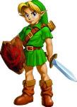
Nice portriat of Link, but it's the only interesting thing, really. The background is cool, but It seems there should be more mountain and less water/ sky. EDIT: I forgot to mention some stuff about the subscreen. The grey looks weird compared to your other detailed stuff, and the buttons ahould be bigger so we can see them, and to take up more space, and give the illusion of detail.
Gashin:
I'm sure I'm the only one who will say something other than "OMG 1337 1337 PWNAgeee" and actually add something constructive. The screen is nice, but the trees seem
too detailed, and next to the plain grass and BS mountais it looks awkward. If you made the grass darker, it's be better, IMO. But, it is still awesome, and I voted for it.
Pikaguy900:
Three words. Way. To. Bland. Sorry, but there should be a lot more there... I'm not sutre how else to say it. It just looks empty.
Darkspawn:
Nice, newer looking shot, but the trees are laid out awkwardly.
Hero Link:
I love the GB set, but you know you're missing some corner-water peices

This is a better showing than usual
Edited by Anthus, 28 September 2006 - 08:02 PM.

 This topic is locked