Screenshot of the Week 115
#1
Posted 12 March 2006 - 01:15 PM
A screen from "The Adventures of Robinhood"
Linkus Mastii
Ask, and you shall recieve! (the sprites)
Rex Zemenheart
Ignore the "Unregistered" thing at the top. The "lag" is not part of the shot, it is where the loop restarts…
Sylph
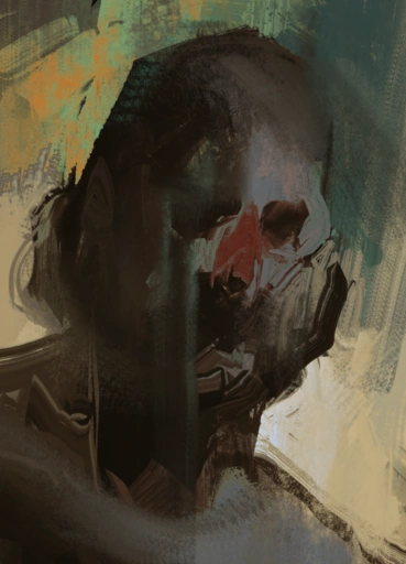
Link: "Thanks... Looks like home!"
XdragonSB
Wow, this place must have been used not to long ago...
ZC-Ninja
I cant come up for a caption... its not the best I could wipe up, but hell, Ive been working all week on this boss.
another huge turnout! I guess complaining about how few submissions I was getting did the trick!
#2
Posted 12 March 2006 - 01:20 PM
FreeDom: I really like this shot. Reminds me of winter. Which is always good to me. =D
Linkus: Wow... I like how you used the sprites. Two tile tall, but not completely.
Rex: I don't nothing to say about it.. Nice animation?
Sylph: Could be less square-ish.
XB: I seen this shot alot already.. =p Umm its a good shot.
ZCN: Wow.. good job. But the boss looks so blurry. Did you re-size a sprite or something?
Linkus.. is who i vote for.
#3
Posted 12 March 2006 - 01:24 PM
Linkus Mastii- would have been my second vote. Also a nice shot
Rex Zemenheart- lacks alot of detail. But, it is a desert.
Sylph and XdragonSB are good shots, but there isn't anything special about them
ZC Ninja- Good shot, but it feels like its missing something.
#4
Posted 12 March 2006 - 01:24 PM
#5
Posted 12 March 2006 - 01:32 PM
#6
Posted 12 March 2006 - 03:14 PM
BH4,
Yep, I'm in the market for some good falling snow, with small flakes, if you know where there is any to be had.
That you posted looks like it would need a lot of re-editing work, with that white background and all.
#8
Posted 12 March 2006 - 03:22 PM
I only have 2 screens in the snow area done so far.
#9
Posted 12 March 2006 - 03:31 PM
Linkus Majestii:You would of gotten my vote, if not for Freedoms shot. But, anyways, love the sprites, and the houses look great!
Rex: I really like the big flag-things on the shot. It seems like it is lacking detail. Yet, that is what deserts are supposed to do. Try adding little mountains or something like that to the shot.
Sylph:I'm sorry to say, but...that shot looks almost unnatural. It is a little too square, and do something to the platform. Overall, it looks pretty good.
XdragonSB:Looking better...try using modefied floor tiles, like edit some of them to look cracked or something.
ZC-ninja:Cool. I wonder how you are gonna makie the custom boss...It looks good. Really good.
#10
Posted 12 March 2006 - 03:47 PM
Edited by xXVolvagiaXx, 12 March 2006 - 03:49 PM.
#11
Posted 12 March 2006 - 05:55 PM
Great work you all.
#12
Posted 12 March 2006 - 06:09 PM
Freedom- Mmm nice. I would vote for this, but I have a soft spot in me heart for nicely drawn custom tiles. I must give you 10 cookies though for all the coloring editing you have done on these tiles.
Linkus- Ah... just what youre shot needed, some good sprites. I can tell you right now, I plan on downloading this tileset and editing some of the tiles to fit into me quest. Good job!
Rex- Its just kinda... bland. Assuming you are using this for a endless dessert kinda thing, it works, but its not really SoTw kinda thing...
Slyph- Same as Rex although slightly better.
Dragon- I think Ive commented on this shot before... just refer to that.
#13
Posted 12 March 2006 - 07:39 PM
#15
Posted 12 March 2006 - 08:25 PM
#6 - Rex Zemenheart: I like the idea of the sandstorm, but there should be more to it than what you have.
#5 - XdragonSB: You continue to get better with your screenshots, from what I have seen before. This is not bad for a more commonly occurring type of cave screen, but it doesn't compete with some of the other screenshots.
#4 - Sylph - I really like the concept. Of course I have seen a lot of screens that look a lot like this. It is good, but it is tough to compete with what is above.
#3 - Linkus Mastii - Now those are not your usual run of the mill looking buildings. I really like the style in them, and how they are placed near each other. It has a very "right at home" feel to it. My main criticism is that the trees along the edges of the screen are too well lined up, which is unnatural.
#2 - ZC-Ninja - You are always coming up with very unique ideas that make us want to stare. Your screenshots easily grab my attention most of the time, often because they are both stange and magnificent at the same time. My only criticism is that it feels very rectangular for something that should seem less so.
And #1 - Freedom - Simply amazing usage of snow and its effect on the whole environment of the screenshot! The trees and ledges blend in very well. In fact, everything in the screenshot blends in well with each other, except maybe the red door. It seems a bit too bright for a harsh environment, but your screen is still my vote choice despite that.
0 user(s) are reading this topic
0 members, 0 guests, 0 anonymous users