Jump to content

Photo

Screenshot of the Week 110


  • This topic is locked This topic is locked
25 replies to this topic

Poll: Screenshot of the Week 110 (64 member(s) have cast votes)

Screenshot of the Week 110

You cannot see the results of the poll until you have voted. Please login and cast your vote to see the results of this poll.
Vote

#1 link3505

link3505

    Ancient

  • Members
  • Real Name:Ben
  • Location:The Edge of Infinity

Posted 22 January 2006 - 02:26 PM

six entries this week! it's a record!

Comix
user posted image
Gate of Kazaar Title Screen

Darkspawn
user posted image

Rex Zemenheart
user posted image
WELCOME TO CORNELIA! WELCOME TO CORNELIA!

Siguy
user posted image

XdragonSB
user posted image
The curse has been set on the castle...

ZC-Ninja
user posted image
Watch as Ruth bravely battles the Male Chavonist Piggy!

and just a reminder, a couple of the screenshots were .bmp. for some reason, the boards don't like those, so please, use .png, .gif, or .jpg/.jpeg. it's a pain when I have to convert them myself

#2 NineLives

NineLives

    Boom. Zoom. Dakota.

  • Members
  • Location:Los Angeles, California

Posted 22 January 2006 - 02:34 PM

oh shoot...
im ganna lose compared to darkspawn...
or any other guys...
beh, its worth a try.

#3 August Yifu

August Yifu

    Magus

  • Banned

Posted 22 January 2006 - 02:45 PM

Rex Zemenheart gets my vote. Theres far too many pure-based quests out there. So seeing something NES-like here is refreshing to me. And that joke there makes it even better.

#4 Sacred Nym

Sacred Nym

    Wizard

  • Members

Posted 22 January 2006 - 02:56 PM

Darkspawn. I personally hate the FF1 graphics. And I may have decided to use Pur for my own quest but seeing other things atre nice.

#5 Siguy

Siguy

  • Members
  • Location:The inactive user list.

Posted 22 January 2006 - 03:06 PM

I voted for myself, although I probobly shouldn't have. Oh well, too late to change that.

#6 Linkus

Linkus

    .

  • Members
  • Real Name:Adam

Posted 22 January 2006 - 03:19 PM

I nulled.

Darkspawn would look like a winner, but the tree, house, or fountain are too bright.
-OR-
The dirt, grass, and cliffs are too dark.

All the others are just... mediocre.

#7 Comix

Comix

    Hello.

  • Members
  • Real Name:Kurt
  • Location:Somewhere in Canada

Posted 22 January 2006 - 03:47 PM

wait for it... wait for it.

I got PWNED!

Wow, my screen sucks compared to the others,

I nulled,

Comix

#8 Eurysilas

Eurysilas

    Paladin

  • Members

Posted 22 January 2006 - 03:59 PM

Siguy. Because seeing his screenshot reminds me of OOT.

#9 Nathaniel

Nathaniel

    Deified

  • Members

Posted 22 January 2006 - 04:07 PM

What I like about the screenshots I did not vote for:

Comix - The custom work with the two swords.
Red Zemenheart - It is something new to the table and has some nice trees in the center and lower left (although they would be much nicer if they were larger and not as many of them clumped together).
Siguy - The symbol above the door of the facade and the shadows indicating the presence of trees that don't actually appear in the screenshot.
XdragonSB - The character sitting in the throne and the symmetry and multi-level usage of the building.
ZC-Ninja - The custom boss and the flames.

And now my vote...

Darkspawn - A lot of uniqueness is in this screenshot, and I like most of it, most especially the front gate.

#10 Anthus

Anthus

    Lord of Liquids

  • Banned
  • Location:Ohio

Posted 22 January 2006 - 04:08 PM

Null'd

Darkspawn seems top have a nice grasp on the Adventure set. When I first saw that, I thought is was Freedom icon_razz.gif

Siguy's is an okay shot, but I personaly think the GBC castle tiles and the ALttP other stuff kind of clash.

ZC-Ninja's is interesting... It looks like "2.11"...

The others are nothing special...

Edit: Uh, Gashin, you do know you put "Screenshot of the Month 110" icon_wink.gif

Edited by Rex Zemenheart, 22 January 2006 - 04:09 PM.


#11 Peteo

Peteo

    Back in Business!

  • Members
  • Real Name:Pete
  • Location:Finland

Posted 22 January 2006 - 04:24 PM

I love Rex's FF screenies a lot. I appreciate people who can make good looking "NES screenies". It gets my vote.

#12 nicklegends

nicklegends

    Trofessional Pransposer

  • Contributors
  • Real Name:Ed
  • Pronouns:He / Him

Posted 22 January 2006 - 05:57 PM

Erm... "Screenshot of the Month 110"? Is it that time already? icon_razz.gif

Comix
Nice. The letters are a tad flat and the background is rather undetailed, in my opinion, but as a title screen it works well. icon_smile.gif

Darkspawn
You use a very smooth palette here, and the tiles are suitably... smooth. I just wish the grass was a little less blue. It makes a rather odd contrast with the mountains through my eyes. icon_wink.gif

Rex Zemenheart
I'll say it again: You squeeze a lot of detail into these screens considering the lack of tiles and the simplistic palette. icon_smile.gif

Siguy
This is a nice shot. The castle and the shade is nice, but I still feel like there could be something more... Hm. icon_confused.gif

XdragonSB
That's a very blue castle, isn't it? icon_razz.gif This shot, like Siguy's, still feels a bit empty, for some reason. Maybe some more color variation would help?
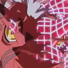
ZC-Ninja
This is a very solid Pure screen, which has some great design, detail, and action. Graphically, it's not that sophisticated, but I will award you with my vote nonetheless for design.

#13 Shoelace

Shoelace

    The Shaman of Sexy!

  • Members
  • Real Name:Michael
  • Pronouns:He / Him
  • Location:Arizona

Posted 22 January 2006 - 06:23 PM

Comix
It is a good tile screen. The background didn't cut it for me and plus I don't vote for title screens because the designs are always poor.

Darkspawn
I see that you are using the Adventure Tileset. I didn't vote for it because it lacks major design. It looks like it was just thrown together in my opinion.

Rex Zemenheart
It is good screen. Nothing really wrong with it, but it doesn't draw my attention.

Siguy
This one has the best design in my opinion. However, it still looks plain for some odd reason.

XdragonSB
Too little detail and the design is so so.

ZC-Ninja
A Custom Boss, ey. I wasn't very high on this one either, however, it has the best mix of design, detail, and appealing out of the bunch. *votes

#14 link3505

link3505

    Ancient

  • Members
  • Real Name:Ben
  • Location:The Edge of Infinity

Posted 22 January 2006 - 08:01 PM

heh, whoops. I was looking at the SotM post to remember how to set up the image URLs, guess I just typed that in without knowing it. it's fixed now

#15 Lemon

Lemon

    Legend

  • Members

Posted 22 January 2006 - 08:03 PM

Comix- Overall ok, but is lacking the pyzaz.
DarkSpawn- Proof that graphics trump setup! No offense, but I really dislike this shot... it just looks like you threw together some nice tiles... its mainly the mountains at the bottem I cant stand... it just looks wierd.
Rex- Nice in everything but graphics... Im not dissing the graphics, I love FF1 Graphics, just it isent as beautiful as some others.
Siguy- Nothing really specail in this shot
Dragon- You need more decorations... Or at least cut off the side stuff in paint.

For the record:
-I used Orions set, not Pure... I never use Pure.
-This isent for any quest or anything, its just a old snapeshot I made for a friends Xmas picture.


0 user(s) are reading this topic

0 members, 0 guests, 0 anonymous users