Jump to content

Photo

Screenshot of the Week 94


  • This topic is locked This topic is locked
44 replies to this topic

Poll: Pick your favorite screenshot. (82 member(s) have cast votes)

Pick your favorite screenshot.

You cannot see the results of the poll until you have voted. Please login and cast your vote to see the results of this poll.
Vote

#1 PrinceMSC

PrinceMSC

    Remember the Name

  • Members
  • Real Name:Michael
  • Location:Oklahoma

Posted 10 July 2005 - 11:29 AM

Comix
user posted image
Bob goes out to kill Pharoah Stick.

Freedom
user posted image
Opening screen of "The Adventures of Robinhood"

Gashin
user posted image
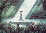
Teaser shot from the first real level in Hyrule Fantasy, Forest Ruins... it's a work in progress.

Jonathan
user posted image
Not as much shading this time.

khazmodius
user posted image

Linkus Mastii
user posted image
What a boring afternoon.

PolygonX8
user posted image
Mt. Celsius

Shoelace
user posted image
Watch for falling blocks!

Tobias Daboi
user posted image
Well... This is problematic...

#2 Comix

Comix

    Hello.

  • Members
  • Real Name:Kurt
  • Location:Somewhere in Canada

Posted 10 July 2005 - 11:48 AM

Johnathan kicks butt again. I might as well not even submit until he leaves icon_heh.gif

Your trees are what gets me.

The two other ones that kicked but was Gashin's and Freedom, who I haven't seen any from him until now.

Wow, this SotW had some awsome screenshots.

(null-vote)

Comix

#3 Hergiswi

Hergiswi

    don't look for me, i'm just a story you've been told

  • Members
  • Real Name:chris
  • Location:house

Posted 10 July 2005 - 11:50 AM

Wow. Lots of shots. O_O

Comix: The screen is pretty empty, kinda boring. You might want to add some stuff.

Freedom: Wow. That's just an awesome shot.

Gashin: Again, awesome shot.

Jonathon: I like the variety, but it sort of confuses me. I'm also not really one for ripped tiles. :\

khazmodius: Nice. Did you draw those yourself?

Linkus Mastii: I like the tiles, but some of them don't look like they really go together, particularly the brown/gray mountains.

PolygonX8: Nice shot. All I really have to say.

Shoelace: Nice side-scrolling shot. I love how you used the falling block with the eye thingy, because I was going to do that too with the GBC tileset. icon_razz.gif

Tobias Daboi: There's not really much there, just a bunch of those orange things.

All in all, I have to say my vote goes to...Gashin. My second pick would probably be Shoelace, since I'm a sucker for side-scrolling. icon_razz.gif

#4 Comix

Comix

    Hello.

  • Members
  • Real Name:Kurt
  • Location:Somewhere in Canada

Posted 10 July 2005 - 11:52 AM

I updated it... icon_blink.gif

I re-submitted it like 5 minutes after I had accidently submitted the wrong one.

icon_shrug.gif

Oh well, I will just have to do better next time. icon_shrug.gif

icon_frown.gif

Comix

#5 LinktheMaster

LinktheMaster

    Hey Listen, Kid

  • Members
  • Real Name:Matt
  • Location:United States

Posted 10 July 2005 - 11:59 AM

This was hard... extrememly hard, but, I found Gashin coming in the lead. icon_wink.gif

BTW: Comix, whenever you reupload the pic, it's best the PM Prince back. icon_wink.gif

#6 /M/

/M/

    6♣7♠8♥9♥10♥

  • Members
  • Location:Gotham City

Posted 10 July 2005 - 12:42 PM

Gashin and Jonathan have VERY good shots. Hmm, I dont know who to vote for.

#7 nicklegends

nicklegends

    Trofessional Pransposer

  • Contributors
  • Real Name:Ed
  • Pronouns:He / Him

Posted 10 July 2005 - 02:24 PM

Wow. This is destined to become my longest post...

Comix: I counted a total of four different tiles on this screen, not including the header. If you had managed to make those four become extraordinary tiles, then I wouldn't mind, but as it is now, there is nothing there that makes a good shot. It's too empty and bland. icon_neutral.gif

Freedom: An impressive shot. The colors are a bit odd in places (i.e. green trees and brown grass) but otherwise, nice picture! icon_thumbsup.gif

Gashin: A wonderful shot! The palette is perfect, and that Hylian emblem on the pedestal is great. The sunlight shining through the trees is a perfect environment-setter as well. Great work! icon_biggrin.gif

Jonathan: It always seems that there's a small thing detracting from your shots. This time, I feel it's the blinding rooftops on the left. It always grabs my eyes because it is a whole lot brighter than the other colors you used, but besides that minor flaw, this is superb. icon_smile.gif

khazmodius: I think a bit more could have been done in this shot as far as tile selection. I understand that you need an empty room to put the boss in, but something other than perpetual darkness in the background would have been nice.

Linkus Mastii: The vertical cliffside borders look a bit odd, and the colors are a bit bright, in my opinion. With a bit of palette alteration, this would be an even better shot. icon_wink.gif

PolygonX8: Wow, another incredible shot. Few people manage to create impressive snow shots, but this is definitely one of them. Among the things that look wonderful in this picture are the falling snow, the ice, and the cliifs. Like Gashin, you really set your environment up well. Here, take my vote. icon_smile.gif

Shoelace: Not a whole lot to say about this shot. I'm not sure if the idea of changing a trap into a thwomp was yours, but it was certainly clever. icon_wink.gif

Last but not least, Tobias Daboi: This shot didn't do too much for me. Some standard Pure tiles are overlayed by a giant unientifyable spiky... thing. So-so. icon_neutral.gif

Some nice shots this time, and lots of them! Great work. icon_thumbsup.gif

#8 Phosphorescent Image

Phosphorescent Image

    Experienced Forumer

  • Members
  • Real Name:Cooper
  • Location:CA

Posted 10 July 2005 - 02:27 PM

Comix This screen is pretty bad, You have 3 tiles for the entire screen. Try giving it alot more variety. Also, if your going for a desert look, use desert tiles, those are just dirt tiles and doesnt give as sharp a look.

Freedom WOW! Where did this come from!? I was soooo tempted to vote for you, except for 2 errors... Your log tunnel at the bottom of the screen really would look better with a black outline, or at least darken the log as a whole. And your hedges around the log have inversed shading. The darker edge should be the outside of the hedge not the inside. Otherwise, this screen blew me away. I love the setup and colors. It looks fantastic.

Gashin Same old, same old. Once again, you amaze me with your incredible tiles. Im starting to get tired of it j/k =p. Awsome screen, Everything about it looks wonerderful, except the doorway, it has a definate 3d look, while the back wall looks very flat. Id recomend putting in a differnt style of door. Incredible screen otherwise!

Jonathan I usually do not like your tiles, or your screens very much... however this was one of the most beautiful screens Ive ever seen. I have never seen such a perfect combination of colors, combinations, and designs, everything works with everything else. I love this screen. *Votes*

Khazmodius I like the futuristic feel, however, the screen is way to bleak, and bland. I also cannot figure out what is going on in the screen.

Linkus Mastii This shot is rather chaotic, Its very hard to train your eye and follow the mountain paths. I also do no like the colors very much, it has too much of a contrast between bright and dark with most of your tiles. I like the fact that you are trying to do something new, however it needs some more work. I also think the mountains look very flat, I think its mostly because of the bottom brown, center mountain that juts over the right bottom mountain. It throws off the perspective of the whole screen.

PolygonX8 Great snow tiles! I really like the screen and the icey, lonely, feel that you have created. The only complaint is that the back mountain looks quite flat, give it some more depth and bring it out a bit more. Otherwise good job.

Shoelace Great shot! This screen is really intrieging, The dark blue tiles, the torches, falling blocks, and grapple pits. I love it. youve done a great job, and unfortunatly for you, Gashin and Jonathan entered this week =p. Truth is, its pretty hard to make a shot like this much better, and in the end, more cinematic shots tend to win the votes. However, I dont think anyone could have made this screen better than you have.

Tobias Daboi This screen is in my opinion pretty bland. I like the feel of death you have bestowed up the screen, the skulls, the desert, the monsterous danger in the center. However The screen itself lacks, it has no borders, whats keeping link from just going around? Anyways, this shot needs more, and I think all those monsters is a bit over the top. (Is that a custom boss?) It almost looks like a HUGE Centapied.)

Edited by Phosphorescent_Image, 10 July 2005 - 02:30 PM.


#9 venom343

venom343

    Senior

  • Members
  • Real Name:Blake
  • Location:Canada

Posted 10 July 2005 - 02:44 PM

Im voting for Jonathan again this week because the tiles have this realistic look to them, i like his style a lot even more than Gashin's. icon_thumbsup.gif to all! Very good week this week icon_biggrin.gif

#10 HappyPuppet

HappyPuppet

    Deified

  • Members
  • Real Name:Palmer
  • Location:Virginia

Posted 10 July 2005 - 02:45 PM

For me, this has been by far the hardest choice in any SOTW in picking who to vote for.

I voted for Jonathan.

#11 Guest_zelda 654 (Guest)

Guest_zelda 654 (Guest)
  • Guests

Posted 10 July 2005 - 03:13 PM

WHEN IS THE ULTI SET GOING TO BE DONE icon_question.gif

#12 Exate

Exate

    Deified

  • Members

Posted 10 July 2005 - 03:17 PM

Well, Jonathan and Gashin take SotW by storm again. I was going to reupload my shot as I changed the palette (I thought SotW would be up later tonight). Blue is too overused, and whitish-gray is more realistic.
user posted image

zelda 654, please do not go off-topic. Say something that pertains to it next time. icon_wink.gif Incase you are confused, Screenshot of the Week is where people enter in their own pictures for a competition to see whose is the best. This isn't a collection of pictures of one tileset or quest. icon_wink.gif

#13 link3505

link3505

    Ancient

  • Members
  • Real Name:Ben
  • Location:The Edge of Infinity

Posted 10 July 2005 - 04:10 PM

QUOTE(venom343 @ Jul 10 2005, 12:44 PM)
Im voting for Jonathan again this week because the tiles have this realistic look to them, i like his style a lot even more than Gashin's.  icon_thumbsup.gif  to all! Very good week this week  icon_biggrin.gif

um, I may be wrong here, and correct me if I am, but I don't think those tiles are his

and if they aren't your's, Jonathan, where did you get them?

#14 Anthus

Anthus

    Lord of Liquids

  • Banned
  • Location:Ohio

Posted 10 July 2005 - 04:15 PM

Yes. That is a (concept) custom boss. The real screen for the battle will be totaly empty... It will have just a few skeletons... This is on the middle of a desert, and its hard to understand that screen unless you fight the boss, but you will see what I mean in a few months icon_wink.gif.

Man... I had no idea that there would be this many shots O.o...

I was a three-way tie between Gashin, Freedom, and Jonathan... I nulled my vote...

#15 lord_jamitossi

lord_jamitossi

    Wizard

  • Members
  • Real Name:Jamie
  • Location:In your blind spot

Posted 10 July 2005 - 05:38 PM

Comix : Okay, quite frankly, I know you're relatively new to this, but I think this shot is really weak. There's 3 different tiles and the main character looks like he's wearing a shoe box on his head. I've seen better from you.

Freedom : I voted for this one. I like the mix of the tiles. Not much new stuff, but what's there really works.

Gashin : I like this shot a lot, but it seems that the wall isn't in proportion with the trees. It looks like it's on a different angle from the ground. I know it's picky, but I guess I really do go for the underdog, and that clearly isn't you. I love your shots though!

Jonathan : The shading issue is better in this shot, but I just don't much like these tiles. The rooves look like they're made out of crystal or something.

khazmodius : I know it's a boss screen, but there's not much going on here. A nice shot altogether, but against the other 8 shots here, it's not a winner. Sorry.

PolygonX8 : Nice. Looks cold. The updated one is better than the original, but I hadn't seen that when I voted...

Shoelace : Nice shot. I like the gameboy graphics.

Tobias Daboi : Another nice shot. Once again though, against the other 8 this isn't a winner. Sorry.

Whew, that took a while. Another suprise: no animated shots this week!

Edited by lord_jamitossi, 10 July 2005 - 05:38 PM.


0 user(s) are reading this topic

0 members, 0 guests, 0 anonymous users